Reviewing my work for assignment 5, I was not happy at all with the outcome of project 13. Certainly I had exhausted my enthusiasm for the subject, but with the monoprinting experiences in projects 14 and 15, I thought that I could try and make some more interesting prints.
The idea was to follow up what I had started in the sketchbook, namely using more varied colours. The other idea was to loosen the relationship between monoprint subject and linoprint subject, i.e. make a picture as underlayer rather than just colorizing the stairs.
I’m now two days before the assignment is due, so had to deal with limited time. I had to fit in not only making the prints, but also writing up and updating the blog to reflect the additions. I guess the practice and experience I gained in projects 14 and 15 helped a lot to quickly come up with a technical approach.
I wanted to stay with Akua inks and print on dry paper, using release agent to improve ink transfer, and print with the press. I chose an eyballing registration method: I placed the monotype plate onto a piece of paper the exact size of the printmaking sheet, then aligned the plate in the upper area of the paper. The printmaking sheet was then aligned with the registration sheet and the monoprint run through the press.Later, the inked linoplate was placed face down on the monoprint, the ensemble turned upside down and run through the press a second time. This worked quite well, although unfortunately the lino plate was slightly larger than the perspex plate, so the lino marks extend on the upper and lower edge. If I had to do it again, I’d cut the linoplate to match the perspex plate size.
The prints have asymmetrical margins, and I will cut them later so that they’re going to be equal on all sides for assessment.
A series of 6 mono and lino combination prints
Monoprint inked with brayer and textured with a spatula, guiding idea of bushes or plants that are growing to the left of the stairway. To the left, the initial monoprint, to the right, after overprinting with the linoplate.

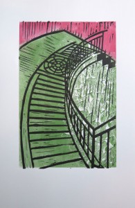
Colour variation: It seemed more natural to have the green around the stairways, and a kind of stone colour for the path itself.

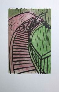
I found the above colours a bit too muted so did another one with brighter red. I used the back of a brush to draw lines into the ink, repeating the handrail shadow pattern. But the lines were too fine and don’t come out after overprinting the linoplate. I also added yellow spots with a fine brush, to hint to flowers. It loosens up the plain green but is a bit too faint in the resulting print.


This print is a favourite. I added ultramarine blue over the rest of red on the stairways, resulting in a pale violet, stone-like colour. I re-inked the greenery, then added yellow and red spots for flowers. I really like the friendly spring feeling evoked by this print.


This was an experimental print on light blue paper. I was skeptical whether the inks would look good, and don’t particularly like the result. I guess the print would look just better on white paper because the colours shine brighter. Technically, I experimented with using a spatula to apply ink, which resulted in the irregular blue pattern around the blue block. It didn’t seem to work for this print but might be interesting in a different context.


Here I created an even more independent image as a monoprint, taking up the Manhattan cityscape topic that attracted me already in part 1. I inked red over blue with a roller and then drew lines into the ink to symbolize the window fronts. The greenery in the foreground was inked with a dabber, deliberately leaving some white for the paper to shine through. I’m quite happy with the print and think the background image adds a lot of interest to the result.


Some reflections
From these prints, I like the one with the green flower lawn and the Manhattan houses best. I’m glad I made the effort to try out these monoprint variations with the linoplate. I think I made a general error by choosing a very limited subject, the staircase shape and its shadow. But then again it was interesting to see whether the initial idea could be pushed further a bit.
I particularly liked integrating the ‘Manhattan skyline’ topic, because it’s something I’m a bit obsessed with. Life in Manhattan is dominated by tall buildings, they can’t be avoided and appear in almost every view. Again there’s the symbolic notion of the stairway printed over the citiscape to indicate a path one takes.
Adding the colour spots for flowers had its own connotations, maybe a bit of spring feeling after the long cold winter. With the new colour choices, the stairways look much friendlier and almost like an invitation to take that path.
I feel that I’m progressing nicely in the technical side of printmaking, but the artistic side or personal voice is not yet developed. Maybe it’s just a bit too much, learning the techniques and trying to develop as an artist simultaneously. I guess once I feel at ease with the practical side of printmaking (or any other art medium), attention will shift to the artistic message.