Preparatory work
For this project, I selected some of the pictures I took in summer 2014 in Crestwood, NY, at the local park where the river Bronx flows. It’s quite a romantic and peaceful place.
I printed them out in a reduced size (about 8×10 cm) and glued them in my large sketchbook next to each other. Initially I wasn’t sure which of the 6 selected images I liked best, but then chose the one with the group of geese on the pond and stayed with it. I liked the wiggly texture of the water and the colour reflections of the geese and bushes on the water surface and thought they’d work well as textures.


I made several sketches to test possibilities and look at some elements a bit closer. I found it easier to focus on selected elements than depicting the entire scene.
1) green oil pastel and india ink, 2) india ink, 3) to 5) pencil


The plate
I decided to make a collagraph of the entire scene. My main idea was to use stretched silk stockings for the water surface. I wanted to have a heavily textured area as the foreground and a smooth surface in the background area, where the reflections on the water were very dark.
For the bushes in the background I used acrylic modeling paste, applied with a painting knife. While the paste was drying, I dapped with my fingers into it to create additional irregular marks. Later I applied a layer of glue and sprinkled black tea over it for additional marks.
 The geese bodies were also made with acrylic modeling paste, and a piece of cotton t-shirt fabric was cut in shapes for neck and head, then placed on top of the paste which acted like glue.
Later I added several thick layers of glue in the middle areas to smooth out the rough texture of the stretched stockings. After everything had dried, the entire plate was sealed with shellac to prevent it from getting sticky when coming into contact with water later on.
Materials: Masonite board (11 x 14 inches / 28 x 35.5 cm), Elmer’s Glue (white PVA glue), shellac sealing
Textures: stretched silk stockings (the water), acrylic modeling paste (upper background of bushes, geese bodies), black tea (texture for the bushes), black cotton T-shirt fabric (geese necks and heads), thick layer of glue (background areas of the water)
The prints
I took many prints from my plate, and it took quite some time until the impressions got better. I struggled with my plate because it was so heavily textured that I did not manage to get enough ink on it. I tried high pressure on dry paper, this improved the ink transfer but caused the paper to wrinkle. I tried damp paper, but then the ink bleeded and the elements lost definition.
In the end, what worked was printing on heavy, damp paper and printing colours in layers rather than inking the plate with more colours in one go.
Paper used: Blick multipurpose paper loose sheets (ca. 120 gms), Strathmore printmaking paper pad (ca 120 gsm), Copperplate unsized printmaking paper (ca 250 gsm), Canson Edition (ca 250 gsm), coloured Canson paper (blue and gray), Japanese rice paper (Kozo), Arches text wove (ca 120 gsm)
Single colour prints
From the many I made, I selected four which are most typical for the results I obtained.
1) On dry, medium weight paper with high pressure: The print is ok, but the paper wrinkles
2) On damp, medium weight paper with moderate pressure: The print gets darker, there’s some bleeding, but the paper does not dry well, with all the buckles
3) On dry, heavier paper (Canson Edition, ca 250 gsm), moderate pressure: A good print, but a little light
4) On damp, heavier paper (Canson Edition again): I think this is a very good print and the paper dries nice and flat


Multicolour prints
I started my multicolour prints on cheap paper (Blick multipurpose, medium weight/ca 120 gsm) because I wanted to see improvements in quality before I use up the more expensive, heavier paper. The first attempts were made with water-soluble oil paints, applied with a brush onto selected areas of the plate. On top of this, black Akua intaglio ink was applied with a brayer. The first print was on dry paper and very faint, the second on damp paper but only blotches of colour made it onto the paper.


I switched to Akua liquid pigment for the colour and continued with damp paper. This wasn’t satisfactory either because the pigments bleeded into each other and the paper looked awful when dried.


First improvements came when I used heavier paper. The left print was on damp Copperplate, which is unsized. The right print is on Strathmore printmaking paper, medium weight but it dries better than the Blick paper. The colour effects when printing from a single plate inked with two colours were still not convincing.
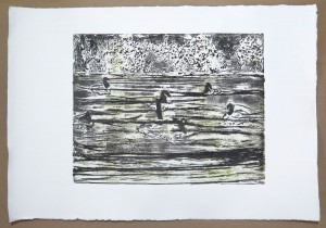

I achieved the best results when printing in two steps on damp paper. The plate was first inked in green, this was printed, then it was inked in black, and printed on top of the green. These two prints show the result, left on Strathmore printmaking paper, right on Canson Edition paper.


Prints on Japanese paper
I wasn’t very happy with the results I achieved on Japanese paper. The single colour prints on dry paper came out a bit faint, and on damp paper they looked blurred. The colour prints weren’t very successful either. Maybe they need mounting to look more attractive.


Prints on coloured paper
Another experiment was printing on coloured paper. I wanted to see the effect of adding white and black so that the paper colour would represent a middle tonal value. I chose a medium-dark blue and medium gray papers, weight ca. 120 gsm.
The blue and trhe first gray were printed in plack first, then white on top. The second gray print was white first, then black on top. Some unavoidable misalignment created a slight 3D effect, but the major problem with these prints is that the textures are not varied enough and so the details can only be read from very close.


More colour options?
A final colour experiment consisted in printing from a plain perspex plate which was inked in blue and fading green, to create a coloured layer. On top of this, the collagraph plate was printed in black.
I think this works quite nicely, although it’s again a bit difficult to detect the geese bodies on the water surface and to make sense of the motif.

Concluding reflections
I must admit that I’m a bit disappointed by the prints that resulted from this project. I think there are several issues which I would address if I had to do it again.
Firstly, I think my choice of motif did not work very well with the textures I created on the collagraph plate. The geese bodies were difficult to distinguish from the water surface, and I wasn’t able to depict the reflections on the water surface. Overall, I think the textures on the plate are not varied enough. For a more interesting effect, I should have included very dark areas, very light areas, and several areas with clearly distinct textures.
Secondly, I might have better chosen a different composition with less, but larger elements. With hindsight, it might have been an error to not follow the intuition I had when doing the prep sketches, where I selected the group of three geese rather than depicting the entire scene on the water.
Thirdly, when working out the collagraph plate, I had in mind that I could use my knowledge of the motif to ink the plate in different colours. This did not work at all. I wasn’t able to create some white areas to indicate the reflections of the geese bodies on the water, nor did I manage to obtain a dark tone in the background area of the water. I think I included too many details in my composition, and then I did not translate them into different kinds of textures that would print differently on the paper.
On a more positive note, I think that I learned a lot from this project. For example, it took me some trial and error to produce nice prints at all, to sort out how I must ink the plate, print the colours, which paper to choose and adjust dampness and pressure of the press. Despite al the issues, I think the final single and two-colour prints are of a good quality and look interesting.
With respect to colour printing, I tried out two of the options suggested in the course materials: Multi-colour inking of the plate and printing colours in layers. I did not experiment with masking because I don’t think the results would have been interesting due to the issues with the plate.
The one thing I’d have liked to explore was combining intaglio and relief techniques in a multi-colour print. But from the initial experiments with the plate, I concluded that my collagraph wasn’t appropriate. I’m thinking of the blotchy multicolour print on damp paper (above). I think the relief was too high so the intaglio effect did not work.
For future work with collagraph, I think I’d try to create a composition that includes strong tonal differences in addition to a variety of textures, for example areas that print as plain colour, other areas that stay white, plus textures from dark to light with a variety of marks. I guess this would help to improve the overall visual effect.