 Recently I came across a painting by Paul Klee (Swiss-German, 1879-1940). It’s entitled ‘Flora on rocks sun’ and Klee made it 1940, the year when he died. The subdued colours are typical for his late works. I think the colours are vibrant and warm and I think that’s what attracted me to the painting.
I looked at it several times and the black marks reminded me of works by Keith Haring. I found the coincidence striking and went ahead to do some research whether Haring might have been influenced by Klee. I did not find any such hint, but maybe it just isn’t documented. Haring studied semiotics at the School of Visual Arts in New York and it would surprise me if he’d never seen works by Paul Klee.
 I found an early work by Haring, it’s very small (7 x 9 inches) and I think there’s already the core of his future style visible. He was known to make no preparatory sketches for his works, but worked entirely from intuition.
To me it looked as if he just couldn’t stop covering surfaces with his sign language, and he extended those surfaces in various ways: Screen printing, embossed printings, the human body. He even made large sculptures from his figurines.


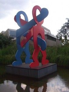


After delving into Pop Culture and New York Art Scene of the 1980s (Keith Haring had been friends with Andy Warhol), I went back to take a closer look at Paul Klee.
 I selected a few works which I found particularly interesting. Three more which take up this motif of black signs on a coloured backgrounds, all from his late years:
left: Nach der Überschwemmung (1936)
below left: Forest Witches (1938)
below right: Heroic Roses (1938)


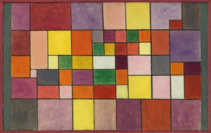
I also liked his colour studies with rectangles. They are said to take up ideas from musical compositions as Klee had also learned to play the violin. What struck me was again the warmth and softness of his colour choices.
left: Red-green and violet-yellow rhythms (1920)
right: Flora on sand (1927)

Piet Mondrian (Dutch, 1872-1944), a contemporary of Paul Klee came to my mind, and I thought Klee and Mondrian must have had very different personalities, in view of the direction that Mondrian’s abstractions had taken him. When I first researched Mondrian, I knew only the purely geometrical works in primary colours. It was only then I discovered that early Mondrian was a very skilled figurative painter who slowly progressed towards increasingly technically precise abstract works.
Rhododendrons (1910)
Composition in Blue, Grey and Pink (1913)
Composition in Red, Blue and Yellow (1930)


Impact on coursework
I started reading the introduction to Part 5 of the course only after having seen the Paul Klee painting. It struck me immediately that Klee’s painting would make an interesting starting point for a combination mono and linoprint. I envision a monoprint background in those muted red-orange-brown-violet tones and a line-based linocut overprinting. Of course I would not want to simply copy an existing artwork, but as a starting point, I really liked the idea. I will see whether I can take this further.
A first step was that I juxtaposed two images in my sketchbook, Klee’s 1940 painting and the photo of Keith Haring painting the floor of a huge space while walking backwards. I filled the remaining white paper of the double page by drawing black signs with oil pastels, then colouring in with watercolours in red, orange, yellow, green and blue tones. I quite like the result. It might be the first painting that actually has a message. It visualizes the closeness I perceive in the visual language of those two artists and also conveys a sense of “endless signmaking” as a basic principle in art.

References
Keith Haring
Brooklyn Museum exhibition (Spring 2012): http://www.brooklynmuseum.org/exhibitions/keith_haring/ (accessed 28 Feb 2015)
Wikipedia Article, overview on life and influences http://en.wikipedia.org/wiki/Keith_Haring (accessed 28 Feb 2015)
Keith Haring Foundation website http://www.haring.com in particular paintings overview by year http://www.haring.com/!/genre/painting and biographical info http://www.haring.com/!/selected_writing/keith-haring-art-and-commerce#.VPH9ieGOfz8 (accessed 28 Feb 2015)
Keith Haring Documentary video https://www.youtube.com/watch?v=GPlzHR_WyVA (accessed 28 Feb 2015)
Paul Klee
Tate modern documentary https://www.youtube.com/watch?v=kLbPTI6bfC4 (accessed 28 Feb 2015)
Wikipedia article http://en.wikipedia.org/wiki/Paul_Klee (accessed 28 Feb 2015)
Piet Mondrian
Website with list of complete paintings http://www.piet-mondrian.org (accessed 28 Feb 2015)