I started this project with some sketchbook work, related to my research on Paul Klee and Keith Haring, but also just “playing around” with things and ideas that popped up. I became attached to the visuals of the shadows of a staircase, and chose this subject for my combination mono and linoprint. In the sketchbook, I tried out slightly different perspectives and colour schemes for this subject, and then focused on the central idea of “Stairway to Heaven” (the title of a song by the Led Zeppelin rock band). This guided my choice of colours for the monoprint with varying shades of blue and a hint of red in the second set of prints, which were supposed to represent the idea of a skyscape. I wanted the stairs to kind of float in the air, taking up the effect I found in one of the watercolour sketches.
Collecting ideas and materials in the sketchbook
Some experiments with inking
A visual relationship between Paul Klee and Keith Haring
Two lions


The staircase, initial sketches
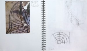

other ideas popping up


Colour schemes and experimenting with lines


A step towards abstraction

Preparing the desing for the linoprint
– Sketch in the size of the monoprint
– Proof of the linoplate: Back-rubbing with a graphite stick on thin paper
– The transparent used for image transfer onto the lino, after corrections


Completing the combination mono and linoprints
The first set of prints: Single colour blue background, printed on dry medium-weight Strathmore printmaking paper (smooth surface). The monoprint plate was inked with a self-made dabber.
1) The lino had moved on the paper, resulting in a blurred print
2) Better impression with less blur
3) “Happy accident” from some paper tissues which I used to texture the surface of the monoprinting plate. I left the tissue on the inked plate for printing where they worked as a mask. In the print, the white areas add contrast and interest.
4) This monoprint has the textured surface but is a little faint, so I think the overall impression is less convincing. That said, it’s still a nice, airy print.
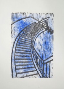


The second set of prints: Adding a hint of red to the monoprint which mixes into violet tones on the plate. These prints were made on dry Canson Edition 250gsm paper. It has a fairly rough surface. I tend to find the third one the most interesting visually because the colours are most intense here. But the airiness I aimed for comes across better in the first, lightly coloured print.


The prints were placed asymmetrically on the paper because I intended to adjust the margins later on, so they would be roughly equal on all 4 sides.
Concluding reflections
There were some considerations about this series of prints with respect to future work.
My choice of subject was something I had difficulties with. On the one hand, I was attracted by the visual effect of the shades, on the other hand I felt there was no personal involvement with the subject. There’s some symbolic effect though, like tapping on my aspirations and unsaid desires for future life, but it’s a bit sterile. Maybe in the future I’d rather choose a subject which feels “warmer”, like the two lions whose picture I transferred into the sketchbook. I might also have taken up the guitar subject. But I think it was good that I followed my inclination towards graphics for now because it made me discover that I might get more inspiration when following up more personal topics.
Technically, I think there is room for improvement with respect to the relationship of the techniques I combined. The irregular, cloudy monoprint works well in principle but it might have worked better if I had inked the plate in portrait orientation rather than landscape orientation. As it is, the cloudy patterns run vertically due to how I inked the plate. Had I inked in portrait orientation, the pattern would have run horizontally, line with the viewer’s perspective.
With a different subject, I’d have said that the monoprint background should have taken up the shapes of the linoprints, for example a different colour for the stairs than for the background. This might be an alternative approach to the subject, departing from my idea of that staircase floating above the sky.
Overall I must admit that I felt a little stuck with my subject. I worked out my idea for this print and think that’s ok as it was. But the subject did not inspire me to go beyond the initial idea. It might be important for the future to look out for subjects I can relate to in more depth.