For the reduction linoprint, I chose a subject from my visit to Norwalk, Conneticut. I had stayed there until evening and had made photos after dark. A photo I particularly liked was that of the local library. It was a nicely lit scene and I found it warm and inviting. I corrected the falling vertical lines of the photo before working out the design for my print.
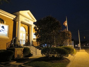
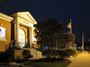
Preparations
First drawing in the size of my linoplate and coloured version using markers

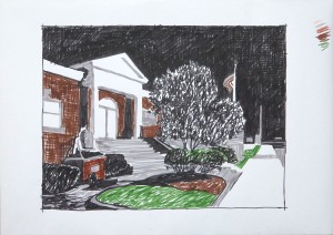
Transfer to transparent paper to reverse the image for cutting the lino

Printing three colours plus black
First colour: Dark yellow
Second colour: Warm brown (burnt sienna)
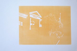

Third colour: Olive green
There was a problem with the area where the building and the tree were overlapping. I had cut away too much from the tree, so the contour of building behind the tree was too strong and edgy. I corrected the plate by filling the holes with an improvised modeling paste made of heavy body acrylics and wheat flour, and checked the result by proofing with a graphite rubbing from the plate. Luckily this worked ok and I continued printing. In the corrected version, the tree shape is restored to cover more of the background building.
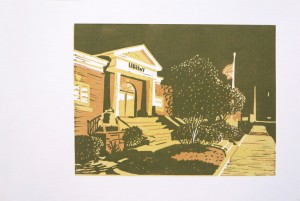

Final colour: Black
Before printing the final layer, I proofed my cutting several times with a graphite rubbing off the plate. I checked the grassy area in the foreground, then the bushes, and then made a final proof of the completed cutting. I was quite glad that I had learnt this method because it considerably reduced the uncertainty how the cutting would look when printed.


But when printing, I ran into misalignment problems. It may not look so problematic in the thumbnail image, but it was very visible in the actual prints. The first problem was the “Library” sign on the building which looked blurred with even the slightest misalignment. I cut it away since I found the colour was already dark enough even without the black layer.
 The next problem was due to me changing the printing colour to a mix of more blue with the black. I had washed the first ink layer off the plate but when I continued printing, the lino was still a little damp. It was slightly warped but rigid, which corrupted my registration method. The result were 4 misaligned and blurred prints, before the plate was finally dry and plain again. The remaining six prints were good.
I had printed with the intention of cutting the paper to size afterwards. This is one of the well aligned prints on the final paper size.

Reflections on the process
Finding a subject had been quite difficult, because almost no subject idea I had conformed to the course brief of simplified shapes to be printed in three colours and a black outline layer. I decided that without having any experience with the method, I wasn’t able to know in advance what would work, and so it was better to just try something out than endlessly agonize over finding the perfect subject. Nevertheless while preparing my design, I was full of doubt whether it would work. But after printing the first and second colour, I became more confident about it and am actually quite happy with the final result.
I learned quite a bit:
- Whithin limits, it is possible to correct a plate. Searching Google, I found two basic approaches: One is to cut away the faulty area and replace it with an exact fitting piece of new lino, then repeat the cut. The lino can be mounted on a piece of wood as a support. The second approach is to use acrylic modeling paste. I guess the acrylic works best because the surface properties are more similar to lino than for example wood filler or plaster. Acrylic is smooth to the touch and slightly elastic. I had no ready made paste so improvised one by mixing wheat flour into acrylic paint, which did the job sufficiently well.
- Never print with a damp linoplate, it will ruin the registration… be patient and wait an hour till it’s dry and flat.
- Ten prints is not much when doing a reduction print because it’s almost inevitable that some prints go wrong. I wish I’d have made some more, maybe in the range of 20, which would have hopefully resulted in about 10 – 12 good prints.
Overall I’m quite satisfied with my final prints. The only thing I’m not totally happy with is the actual artistic process, because I cannot see “development of an idea” from selection of subject to final outcome. It may have to do with using a photo, which is always slightly static. It may also be a result of my conscious decision to stop worrying about the subject and gain some experience with the technique. And then, I really liked my design and did not see anything that I should have changed.
So the project was good in terms of getting hands-on technical experience, but the artistic component is less obvious. It may be hidden in what I learnt from the previous multicolour linoprint and improved in this one: While translating from the photo to the design, I made a conscious effort to simplify and find shapes I’d be able to cut. It was also in considerable reflection while cutting – variety in applying the tools, for example using straight and edgy cuts for the architectural elements versus rugged cutting in the organic shapes.
So the creative aspect was not completed once I had made the reversed drawing, but it continued over the entire printing process, including the corrections until the final print.