Task 1 (Project 13): Combination mono and linoprints
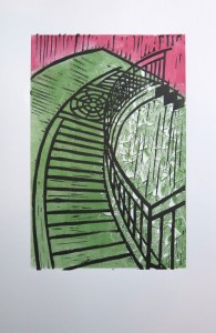
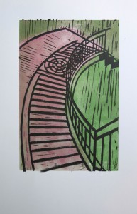
For this project, I chose a view downwards a stairway located close to the UN building in Midtown Manhattan. I was fascinated by the shadow pattern of the handrail on the stone pavement, and by the curvy outline of the stairway. The result was a line-dominated linoprint focusing on that visual pattern and excluding the rest of the setting. I had the association of a “Stairway to heaven”, the Led Zeppeling rock ballad from the 1970s, and this inspired the first set of prints in blue tones where I tried to create an ethereal background with the monoprint layer, so the stairway would look like floating freely in the atmosphere.
Preparing for the assignment though, I realized that I had achieved not enough variation in approach and outcome in that first set. Therefore I created a second set of prints taking up colour ideas I had previously tried out in the sketchbook, and also experimented with integrating a different subject, an imagined Manhattan cityscape, into the composition.
The second print takes up the “Spring time” topic by adding some greenery with yellow and red colour spots for flowers, adding a positive feeling and some liveliness to the somewhat austere linocut design. The third print reflects my ongoing preoccupation with living in the huge city. It’s kind of a hate-love and I’m not sure whether I’m truly happy with the choices I’ve made and the path I took, which I see symbolized in this print, as if I posed the question to myself.
The first set of prints was made on heavyweight printmaking paper, the second on Bristol vellum with a smooth surface. The margins of the prints will be adjusted for assessment presentation.
Blog post, first set: http://ocaprintmaking1.blueconcretemoon.com/?p=1685
Blog post, second set: http://ocaprintmaking1.blueconcretemoon.com/?p=2102


Task 2 (Project 14): Combination printmaking with chine collé
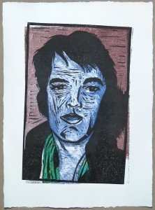
The topic of this project was inspired by my accidental re-discovery of Elvis Presley as a singer and entertainer. Over the course of a few weeks I became a real fan and “Elvis Expert”, studying his musical career and personal life, including the sad ending of the story. Of course I felt a bit silly for the devotion, but couldn’t help being swept away by the quality of his singing. Choosing to make an Elvis portrait as a printmaking project thus was quite a personal thing. But in the research point on chine collé I had come across Andy Warhol’s celebrity screenprints, which sort of legitimized the topic choice, besides providing visual input.
One of the problems I encountered was that apparently the only pictures of Elvis in the public domain were taken at the occasion of his visit to U.S. President Nixon in 1971. None of these photos I liked, so instead, I chose a very attractive picture posted anonymously on the www as my image source. I hoped that using it for strictly educational purposes only would be acceptable. It taught me that digital rights issues can become complex when an artist is not able to use his or her own photos.
The project developed from more realistic colour schemes towards “odd choices” which worked surprisingly well conveying my impression of him as a “broken hero” and the discrepancy between the public and the private person of Elvis Presley. In the later prints, I began texturing and wiping into the inked monoprint plate to give depth to the facial area. I used chine collé only as an accent for his scarf.
With hindsight, I think that I was somewhat intimidated by the devotion I felt, and therefore reluctant to be more experimental with my subject. It was as if I permitted myself only to do “a beautiful portrait” and treat the image with respect. I think the subsequent experimentation in the sketchbook with collage and watercolour underpaintings shows that I let off steam at least a bit afterwards.
I chose a different set of prints for assignment 5 than what I thought were the best prints when I completed the series. I think the four I present here better reflect the variation in colour choices. In particular, I think the slightly misaligned second print was an important one because it made me see that I could convey my perception of Elvis’ personality by making unrealistic colour choices.
To summarize, I’m pleased with the actual outcome of the project, but I’m also aware that assessors might have expected more experimentation and greater variety in the use of chine collé. I guess it’s up to me to develop this further in future work with a variety of different subjects.
Blog post, Project 14: http://ocaprintmaking1.blueconcretemoon.com/?p=1720Chine collé research point: http://ocaprintmaking1.blueconcretemoon.com/?p=1707



Task 3 (Project 15): Four combination and experimental prints
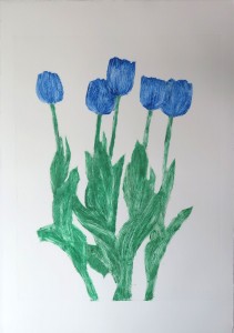
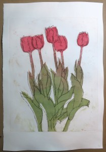
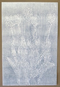
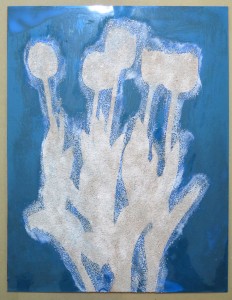
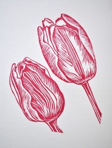
In this project, I chose a simple flower still life with tulips as my subject. I loved the elegant shapes and the colours of my model, and this was what I focused on during project work. I started with a broad approach for the experimental phase, with 3 different collagraph plates plus a cardboard plate for textures and a hot glue relief plate as an alternative to backdrawing. I combined these with various monotype techniques, including texturing, wiping, painting and rejection effects from different ink types. I also worked with masks and assessed the effects of backdrawing. During that phase, I made prints on almost all types of paper I had in stock: Smooth drawing paper, thin Thai Kozo, plus various medium-weight printmaking colours in different hues of white. I tried out hand burnishing versus printing with the press as well.
In the end, I settled on the one technique I liked best: Painted monotype combined with a collagraph plate inked intaglio style, printed with the press in two consecutive runs on damp Canson Edition paper. Print size is 57 x 40 cm, with a printed area of 45 x 35 cm.
The colour choices represent warm vs cool colours, with two coloured backgrounds inspired by earlier prints I particularly liked (a transparent black and a yellow one). The selection of prints for the assignment was informed by my intention to produce a coherent series of prints, not just a collection of the most interesting prints that had come out of the experimentation phase. Therefore, the selected prints are the outcome of an analysis and consolidation phase where I tried to identify the most interesting elements of the experimental prints and combine them selectively for the final series.
I do see the potential for further development of the idea, for example by combining different views of the tulips, not just different colour schemes. If I had more time, I’d work out more designs and create the collagraph plates for more variation. I’m a bit sad that chine collé did not make its way into the final prints, but I tried it and found it did not work well with the subtle collagraph inking, because the paper soaked up the ink to invisibility. I could have tried different papers, but I found that I was able to achieve my desired colour effects with the monoprints and did not want to include the technique just for the sake of it. Likewise, I did not find a reason to add a chine collé element elsewhere on the print, and so did not do it. Now I realize that I might have tried using it for structuring the background.
I’ll take this as learning point for future printmaking: Rarely is the potential of a subject developed in a single printmaking session. I don’t seem to be the person who uses the sketchbook very much for ideas, I’m more comfortable doing the experiments directly in the form of prints, which makes me see what I get from different approaches and techniques. So my method might be to plan for several consecutive sessons with reflective pauses in between.
The printmaking process in project 15 is documented in 4 separate blog posts, plus a fifth for the supportive statement. I’m using the blog extensively because it provides a valuable resource which enables me to get back later to the technical steps I made and how I achieved certain effects. In its detail, it is not directed at assessors who merely have an hour to assess student work produced over the course of a year or longer.
I’m not quite sure how to resolve the discrepancy. It might help to include summary articles that are short on process details and emphasize reflection on my journey. I guess this is what my tutor suggests as well, by pointing out in his feedback that he doesn’t see what I like or where I’m going. Maybe the reflective parts are underdeveloped because I’m busy learning techniques.
Sketchbook work and printing plates: http://ocaprintmaking1.blueconcretemoon.com/?p=1869
Monochrome printing experiments: http://ocaprintmaking1.blueconcretemoon.com/?p=1902
Combination and multicolour printing: http://ocaprintmaking1.blueconcretemoon.com/?p=1936
The final series: http://ocaprintmaking1.blueconcretemoon.com/?p=1970
Supporting statement: http://ocaprintmaking1.blueconcretemoon.com/?p=1987


Research and reflection
As in the other course parts, I alternated research with project work, and wrote up in chronological order. The respective blog posts can be accessed by clicking on the ‘research and reflection’ side menu, or via the drop down menu in the context of each project. For ease of reference, I’m including links here as well:
Paul Klee, Keith Haring, Piet Mondrian: http://ocaprintmaking1.blueconcretemoon.com/?p=1611
Research point: Chine collé examples http://ocaprintmaking1.blueconcretemoon.com/?p=1707
Sasha Barker http://ocaprintmaking1.blueconcretemoon.com/?p=1778
Juan Sebastián Carnero http://ocaprintmaking1.blueconcretemoon.com/?p=1801
Reviewing my blog and personal journey http://ocaprintmaking1.blueconcretemoon.com/?p=1811
Linocuts by Jacques Moiroud http://ocaprintmaking1.blueconcretemoon.com/?p=1819
Inspirations: Tulips in print http://ocaprintmaking1.blueconcretemoon.com/?p=1842
During part 5 I also got back to collagraph and I guess that research encouraged me to make another attempt in the final project. I categorized the research as follow-up to part 4, but now realize its effect on part 5.
Collagraph printmakers: http://ocaprintmaking1.blueconcretemoon.com/?p=1637
I now see that my research was based on what I come across in social media, in particular the facebook groups and sites I’m associated with. I followed up images I found particularly interesting. On the one hand, I appreciate how this broadens my horizon and gives me pointers to contemporary printmakers and artists I wouldn’t have known otherwise. On the other hand, I think I should also learn to do more self-directed research, for example artists employing particular techniques or art movements reflected in printmaking. That’s an area I wish to develop in the future.
Final check-up against the assessment criteria
Demonstration of Technical and Visual Skills – materials, techniques, observational skills,
visual awareness, design and compositional skills
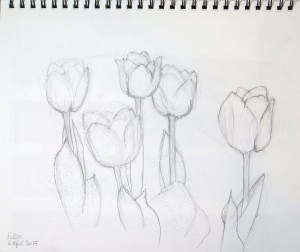
I think technically, I made good progress in part 5. I worked with quite an array of techniques and tried to analyse what worked and what not, for example when using the press vs printing by hand. Unfortunately I didn’t find the time to do course-independent sketchbook work, but I think the tulip drawings in Project 15 are quite good. I also think that I began building up technical expertise and made use of experiences to produce quality outcomes.
Quality of Outcome – content, application of knowledge, presentation of work in a coherent
manner, discernment, conceptualisation of thoughts, communication of ideas
The blog seems to be my primary means for communicating ideas, thoughts and the prints themselves, and I think it’s quite coherent as a whole. I do see the problem that the blog contains too much information to be digested in the time available for tutors and assessors, and am trying to alleviate this by providing pointers and summaries of relevant content.
The blog served to partially replace sending in physical work, and I don’t maintain a physical learning log, so I found it important to present a complete picture of my progress through the course to permit adequate feedback. Maybe tutors and assessors would have needed to see less, but then the blog wouldn’t represent the actual journey, including wrong avenues and items that appear irrelevant at first but later might turn out to be pivotal. As it is, the blog represents my personal dictionary of printmaking techniques, applications and errors.
Application of knowledge in terms of setting printmaking techniques into practice works well, I think. I can be quite stubborn and keep trying to make things work.
Demonstration of Creativity – imagination, experimentation, invention, development of a
personal voice
The creative part seems to be the hardest for me. As much as I’m at ease with trying out technical variations, I think I could have done a lot more experimentation. I guess it has to do with my tight schedule, which makes me focus on producing acceptable outcomes and doesn’t leave enough time to play around and try new and unconventional things. I do see some progress with respect to personal voice in the way I personally related to the chosen printmaking topics. But to be honest, I don’t feel as an artist yet. I produced a lot of prints, but the creative, experimental aspects are still a bit underdeveloped.
Context – reflection, research, critical thinking (learning log)
Hopefully my work for part 5 demonstrate that I took tutor feedback on board. I included a good deal of notes on my inspirations and tried to incorporate more reflective elements everywhere in the writeup. What still needs improvement is drawing connections between artists’ works and my own stuff. I guess it has to do with my work ethic of ‘no cheating’, always having been proud to do my homework without copying from my classmates… Making prints “in the style of …” has that negative connotation of not being original and stealing from others, which I find difficult to overcome. As much as I like looking at other’s works, and am ready to appropriate the technical aspects, I don’t want to copy any other artist’s style. I’ve not yet found a way to resolve the conflict between what the course seems to encourage and what I personally strive for. Put briefly, “it’s against my religion”, and I’m not sure what to do about it, so for now I try to take it easy and see how things develop without forcing me into any particular direction.