The central idea for this project was to make a portrait of Elvis Presley. I was inspired by Andy Warhol’s celebrity prints, in particular the portraits of Mick Jagger which I included in the research point (see http://ocaprintmaking1.blueconcretemoon.com/?p=1707)
Preparatory work
 I started from a photo and made some sketches to study the image as a source for further work.
The second charcoal sketch captured the facial expression better than the first. I wanted to have both line and shape in my print so continued with a line drawing on which I added a wash on top (sketch 3). This was followed by a stylized ink painting where I tried to emphasize simple shapes. The scarf was drawn in with oil pastels in blue, violet and white for a soft colour accent.


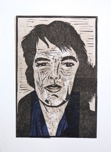
Finally I made a pencil sketch on a loose sheet of drawing paper. From this sketch I developed the linocut by copying it onto transparent paper, then transferring a line drawing from the transparent onto the lino plate with carbon paper. I focused on contours and indicated those areas which were supposed to print with cross-hatching.
I later realized that this was a design “on the fly” which I cannot fully document. Maybe I should have made a photograph of the linoplate before cutting to document the transfer drawing. But then again, the linoplate itself documents what I transferred from the sketch. I proofed the plate with a graphite rubbing and found it worked well, so went ahead.


Combination prints with Chine collé
Set 1
My idea was to use the Chine Collé to introduce a “glitter aspect” to the portrait, symbolizing the show business going on. I selected a range of thin, fiber-textured, coloured Mulberry paper scraps. Some of the scraps had tiny shimmer bits or fibers in them and I expected this to work nicely for the scarf area around the neck.
The first step were the monoprints. I used a medium brown tone and applied it with a dabber to the perspex plate, using the transfer image below. I used tissue paper and cotton buds to wipe away ink in a subtractive method. The first two prints were made in reverse, the next to in correct orientation. The monoprints looked very weak. I was disappointed and did not expect anything interesting would come out of this.
This changed when I added the linoprint with Chine Collé on top. I was surprised how well the prints turned out. The reverse-side error didn’t didn’t matter that much, in contrary it looked quite interesting.
Initially I used the Mulberry paper as large pieces, as in the first print (blue chine collé), but then gradually refined the shape over subsequent prints to mach the scarf area better. I also switched to lighter colours for the scarf to provide more contrast.
These four were like initial experiments with the technique and the idea. They were made on dry, medium weigh printmaking paper with a smooth surface, using Akua inks.


Set 2
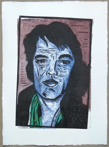
The next set was printed on Canson Edition paper (250 gsm), which has a rough surface. The first monoprint print on dry paper came out too pale, so I made subsequent prints on damp paper. I used the same brown tone for the face and added a blue tone for the background, all applied with a dabber. The fourth print reversed the colours as an experiment.
I experimented with the wiping technique, trying to create some three dimensionality. The monoprints alone looked like death masks, it was scary. But when the linoprint layer and the Chine collé came on top, I was quite happy with the results.
I think there’s a step forward in visual effect compared to the first set, the colours are used more effectively. The fourth print is a special case. Initially I was disappointed because the linoplate had accidentally moved so it wasn’t aligned with the monoprint. But a day later, I found this print stood out, because it conveyed something I felt about Elvis’ personality. I termed it ‘broken hero’, because I saw a discrepancy between the public image of successful show star and the real man who had so many doubts about himself and became dependent on prescription drugs. The misalignment as well as the reversed colours both contribute to that message.
At the time I made the set I wasn’t so clear about it and therefore decided to make another set of prints aiming to correct what I perceived as a misalignment error.


Preparing Set 3
I had a gut feeling that I was too focused on realistic depiction in my series, and wanted to get back to what I had liked about the Warhol prints of Mick Jagger: The combination of linear elements, shapes and colour in a loose fashion. I perceived it as a kind of floating layer that transcended the photo source. I guess I don’t have the words to describe my perception…
In the sketchbook I tried an abstract composition of line, pattern, shape and colour, using bits of the Mulberry paper as a collage. After discussing my “abstract collagraph” with my tutor during the hangout for feedback on Assignment 4, I’m now a bit clearer with the term. I termed the collagraph “abstract”, meaning only that I had no figurative idea but was experimenting with patterns in a more or less random way. So in that sense it was abstract, but it wasn’t a composition, at least there was no conscious effort to create visual tension of some sort.
By contrast, the abstract image I made in the sketchbook started out with some random lines, but then I followed visual clues from the image to create patterns I found interesting, something like visual rhythms. So maybe this one could be called an abstract composition because it’s not figurative and there was some “gut intentionality” with the patterns. Hopefully this doesn’t sound awfully naive to those who studied abstract art more thoroughly.
The second page depicts two photos of linocuts which had interesting black and white patterns. It’s not related to this project but I found it relevant for development of my linocut technique.

The monoprints
I was so intrigued by the effect of the linocut on top of the monoprint that I made pictures of the monoprints before overprinting them to document how strange they looked.
I wanted use colour a bit more freely and therefore applied it in broader areas, less confined to the demarcation of face vs background. I used the paper of the first set and printed dry. I used blue Akua intaglio and yellow Akua Liquid Pigment for the first print, but found the yellow much too pale. I switched to magenta for the second, but it was still too pale. I then mixed the liquid pigment with transparent base and finally achieved the colour intensity I was aiming at. I applied the ink layers with two rollers and tried to create a transition effect between the colours which worked less well than I had hoped. But it did provide a darker tone to the sides of the face which I thought would support a 3D effect.
I used cotton buds for a subtractive technique after inking the plates and worked out a face mask using the transfer sketch below the perspex plate. The idea was to provide the shades for the face to make it a bit sculptural. In prints 3 and 4 I used the backside tip of a brush for a hatching effect aiming to create different tonal values.
Another improvement was to extend the background colour over the area below the shadow to the right side of the head, which I previously had forgotten, so the earlier prints have a white spot there (with the exception of the ‘broken hero’ print).


Set 3
The linoprints with Chine collé on top again transformed the prints considerably. I think the Chine collé looks best in print 4, but the overall effect of print 3 is a bit more interesting because of the white contrast. It is a bit more like a mask, whereas print 4 looks more natural, despite the strange blue colour for the face. Maybe ‘blue hero’ would be the appropriate title for print 4, and ‘hero mask’ for print 3.


More experimentation in the sketchbook
I was quite happy with my series of prints, but had paper scraps and ink leftovers so just went ahead and played in the sketchbook. The prints were made in a loose sequence and different techniques:
Page 2) Overprinting a red and blue background made with the inked dabber
Page 4) Overprinting an arbitrary collage patterns from red and green paper scraps
Page 5) Overprinting red watercolour stripes. The print quality isn’t so good, but I found an interesting idea here: Elvis behind bars (captured to the confines of his image)
Page 6) Printing over an irregular watercolour pattern in red and blue, similar to that of page 3
Page 8) Printing over a pattern of geometric and irregular shapes in turquoise blue


I’m not sure what might develop from these experiments, but doing them was quite important for me because I was allowing myself to play around independently from the course brief or a straightforward idea for the result. I realized this would be the way to go for developing an initial idea forward, before settling on the actual concept for a print. I could now take this further into another set of prints, maybe applying Chine collé more liberally and using the monoprint layer similarly to watercolour effects.
The problem is that I’m on a tight schedule, so I’d better leave it at that for now, but I’m very happy about this little progression. I know that I tend to be very focused on executing my initial ideas, mostly because I’m so curious about the outcome, and by doing this I miss the part of developing an initial idea further. Maybe my way to proceed will be to let myself have a go at the initial idea, and then afterwards do the exploration and experimentation “what else” I could do with the materials. And then develop the next print series from that. This might work in the sense of a developmental pyramid, an idea which I think my tutor wanted to get across in his feedback.