Linocuts by Jacques Moiroud

Jacques Moiroud is a regular contributor to the Linocut Friends Facebook group. I’ve seen several works over the recent months and admired them for their textural variety. He posted another one today and I decided to study his work a little more.

What intrigued me was how he managed to create tonal effects through the density of cuts into the linoleum. I wondered whether he used gray ink for these effect, but in a discussion he said it was all based on cutting. Most of the linocuts I selected for a closer look are very large, 24 x 36 inches (about 60 x 90 cm), and I guess the grayscale effect is partly due to scaled down images on the computer screen. It’s fascinating to look at the pictures enlarged to study the fine cutting.

I’m not sure whether my final project leaves enough room to explore further what I like in these prints. What I’d like to do is to make an experimental series where I use the equivalent of hatching and cross-hatching or other cutting techniques to achieve tonal values in the linoprints. I do have some larger linoplates, I think they are A3 and even an A2 size. I’ve never printed that large and they might not fit into my press so I’d have to print from hand pressure.

The second thing I’d like to explore with linocuts (independent of the tonal effects in Jacques Moirouds prints) is the interplay of white lines on black ground versus black lines on white ground. I haven’t yet discovered this play of light and shade in a visual scene, but will look out for it.

I’m including a little gallery of Jacques Moirouds linocuts for reference and study. Actually I rather have images in the blog than cutting them out and sticking them into the sketchbook. I can refer to them using the blog and increase their size on the computer screen to study the details, which for me works much better than a printout that gets lost on some page inside the skechbook.

The linocuts are mostly figure studies featuring intricate details. I don’t think I could commit myself to this type of fine detail on the large scale, and I’m not so much into figure as a subject, but I admire the approach and think I might learn from this for other subjects. I think my recent linocuts focused on shape and line, not on texture, and adding textural qualities might enrich them considerably.

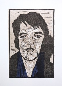
Two of the smaller portrait linocuts, size 10 x 7 inches (25 x 17.5 cm): Jean Paul Sartre (2005)
and David Lynch (2005)

I think these were made from photos (since it’s highly unlikely they sat for him), but for the other prints there were hints that he had sitters and sketched from life for the linocuts.

Jacques Moiroud 2005 Jean Paul Sartre 7x10in     Jacques Moiroud 2005 David Lynch 7x10in

Selected figures, 2005 – recent – large size originals (24 x 36 inches / 60 x 90 cm)

The distance between you and me / detail (2011)
Jacques Moiroud XXXX The distance between you and me      Jacques Moiroud 2011 The distance between you and me - detail

The detail shows how the tonal values were achieved through cutting fine lines rather than carving away large areas. This is a much more delicate approach compared to what I did in my Elvis linocut. I think both styles work, I’m just getting aware of the different visual effects created through the cutting technique.

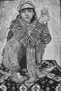
Hiromi (undated)
Timbuktu (2009)

Jacques Moiroud 2015 Hiromi 24x36in      Jacques Moiroud 2009 Timbuktu 24x36

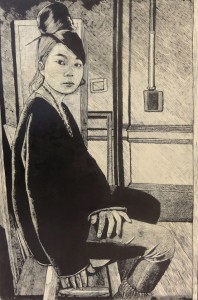
I’d guess the Hiromi print was earlier, because it is more graphic in approach, similar to the two small portraits from 2005. Interesting aspects: The irregular shape of the linoplate which follows the outline of the staircase, and in the middle follows the girl’s arm and leg. I also like the contrasting patterns of the striped shirt against the wood grain of the stairs. Very nice the light shadows on the lower feet and the dark shadows on the ankles towards the jeans.

By contrast, the right print evokes almost grayscales from the way the lino is cut. I’m really fascinated by the various textural effects in the girl and the fabrics.

Upper West Side
Carl, the stamp collector (2005)

Jacques Moiroud 2005 The Upper West Side      Jacques Moiroud XXXX Carl the stamp collector

Again, fascinating variety of tonal values, image details and great composition.

Alcools
Not from Texas

Jacques Moiroud 2010 Alcools 24x36 in      Jacques Moiroud XXXX Not from Texas 24x54in

Avenit
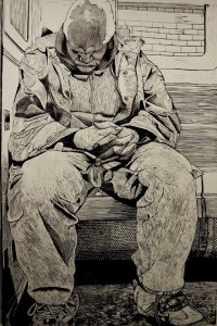
Slow Commuter

Jacques Moiroud XXXX Avenit 24x48 in      Jacques Moiroud 2015 Slow Commuter 24x36in

‘Avenit’ (left) is a print I included because I found it less successful and wanted to analyse why. I guess it is because the textures and tonal values in the middle are too similar, and the image lacks contrast. By contrast, the ‘Slow Commuter’ (right) works better. The textures are not that varied as well, but they are set off better through the inclusion of stronger contrasts.

Wallflower
A girl and a bird

Jacques Moiroud 2010 Wallflower 24x36in      Jacques Moiroud 2008 A girl and a bird 24x36in

I love these two for the expressiveness of the women depicted. Technical aspects are one thing, but these two convey so much about their lifestyle and personality. The way they sit, the way they look at the viewer, their clothes. The print to the right works technically better because it’s clearer and has more contrast, but they’re both excellent with respect to depicting personalities.

I’m certainly not at a point where I could hope to produce similar quality prints, but I think I’m getting an idea what I find interesting when depicting people: Capturing personality. Indeed while I was working on the series of Elvis prints in the Chine Collé project I found that despite technical imperfections they seemed to convey aspects of Elvis’ personality as I perceived it: The idea of a ‘broken hero’ that came best forward in print 4 of the second set, where the linoplate had moved and the print was misaligned as a result. I find the final print quite successful in capturing the glamorous, glittery aspects of his style, combined with some inner turmoil and exhaustion.

References

Jacques Moiroud artist website http://www.jacmo.com/html

Reviewing my blog and personal journey

I’m trying to get to grips with tutor feedback from the printmaking course as well as recent assessment feedback on the watercolour course. I understood that my blogs are seen as too descriptive. My printmaking tutor pointed out that I should be including more information on my personal journey as an artist. I guess I put too much focus on describing the technical process, at the expense of writing about inspirations and personal motivations.

Therefore I’m reviewing what my approach in the blogs was so far. For one, I think it’s valuable  to simply document the technical side because this represents knowledge I gained through the coursework. I can get back later to it and check how I achieved certain effects, and see what worked and what didn’t.

Then there’s the aspect of enabling my tutor to see what I’m doing beyond the assignment outcomes and selected preparatory work. The blog contains the complete coursework and this means it also includes the “uninteresting” stuff. It might be a problem that assessors don’t have the time to read it all and therefore simply don’t find the bits of reflection that are included in the text.

Beyond this, I’m somewhat at a loss for now what I’m actually expected to do or write. But I do perceive “lack of motivation” in the sense that I’m eager to do some printmaking, but I’m often having trouble finding a subject. Or maybe rather, trouble to develop the initial idea further into something more exciting.

I was happy about the recent development in sketchbook work, where I experienced a sense of departure and liberating myself from strictly focusing on sketches that are relevant for  coursework. I also think that the experimentation I did after completing the Elvis prints in project 13 was a huge step forward, because I just played around without limiting myself to one particular approach. This might be a way to approach the problem: If I can’t liberate myself to experiment with an idea before I’ve actually done it as aprint, then it might work to do the playing afterwards. I might then make a second set of experimental prints, which take the initial idea further into new territory.

There’s a discrepancy between what I perceive as steps forward and the feedback I receive… somehow I feel like an infant proud to have made its first consious “La La La” utterances after the stage of either sleeping or crying. Now being criticized that I still can’t pronounce intelligible speech… it will come, but it takes time and everybody develops at his or her personal tempo.

I guess I will just have to endure the comments, try to respond appropriately and continue to strive for development of what I’ve begun.

Inspiration from Juan Sebastián Carnero

I came across this young Spanish artist on the Linocut friends facebook group, where he posted images of a recent linocut he made. The linocut explores a graphical subject with a 4-colour C-M-Y-K transparent overprinting technique. I was fascinated by the colour effects and thought I might build on this in the next project.

trabajo final

The artist posted images from the stages over the development as well as detail sections of the print, which I find helpful in understanding the build-up of colours.

estampas cmy, cy

cyan+magenta+amarillo     cyan+magenta+amarillo detail

cyan+magenta+amarillo+negro detail     cyan+magenta+amarillo+negro

The 4 linocut blocks:

matrices

It was also very interesting to see where the ideas for the subject came from. In a subsequent discussion, the artist posted photos that documented the sources of his memories on which he later built the composition.

parque de Coimbra   formas

Seeing this, I thought I might take a similar approach in the next project, using the suicide linocut technique and multiple colours. It is also an example of how I might trace back my own sources of inspiration that can develop into subjects for prints.

The pictures made me aware that I might have neglected developing ideas for prints for a while. I’m actually a “hobby photographer” and often go through phases of “increased visual awareness”, when I’m out with a camera. It’s a state of altered perception which makes me focus on visual stimuli. When for example I see a traffic light, I look at it not in terms of the information it conveys about the traffic situation, but in therms of its visuals – the shapes and colours of the object, contrast to background etc. When I’m in this mode I usually take a lot of pictures that might look random to an outsider, but they capture the little visual sets I happened to come across.

Unfortunately nowadays I’m mostly stressed, busy and in a hurry when I go outside – having to go to work or to the supermarket, or I’m going to the dentist, etc, so never seem to be in the mode for visual journeys. Or maybe I manage a trip outside, taking pictures, but then afterwards I don’t find the time to work out what I found and develop it further. But at least for now I realized that there’s something I might get back to.

I’m going to re-read the brief for the next project, but if I remember correctly the task was to combine printmaking techniques. A densely composed, 4-colour linoprint would probably  become overloaded if I just added more techniques for the sake of themselves.

I think I’ll develop more ideas along the way once I’ve started the project, and will see whether it’s going to correspond to the subject idea I’ll be choosing.


Assignment 4: Tutor report

Overall Comments

Physical submission, student lives in USA

Summary of video feedback 30 Mar 2015

  • A submission of work demonstrating good engagement and hard work
  • Stronger on technical side than visual side
  • You have achieved an understanding of collagraph printmaking through your hard-work and tenacity
  • Make clear decisions about colour: descriptive/functional or more for own sake?
  • Your sketchbook is developing, but needs to link to projects tasks
  • Your log is progressing well. Provide reflection your personal journey

Assessment potential

I understand your aim is to go for the Painting Degree and that you plan to submit your work for assessment at the end of this course. From the work you have shown in this assignment, providing you commit yourself to the course, I believe you have the potential to succeed at assessment. In order to meet all the assessment criteria, there are certain areas you will need to focus on, which I will outline in my feedback.  

Feedback on assignment

Demonstration of technical and Visual Skills, Quality of Outcome, Demonstration of Creativity

Project 11. Making a test collage block:

You set yourself up well with Mary Ann Wenniger book and the Romano and Ross print exhibition, plus the artist research.

Your series of six test blocks demonstrate hard work and engagement with the task. A varied, interesting and potentially useful vocabulary of marks has been produced. Print quality is generally good and you have explored working with different papers and with colour. Your commendable persistence with intaglio has produced some interesting results, too.

Project 12. Collatype collage prints:

Group of geese: good composition and interesting and appropriate use of textures, though some readability issues (larger scale helpful?).

I prefer the strong, bold image of the black and white print. The colours of the multi-colour prints don’t contribute much to our understanding nor are they gorgeous in themselves. We discussed approaches to colour.

Your prepared printing plate has the poetic flavour of Pierre Bonnard (1867–1947) or Japanese prints.

You                                                      Bonnard

Pat-+-Bonnard

Abstract collagraph: The composition is rather random, lacking a focal point or structure. You explained why. We discussed the challenges of making abstract images.

As images demonstrating explorations, textural effects and the ability to lift a print, they are more successful.

This print demonstrates colour serving a purpose, bringing focus to the busy all-over activity:

IMG_2178

You talk in your blog about the above being a ‘face’ shape; it would have been good to see some suitable-looking artist reference support this, e.g. Jean Dubuffet (1901-1985):

Dubuffet

Single goose print: Your image transfer technique has been interesting to see, but with your good drawing abilities was it worth the effort?

The prints themselves are interesting in the relief textures produced but greater contrast would have helped readability. The image itself lacks interest (need more going on e.g. river bank or weeds).

Backgrounds need to appear to pass behind the subject, not end short of it

General evidence of hard work, exploration, tenacious problem-solving throughout the assignment submission. Well done.

Sketchbooks

Demonstration of technical and Visual Skills, Demonstration of Creativity

Some lovely things in here, especially the cats – intimate and well executed in a variety of media.

Line drawing of you cats: look at Andy Warhol (1928-1987) ink-line transfers from his days as an illustrator.

Coloured grounds interesting but over-used. Think of them as punctuation to give rhythm.

Need to support the project work much more e.g. drawings of geese would have been relevant. And I’d like to see linkage to artist research and also the pyramid of ideas/development we discussed last time.

Learning Logs or Blogs/Critical essays

Context

Your blog demonstrates your engagement with the assignment tasks and you take its upkeep seriously. Artist references, lots of information about the materials and processes, and well-illustrated.

Still insure of your likes/dislikes/motivations. You may find externalising this in written form helpful.

Suggested reading/viewing

Context

Variation in a sketchbook – big/small/colour/black & white/singles/multiples:
Midda, Sara (1990) Sketchbook from Southern France. London: Sidgwick & Jackson

You seem to like animals. Check out John Skeaping (1901 – 1980).
Skeaping, John (1940) Animal Drawing. London & New York: The Studio Publications.

John-Skeaping

To follow-up on the Warhol lead, you may enjoy:
Kornbluth, Jesse (1988) Pre-Pop Warhol. New York: Panache Press at Random House

Andy-Warhol

Pointers for the next assignment

Part 5. Exploring printmaking and combination print techniques.

Work to your strengths. Select subject matter that is ‘you’. Support activities with research into artists who aid your visual ambitions – these don’t necessarily have to be printmakers. And remember the pyramid notion as you develop your ideas.

On a simple, practical note, ensure your chine collé papers are stuck down properly – loose edges wafting around look awful.

Inspirations: Sasha Barker

 Sasha Barker: View of Mt. Hood (Multiple colour linocut)

Sasha Barker > Linocut Friends 1      Sasha Barker > Linocut Friends 2

– cutting lines and shapes

There are coloured areas where white lines appear, and there are white areas with coloured linear elements. This interplay creates a lot of visual interest. I repeatedly found this pattern in linocuts, only recently in two other postings to a FB group. I’d like to integrate this in my prints as well.

– multiple colour inking

The plate was inked in a gradient from blue over turquise and green into almost black. In his feedback to Ass. 4, my tutor pointed out that I need to improve my use of colour and should be attentive how others employ colours and what function it has in an image. I think here the colour helps creating space, it lifts up the sky from the woods that surround the mountain.

Source: Sasha Barker -> Linocut friends FB group (30 March 2015)


Combination printmaking with Chine Collé

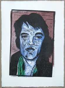
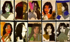
The central idea for this project was to make a portrait of Elvis Presley. I was inspired by Andy Warhol’s celebrity prints, in particular the portraits of Mick Jagger which I included in the research point (see http://ocaprintmaking1.blueconcretemoon.com/?p=1707)

Preparatory work

IMG_2326I started from a photo and made some sketches to study the image as a source for further work.

The second charcoal sketch captured the facial expression better than the first. I wanted to have both line and shape in my print so continued with a line drawing on which I added a wash on top (sketch 3). This was followed by a stylized ink painting where I tried to emphasize simple shapes. The scarf was drawn in with oil pastels in blue, violet and white for a soft colour accent.


IMG_2328     IMG_2330

Finally I made a pencil sketch on a loose sheet of drawing paper. From this sketch I developed the linocut by copying it onto transparent paper, then transferring a line drawing from the transparent onto the lino plate with carbon paper. I focused on contours and indicated those areas which were supposed to print with cross-hatching.

I later realized that this was a design “on the fly” which I cannot fully document. Maybe I should have made a photograph of the linoplate before cutting to document the transfer drawing. But then again, the linoplate itself documents what I transferred from the sketch. I proofed the plate with a graphite rubbing and found it worked well, so went ahead.

IMG_2341

IMG_2343     IMG_2373

Combination prints with Chine collé

Set 1

My idea was to use the Chine Collé to introduce a “glitter aspect” to the portrait, symbolizing  the show business going on. I selected a range of thin, fiber-textured, coloured Mulberry paper scraps. Some of the scraps had tiny shimmer bits or fibers in them and I expected this to work nicely for the scarf area around the neck.

The first step were the monoprints. I used a medium brown tone and applied it with a dabber to the perspex plate, using the transfer image below. I used tissue paper and cotton buds to wipe away ink in a subtractive method. The first two prints were made in reverse, the next to in correct orientation. The monoprints looked very weak. I was disappointed and did not expect anything interesting would come out of this.

This changed when I added the linoprint with Chine Collé on top. I was surprised how well the prints turned out. The reverse-side error didn’t didn’t matter that much, in contrary it looked quite interesting.

Initially I used the Mulberry paper as large pieces, as in the first print (blue chine collé), but then gradually refined the shape over subsequent prints to mach the scarf area better. I also switched to lighter colours for the scarf to provide more contrast.

These four were like initial experiments with the technique and the idea. They were made on dry, medium weigh printmaking paper with a smooth surface, using Akua inks.

IMG_2345      IMG_2348 IMG_2351      IMG_2353

Set 2

The next set was printed on Canson Edition paper (250 gsm), which has a rough surface. The first monoprint print on dry paper came out too pale, so I made subsequent prints on damp paper. I used the same brown tone for the face and added a blue tone for the background, all applied with a dabber. The fourth print reversed the colours as an experiment.

I experimented with the wiping technique, trying to create some three dimensionality. The monoprints alone looked like death masks, it was scary. But when the linoprint layer and the Chine collé came on top, I was quite happy with the results.

I think there’s a step forward in visual effect compared to the first set, the colours are used more effectively. The fourth print is a special case. Initially I was disappointed because the linoplate had accidentally moved so it wasn’t aligned with the monoprint. But a day later, I found this print stood out, because it conveyed something I felt about Elvis’ personality. I termed it ‘broken hero’, because I saw a discrepancy between the public image of successful show star and the real man who had so many doubts about himself and became dependent on prescription drugs. The misalignment as well as the reversed colours both contribute to that message.

At the time I made the set I wasn’t so clear about it and therefore decided to make another set of prints aiming to correct what I perceived as a misalignment error.

IMG_2355      IMG_2357 IMG_2360      IMG_2363

Preparing Set 3

I had a gut feeling that I was too focused on realistic depiction in my series, and wanted to get back to what I had liked about the Warhol prints of Mick Jagger: The combination of linear elements, shapes and colour in a loose fashion. I perceived it as a kind of floating layer that transcended the photo source. I guess I don’t have the words to describe my perception…

In the sketchbook I tried an abstract composition of line, pattern, shape and colour, using bits of the Mulberry paper as a collage. After discussing my “abstract collagraph” with my tutor during the hangout for feedback on Assignment 4, I’m now a bit clearer with the term. I termed the collagraph “abstract”, meaning only that I had no figurative idea but was experimenting with patterns in a more or less random way. So in that sense it was abstract, but it wasn’t a composition, at least there was no conscious effort to create visual tension of some sort.

By contrast, the abstract image I made in the sketchbook started out with some random lines, but then I followed visual clues from the image to create patterns I found interesting, something like visual rhythms. So maybe this one could be called an abstract composition because it’s not figurative and there was some “gut intentionality” with the patterns. Hopefully this doesn’t sound awfully naive to those who studied abstract art more thoroughly.

The second page depicts two photos of linocuts which had interesting black and white patterns. It’s not related to this project but I found it relevant for development of my linocut technique.

IMG_2332

The monoprints

I was so intrigued by the effect of the linocut on top of the monoprint that I made pictures of the monoprints before overprinting them to document how strange they looked.

I wanted use colour a bit more freely and therefore applied it in broader areas, less confined to the demarcation of face vs background. I used the paper of the first set and printed dry. I used blue Akua intaglio and yellow Akua Liquid Pigment for the first print, but found the yellow much too pale. I switched to magenta for the second, but it was still too pale. I then mixed the liquid pigment with transparent base and finally achieved the colour intensity I was aiming at. I applied the ink layers with two rollers and tried to create a transition effect between the colours which worked less well than I had hoped. But it did provide a darker tone to the sides of the face which I thought would support a 3D effect.

I used cotton buds for a subtractive technique after inking the plates and worked out a face mask using the transfer sketch below the perspex plate. The idea was to provide the shades for the face to make it a bit sculptural. In prints 3 and 4 I used the backside tip of a brush for a hatching effect aiming to create different tonal values.

Another improvement was to extend the background colour over the area below the shadow to the right side of the head, which I previously had forgotten, so the earlier prints have a white spot there (with the exception of the ‘broken hero’ print).

IMG_2316      IMG_2317 IMG_2321      IMG_2323

Set 3

The linoprints with Chine collé on top again transformed the prints considerably. I think the Chine collé looks best in print 4, but the overall effect of print 3 is a bit more interesting because of the white contrast. It is a bit more like a mask, whereas print 4 looks more natural, despite the strange blue colour for the face. Maybe ‘blue hero’ would be the appropriate title for print 4, and ‘hero mask’ for print 3.

IMG_2364      IMG_2366 IMG_2369      IMG_2370

More experimentation in the sketchbook

I was quite happy with my series of prints, but had paper scraps and ink leftovers so just went ahead and played in the sketchbook. The prints were made in a loose sequence and different techniques:

Page 2) Overprinting a red and blue background made with the inked dabber
Page 4) Overprinting an arbitrary collage patterns from red and green paper scraps
Page 5) Overprinting red watercolour stripes. The print quality isn’t so good, but I found an interesting idea here: Elvis behind bars (captured to the confines of his image)
Page 6) Printing over an irregular watercolour pattern in red and blue, similar to that of page 3
Page 8) Printing over a pattern of geometric and irregular shapes in turquoise blue

IMG_2333      IMG_2336 IMG_2338      IMG_2339

I’m not sure what might develop from these experiments, but doing them was quite important for me because I was allowing myself to play around independently from the course brief or a straightforward idea for the result. I realized this would be the way to go for developing an initial idea forward, before settling on the actual concept for a print. I could now take this further into another set of prints, maybe applying Chine collé more liberally and using the monoprint layer similarly to watercolour effects.

The problem is that I’m on a tight schedule, so I’d better leave it at that for now, but I’m very happy about this little progression. I know that I tend to be very focused on executing my initial ideas, mostly because I’m so curious about the outcome, and by doing this I miss the part of developing an initial idea further. Maybe my way to proceed will be to let myself have a go at the initial idea, and then afterwards do the exploration and experimentation “what else” I could do with the materials. And then develop the next print series from that. This might work in the sense of a developmental pyramid, an idea which I think my tutor wanted to get across in his feedback.


Research point: Chine Collé examples

Andy Warhol (1975): Mick Jagger

The first thing that came to mind was an image I had seen recently when I did some research on Andy Warhol’s celebrity portraits. Warhol had made a series of prints of Mick Jagger. I looked them up and found out they’re screenprints. But I think the way Warhol treated the subject would work as an approach to chine collé as well. Warhol combined linear elements with shapes in different colours. I find this series really exciting and it brings across Jagger’s (projected?) personality extremely well.

Andy Warhol 1975 Mick Jagger

Multiple versions seem to exist. I like the photo where original polaroids were placed next to the prints that were developed from these. Particularly important for me is how Warhol used photographs as sources for his prints. I’m alway having legitimacy issues when using photos, as if they’d be an “inferior” source to work from, compared with drawings. So it’s good to see an artist using photos well, as it means “it’s allowed”.

Mick-Jagger-Andy-Warhol-1975     Andy_Warhol_Mick_Jagger23

Naila Smith: Finch

This is a true chine collé. It incorporates pieces of newspaper which add a subdued tone and visual texture. The two versions of the print are slightly different by the colour composition. The left one is lighter which makes the finch stand off from the background. The right one uses an earth colour background and to me this makes the image space more narrow, less airy. It’s interesting to see how the choice of colour affects the spatial effect.

Naila Smith xxxx Finch__chine_colle

Stephanie Flier: Linocut & chine collé

Springtime window (2013): The print has also an embossed effect. The motif has many linear elements. I wouldn’t have believed that lines in linocuts work so well. This aspect of the print is similar to my prints for the combination mono and linoprint which also emphasizes lines, but this print includes more interesting textures than mine.

The tulips (2013) also feature many linear elements. They remind me a bit of Art Déco, but are less stylized, more organic.

With springtime window and the tulips one can only guess what the chine collé elements are. Maybe the coloured flower buds?

Stephanie Flier 2013 Springtime window     Stephanie Flier 2013 Tulips

The third print, Little Sister, big sister (2011) includes a handwritten or photocopied piece of paper on a first layer print in a different colour, then a linoprint on top. I particularly like the title because it reminds me of a song by Elvis Presley – Little sister don’t you do what your big sister does. But I don’t know how the title relates to the print’s subject. Despite this ambiguity, I find this as well as the other two prints visually very appealing.

Stephanie Flier 2011 Little sister, big sister


References

Andy Warhol / Mick Jagger (1975) series: https://onlineonly.christies.com/s/pop-culture/andy-warholmick-jagger-34/3043/ (accessed 23 March 2015)

Naila Smith : http://naylasmith.deviantart.com/art/Finch-Chine-Colle-266661857 (accessed 23 March 2015)

Stephanie Flier: http://stephanieflierartist.weebly.com/prints.html (accessed 23 March 2015)


Combination mono and linoprint

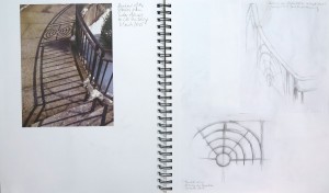
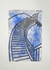
I started this project with some sketchbook work, related to my research on Paul Klee and Keith Haring, but also just “playing around” with things and ideas that popped up. I became attached to the visuals of the shadows of a staircase, and chose this subject for my combination mono and linoprint. In the sketchbook, I tried out slightly different perspectives and colour schemes for this subject, and then focused on the central idea of “Stairway to Heaven” (the title of a song by the Led Zeppelin rock band). This guided my choice of colours for the monoprint with varying shades of blue and a hint of red in the second set of prints, which were supposed to represent the idea of a skyscape. I wanted the stairs to kind of float in the air, taking up the effect I found in one of the watercolour sketches.

Collecting ideas and materials in the sketchbook

Some experiments with inking
A visual relationship between Paul Klee and Keith Haring
Two lions

IMG_2293     IMG_2296

IMG_2297

The staircase, initial sketches

IMG_2298     IMG_2300

other ideas popping up

IMG_2302     IMG_2304

Colour schemes and experimenting with lines

IMG_2306   IMG_2308

A step towards abstraction

IMG_2310

Preparing the desing for the linoprint
– Sketch in the size of the monoprint
– Proof of the linoplate: Back-rubbing with a graphite stick on thin paper
– The transparent used for image transfer onto the lino, after corrections

IMG_2312     IMG_2314

Completing the combination mono and linoprints

The first set of prints: Single colour blue background, printed on dry medium-weight Strathmore printmaking paper (smooth surface). The monoprint plate was inked with a self-made dabber.

1) The lino had moved on the paper, resulting in a blurred print
2) Better impression with less blur
3) “Happy accident” from some paper tissues which I used to texture the surface of the monoprinting plate. I left the tissue on the inked plate for printing where they worked as a mask. In the print, the white areas add contrast and interest.
4) This monoprint has the textured surface but is a little faint, so I think the overall impression is less convincing. That said, it’s still a nice, airy print.

IMG_2277     IMG_2279     IMG_2280     IMG_2283

The second set of prints: Adding a hint of red to the monoprint which mixes into violet tones on the plate. These prints were made on dry Canson Edition 250gsm paper. It has a fairly rough surface. I tend to find the third one the most interesting visually because the colours are most intense here. But the airiness I aimed for comes across better in the first, lightly coloured print.

IMG_2285   IMG_2287   IMG_2288

The prints were placed asymmetrically on the paper because I intended to adjust the margins later on, so they would be roughly equal on all 4 sides.

Concluding reflections

There were some considerations about this series of prints with respect to future work.

My choice of subject was something I had difficulties with. On the one hand, I was attracted by the visual effect of the shades, on the other hand I felt there was no personal involvement with the subject. There’s some symbolic effect though, like tapping on my aspirations and unsaid desires for future life, but it’s a bit sterile. Maybe in the future I’d rather choose a subject which feels “warmer”, like the two lions whose picture I transferred into the sketchbook. I might also have taken up the guitar subject. But I think it was good that I followed my inclination towards graphics for now because it made me discover that I might get more inspiration when following up more personal topics.

Technically, I think there is room for improvement with respect to the relationship of the techniques I combined. The irregular, cloudy monoprint works well in principle but it might have worked better if I had inked the plate in portrait orientation rather than landscape orientation. As it is, the cloudy patterns run vertically due to how I inked the plate. Had I inked in portrait orientation, the pattern would have run horizontally, line with the viewer’s perspective.

With a different subject, I’d have said that the monoprint background should have taken up the shapes of the linoprints, for example a different colour for the stairs than for the background. This might be an alternative approach to the subject, departing from my idea of that staircase floating above the sky.

Overall I must admit that I felt a little stuck with my subject. I worked out my idea for this print and think that’s ok as it was. But the subject did not inspire me to go beyond the initial idea. It might be important for the future to look out for subjects I can relate to in more depth.


Collagraph printmakers

I just saw pictures from a collagraph workshop on printmaker Hester Cox’s Facebook page. The prints were made by workshop students and are just lovely. I would have liked to achieve something like this myself. I thought I’d include a reference in my blog to help me improve my collagraphs.

Glenda: Beach hut series
Glenda: Beach hut series, inked a la poupee

glenda's beach hut series     glenda's beach hut series inked a la poupee

What works well here is the contrast between strongly and lightly textured areas, which is supported by different tonal values. As a result, the image can easily be read as figure and ground.

This was one of the major problems I identified in my own collagraphs. Both the group of small geese and the single large goose were texturally not different enough from the background. Using different colours for figure and background improved overall readability, but overall the composition did not provide enough textural contrast between different areas.

Angie: Leaf series
Angie: Landscape and feathers

Angie's leaf prints    Angie's landscape and feathers

The leaf and feather prints use natural objects to create interesting textures. I think an intaglio technique was used to wipe away ink from the surfaces, probably also making use of differences in ink retention. The landscape works through the colour contrast between the warm brown and cold blue.

These prints show another element that I did not get to work in my collagraphs, the intaglio wiping technique. Maybe it has to do with the textures I used, which may have had to much size difference. Actually I did not try out natural objects, maybe this would have worked better.

Bryce: Little owl
Bryce: Kestrel

Bryce's little owl     Bryce's Kestrel

The two prints make use of strong figurative images and expressive shape, with a lovely feather texture for the kestrel. Compared to this, I think my geese shapes might have been a bit simplistic and the textures I chose did not sufficiently support the “feathery” aspect of my chosen subject. But I don’t want to be overcritical, as the shapes might have worked if set against a quieter background texture.

Lenisa: Sculptural work
Claire: Gingko leaf series

Lenisa - sculptural work      Claire's Gingko leaf series

I think the ‘sculptural’ prints strongly build on the wiping technique. The middle one with irregular shaped objects looks particularly intriguing. It’s breaking up the standard rectangle image boundaries. I discoverd this during linocut research and used it for the experimental linocut as well. It’s nice to see this applied to collagraph as well.

The Gingko leaf series explores a variety of approaches. Some are a bit weaker for the same reason I criticised my collagraphs, not enough contrast between figure and ground. But they are interesting to look at nevertheless. Again a single leaf evokes the impression of a whole tree. This reminds me of my leaf prints in part 1, where I created landscapes with trees based on the effect.

To conclude, looking at these prints I think that I was right being less than satisfied with my collagraph prints so far, and also identified what I could improve for future attempts.

Post scriptum

It was only after completing Part 5 of the course that I realized this little research must have worked subconsciously as an encouragement to choose collagraph in the final project, despite the technical difficulties I had encountered in Part 4. I guess this is an example of how much I integrate what I see and study along the way, without immediately drawing the connections or anticipating future effects. I’m much more at ease with this kind of organic influencing, compared to deliberately working “in the style of” any particular artist.

References

Original Facebook posting by Hester Cox: https://www.facebook.com/hestercoxprintmaker/posts/800684823352850

Paul Klee, Keith Haring, Piet Mondrian

Paul Klee 1940 Flora on rocks sunRecently I came across a painting by Paul Klee (Swiss-German, 1879-1940). It’s entitled ‘Flora on rocks sun’ and Klee made it 1940, the year when he died. The subdued colours are typical for his late works. I think the colours are vibrant and warm and I think that’s what attracted me to the painting.

I looked at it several times and the black marks reminded me of works by Keith Haring. I found the coincidence striking and went ahead to do some research whether Haring might have been influenced by Klee. I did not find any such hint, but maybe it just isn’t documented. Haring studied semiotics at the School of Visual Arts in New York and it would surprise me if he’d never seen works by Paul Klee.

Keith Haring 1978 Untitled (felt-tip pen, watercolour, 7x9 inches)I found an early work by Haring, it’s very small (7 x 9 inches) and I think there’s already the core of his future style visible. He was known to make no preparatory sketches for his works, but worked entirely from intuition.

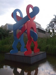
To me it looked as if he just couldn’t stop covering surfaces with his sign language, and he extended those surfaces in various ways: Screen printing, embossed printings, the human body. He even made large sculptures from his figurines.


Keith Haring Original Screen Print      Keith Haring 1990 White Icons (Embossing, 21 x 25 inches)

Keith Haring 1983 Body Painting     Keith Haring 1987 Boxer

Keith Haring 1979 Painting myself into a corner     Keith Haring Painting

After delving into Pop Culture and New York Art Scene of the 1980s (Keith Haring had been friends with Andy Warhol), I went back to take a closer look at Paul Klee.

Paul Klee 1936 Nach der ÜberschwemmungI selected a few works which I found particularly interesting. Three more which take up this motif of black signs on a coloured backgrounds, all from his late years:

left: Nach der Überschwemmung (1936)
below left: Forest Witches (1938)
below right: Heroic Roses (1938)


Paul Klee 1938 Forest Witches   Paul Klee 1938 Heroic Roses


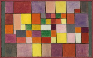
I also liked his colour studies with rectangles. They are said to take up ideas from musical compositions as Klee had also learned to play the violin. What struck me was again the warmth and softness of his colour choices.

left: Red-green and violet-yellow rhythms (1920)
right: Flora on sand (1927)

Paul Klee 1920 Red-green and violet-yellow rhythms     Paul Klee 1927 flora-on-sand-1927(1)

Piet Mondrian (Dutch, 1872-1944), a contemporary of Paul Klee came to my mind, and I thought Klee and Mondrian must have had very different personalities, in view of the direction that Mondrian’s abstractions had taken him. When I first researched Mondrian, I knew only the purely geometrical works in primary colours. It was only then I discovered that early Mondrian was a very skilled figurative painter who slowly progressed towards increasingly technically precise abstract works.

Rhododendrons (1910)
Composition in Blue, Grey and Pink (1913)
Composition in Red, Blue and Yellow (1930)

Piet Mondrian 1910 Rhododendrons      Piet Mondrian 1913 Composition in Blue, Grey and Pink Piet Mondrian 1930 Composition in Red, Blue and Yellow

Impact on coursework

I started reading the introduction to Part 5 of the course only after having seen the Paul Klee painting. It struck me immediately that Klee’s painting would make an interesting starting point for a combination mono and linoprint. I envision a monoprint background in those muted red-orange-brown-violet tones and a line-based linocut overprinting. Of course I would not want to simply copy an existing artwork, but as a starting point, I really liked the idea. I will see whether I can take this further.

A first step was that I juxtaposed two images in my sketchbook, Klee’s 1940 painting and the photo of Keith Haring painting the floor of a huge space while walking backwards. I filled the remaining white paper of the double page by drawing black signs with oil pastels, then colouring in with watercolours in red, orange, yellow, green and blue tones. I quite like the result. It might be the first painting that actually has a message. It visualizes the closeness I perceive in the visual language of those two artists and also conveys a sense of “endless signmaking” as a basic principle in art.

IMG_2296

References

Keith Haring

Brooklyn Museum exhibition (Spring 2012): http://www.brooklynmuseum.org/exhibitions/keith_haring/ (accessed 28 Feb 2015)

Wikipedia Article, overview on life and influences http://en.wikipedia.org/wiki/Keith_Haring (accessed 28 Feb 2015)

Keith Haring Foundation website http://www.haring.com in particular paintings overview by year http://www.haring.com/!/genre/painting and biographical info http://www.haring.com/!/selected_writing/keith-haring-art-and-commerce#.VPH9ieGOfz8 (accessed 28 Feb 2015)

Keith Haring Documentary video https://www.youtube.com/watch?v=GPlzHR_WyVA (accessed 28 Feb 2015)

Paul Klee

Tate modern documentary https://www.youtube.com/watch?v=kLbPTI6bfC4  (accessed 28 Feb 2015)

Wikipedia article http://en.wikipedia.org/wiki/Paul_Klee  (accessed 28 Feb 2015)

Piet Mondrian

Website with list of complete paintings http://www.piet-mondrian.org  (accessed 28 Feb 2015)