Assignment 4: Collatype collage block prints

This assignment is a little different because I’m going to submit physical work to my tutor. Nevertheless I’m going to include an assignment blog post, because I think the blog should be complete with all five assignments. It will hopefully also guide looking through the submitted materials.

Task 1 (Project 11): Collage test block

I made my first collage test block on an A3 sized cardboard. I glued simple household materials in the 16 fields:

upper row: rice / burlap scraps / sweets foil / woodcut scraps / sand / linocut scraps / cotton thread / pieces of rubber band / flat ribbon

lower row: metal pins / Quinoa grain / Black Tea / Rice paper for spring rolls / glass noodles /  yellow lentils / rolled oates

I made prints on four different types of paper. For the assignment, I selected two of these. The first was printed by hand with a baren, on damp paper. I used plain white drawing paper. This print was executed as a plain relief print. I inked the plate thoroughly and tried to get as much ink on the paper as I possibly could. Using the hands, not the press, helped to transfer ink also from the more recessed areas of the plate.

The second print was printed with the press, on damp Arches Text Wove paper. Here I had the intention to try out an intaglio technique, and had wiped off much of the ink. I wanted to obtain an impression from the ink that remained in the recessed parts of the plate. This did not work out exactly as I had planned. It is actually more of a relief print with a lighter overall tone because the ink in the flatter areas had been iped away.

IMG_1836     IMG_1842

I did two additional prints from a collagraph plate I had made in 2012 using paper, strings and fabric. This time, I inked the plate with self-made dabbers. The plate size was a little smaller than A4. I printed on damp sulphite paper. The two-colour print in brown and blue looked quite interesting.

IMG_1853

After these, I felt I needed more experimentation with collagraph and made four more plates using different materials.

First plate: Organza cloth, sandpaper, bandage and bristol board

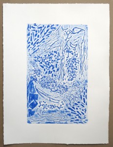
The first print was made as a plain relief on dry rice paper. The second print was made as a relief print on damp sulphite paper, the plate wiped off after very thorough inking. Thus the ink got deeply into recessed areas and the cloth bandage held much more ink than the smooth bristol board. Consequently, tonal values are very different from the first print.

IMG_1889    IMG_1892

Second plate: Different kinds of tape with rough and smooth surfaces

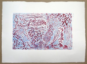
Here I wanted to explore further the tonal effects of different surfaces, and the intaglio effects which had occurred on the edges of the bristol board. The first print was made as a plain relief print on dry, rough, medium weight paper. After some experimentation, I had made at an intaglio print that consistet almost exclusively of outlines. I overprinted it after re-inking the plate with dabbers in three colours, which created interesting transparency effects in the final print.

IMG_1944     IMG_1952

Third and fourth plate: Textured plates made with joint compound, textured with a plastic card vs a bamboo skewer.

I did various printing experiments with these plates. One technique I found most interesting was to create a coloured background layer by inking the plate with a dabber, then making one impression on dry paper to take off ink from the relief surface, and then re-ink the plate in black. The print from this plate would combine relief and intaglio effects and subtle colour mixing. Both prints were made on heavy-weight printmaking paper, and I consider them the most successful of my collagraph test prints. Actually the left print is larger than the right one, but the blog software does not let me adapt the image sizes accordingly.

IMG_1928     IMG_1934

Blog posts

Making a test collage block: http://ocaprintmaking1.blueconcretemoon.com/?p=1199
Further experimentation with collagraph: http://ocaprintmaking1.blueconcretemoon.com/?p=1243

Task 2 (Project 12): Collatype Collage prints

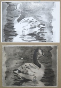
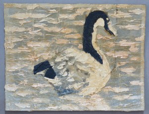
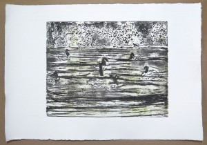
As my subject, I chose a group of geese on a pond. I worked from photographs I made during an out-of-town trip. From several sketches I chose the one that depicted the group of animals, because I liked how they seemed to enjoy each other’s company. I made the collagraph plate from stretched stockings (wavy water), acrylic modeling paste (geese bodies, background bushes), black tea (leaf textures) and cotton (geese necks).

Initial single-colour prints were a bit pale but after some experimenting, I achieved deep tone. Multi-colour printing was not easy either as I often got patchy areas which did not support the motif. The most successful print was one with a green background layer and black texture printed on top.

IMG_2054  IMG_2080

I also experimented with gray paper, printing white and black ink on top. They are quite interesting when looked at from close. I liked the one with white on top of black best. The ink layers create a slight 3D effect which is interesting. As an experiment, I made a final print with a coloured underprint from a perspex plate, then a single-colour black impression from the collagraph plate.

IMG_2084     IMG_2087

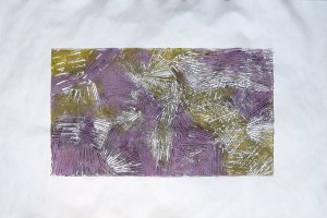
As a follow up, I did a series of abstract collagraphs. I experimented with printing colours and black, using masks, and printing reversed layers. I think these prints are good and I felt much more comfortable with abstract shapes as this permitted me to play around with effects without the need to create a representational image.

IMG_2146     IMG_2162

IMG_2170     IMG_2174

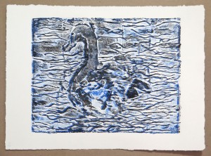
Finally, I went back to my geese sketches and made another collagraph plate, this time choosing the single goose sketch as a source. The plate was made from cotton bandage, rice noodles, acrylic modeling paste, and cotton cloth. The problem of differentiating figure and ground returned, and I tried to achieve the effect by using different colours and working with masks.

IMG_2190     IMG_2199

Blog posts

Collatype collage prints: http://ocaprintmaking1.blueconcretemoon.com/?p=1355
Abstract collagraph: http://ocaprintmaking1.blueconcretemoon.com/?p=1431
Figurative collagraph: http://ocaprintmaking1.blueconcretemoon.com/?p=1488

Sketchbook work

IMG_2225During part 4, I continued to wirk in the A5 size ringbound sketchbook. Over the course of Part 4, my use of the sketchbook has changed from making neat sketches to being more experimental and trying out ideas as in a visual diary. I’m quite glad about this development and when I look through the sketchbook I think it’s now more exciting and contains nice surprises. The blog article presents the pages made during Part 4 with some comments about ideas and processes.

Sketchbook blog article: http://ocaprintmaking1.blueconcretemoon.com/?p=1594

Reflection

When creating the plate I had assumed the textures were distinct enough to separate the geese from their background, but unfortunately this was not the case. So the prints turned out less well overall than I had hoped.

Checking my work against the assessment criteria

 • Demonstration of Technical and Visual Skills – materials, techniques, observational skills,
visual awareness, design and compositional skills

I think that my work for Part 4 is strong in approach and I have demonstrated technical skills when creating the plates. I also see some progress in print quality as I’m experimenting a lot until impressions are good, and begin to use quality paper. I’m less happy with the visual qualities of the outcome. I created appealing texture effects but was less able to combine these into producing strong figurative images.

• Quality of Outcome – content, application of knowledge, presentation of work in a coherent
manner, discernment, conceptualisation of thoughts, communication of ideas

I take a lot of effort into presenting my work and associated processes in the blog. Sometimes I think it is too time consuming and I’d better spend the time improving visual skills. But then again, blogging skills might become valuable when some day I’ll be presenting my work to a broader audience. I also hope that with time, I’ll become more efficient and to the point with less digression into purely descriptive content.

In his feedback for Assignment 3, my tutor recommended I’d take some time to reflect on my motivations and visual interests. I feel he’s right in pointing out something that’s missing or hidden in my reflective comments so far. Otherwise, if I’m able to set aside some time for it, I think I’m quite good at communicating ideas.

• Demonstration of Creativity – imagination, experimentation, invention, development of a
personal voice

I may be somewhat disappointed from the outcome of Part 4, but I think that I’ve made some progress on the creative side. For one, I discovered my sketchbook as a place where I can try out things. It is not yet related to actual coursework but I’m quite certain that ideas will begin to feed back into printmaking projects.

IMG_1884During Part 4, I also experimented with Suminagashi, Japanese water-based paper marbling. It was quite interesting because I likened it to printing of a coloured water surface. I described it in this post: http://ocaprintmaking1.blueconcretemoon.com/?p=1230

To the extent that I let myself explore ideas, I think there’s also more potential for developing personal interests and ultimately a personal voice. I’m very aware that I’m only at the beginning of a long journey but it feels like I’d made first steps towards the right direction.

• Context – reflection, research, critical thinking (learning log)

From the feedback on the last assignments I became aware that my blog does not reflect that I’m actually constantly researching and digesting visual information, because I do not write it down here. Since a few months, I spend about an hour daily sifting through various online resources, following up recommendations by fellow students or co-members of online printmaking groups. I’m going to revise my current practice and will see that I’ll include pointers to these little bits. It might make it easier to trace down my influences. On the other hand, there’s a real need to keep all the note-taking to a manageable level because otherwise I’ll end up with no time left for actual practice.


Sources of inspiration

I developed a habit of regularly following up interesting stuff I come across online. Actually, Facebook groups have become the most important source of inspiration for me. I’m a member of several OCA student groups and through this and independent research have found many additional art and artist sites. Through Facebook notifications there’s a constant stream of visual stimulation and it can get hard at times to even keep up.

Life with Facebook groups

There’s good things and there’s bad things about this. The good thing is that I feel connected to current art practice and see what other people are doing. Particularly important for this module is the OCA printmaking group, where students regularly post recent works, art stuff they come across, and discuss printmaking stuff. We’re all aware that the OCA student forum should be the place for this to happen, but Facebook offers much more social connectedness and easy interaction so this is probably the reason for its success.

On the downside, I observe that I’m quite quick in following up, but usually don’t do in-depth research because of the constant arrival of new stuff. I’m in a phase of learning how to keep up with all the information, and my reception might be somewhat too superficial. On the other hand, it does happen that things really capture my interest and this leads to prolonged research, as was the case when I came across David Bull and his Mokuhankan Project. I spent several days reading about his activities, and how he used crowdfunding to finance a printmaking studio close to his home in Ome (Tokyo), Japan. This also inspired my use of rice paper, some experimentation with flour paste and watercolours to print (not successful so far), and with image transfer. I used this to prepare one of the collagraph plates (the goose).

The Facebook printmakers groups also provide much stimulation from the prints members post. It’s interesting and inspiring to see work that’s done at a professional level, unrelated to OCA course briefs, fresh and not yet embedded in artspeak -isms. Linoprints by Hans von Doehren, a German artist and printmaker living in Berlin and Bretagne in France, come to mind. In December and January, he posted a series of prints made by his father, who was also an artist. The father lived and worked in Berlin, Germany in the early 20th century and made exceptional, expressionist linocuts.

In particular, the ‘Linocut friends’ Facebook group provided me with lots of visual input and showed me that I’ve only scratched the surface with my first attempts in the medium.

Other inspirations

During part 4, I haven’t been to an exhibition. There were the Matisse Cut-outs and the Cubist exhibition which I wanted to see, but didn’t make it. Reasons are a combination of busy work schedule, general exhaustion, and bad weather. I hope that as spring arrives and the weather gets better the enthusiasm for going out returns.

The most recent big topic for me is rediscovery of Elvis Presley and his music. I’ve been researching his life and performances and am off my feet by the way he sang. The memories I had were from his last years and I hadn’t realized there was so much more. Born in 1935 he was older than my father and would have turned 80 on January 15, 2015. What I find truely inspirational is the way he was present, in the moment, during his live performances. But also watching old footage from studio rehearsals is hugely interesting. He must have been quite an exceptional person. I know it’s not related to artmaking or my current printmaking practice, but I’m deeply impressed at a personal level.

References

David Bull, Mokuhankan project site http://mokuhankan.com/ (accessed 26 Feb 2015)
Hans von Doehren, artist and printmaker https://www.facebook.com/Hansvondoehren (accessed 26 Feb 2015)

Part 4 Sketchbook work

During this part of the course, I began using my A5 ringbound sketchbook more freely. I mostly worked in it at home but occasionally had it with me during the day and sketched when I found an opportunity. There’s no direct relation to coursework.

Pots on the terrace, in the snow
Mark making with india ink

IMG_2202    IMG_2204

Some sketches of my cat Gina. She’s often with me in the studio. The other cats less so. I continued to experiment with India ink which I find is a difficult medium.

IMG_2205      IMG_2208 IMG_2210      IMG_2212

Chairs on the terrace, in the snow
Self portrait with strong shadow effects

IMG_2215      IMG_2217

Trees in planters, Midtown Manhattan
My desk at the office

IMG_2219      IMG_2221

Gina sleeping at my side
Ink bottles on my desk. Here I started using up printmaking inks to colourize the pages of the sketchbook. This was inspired by a discussion in the printmaking group how people make use of their ink leftovers, and I think this got me started using the sketchbook more experimentally.

IMG_2223      IMG_2225

Inspired by another discussion in an OCA student group on Facebook, I began experimenting with image transfers. The first transfer was made from a double-page photo in Times Magazine which depicts people marching on the Brooklyn Bridge to honour Martin Luther King Day on January 18. I soaked one half of the photograph in odourless spirit, placed it face down on the page and rubbed the back with a spoon. The toner thus transferred onto the paper. To complement the transfer, I glued the other page of the photo directly into the sketchbook.

The second image transfer was made differently: A colour photocopy was glued onto the sketchbook page with Mod Podge. After drying, the paper was made wet with a sponge, and gently rubbed so the fibers would disintegrate. The process was repeated several times, until the paper was off and only the thin toner colour layer remained. As I had glued a simple photocopy face down, the resulting transfer was reversed. So I made another one with a reversed photocopy, which resulted in a transfer in correct reading orientation.

I had selected sheets from my calendar because I was attracted to the graphic qualities and the connotation of passing time which works well with the withered character of the result.

IMG_2227      IMG_2229

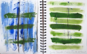
I extended the idea of image transfer to painting with leftover water-soluble oil paints. I painted a page in blue, and the opposite page in green, then closed the sketchbook over the paint still wet, which resulted in a transfer of marks between the two pages.

IMG_2230

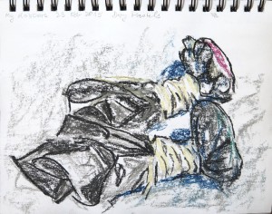
Some more cat sketches with felt pen and oil pastel, and an experiment of oil pastels blended with odorless spirits.

IMG_2232      IMG_2234 IMG_2237     IMG_2238 IMG_2241

Some interior sketches with ink and felt pen over printmaking ink, and using up leftover paint.

IMG_2243      IMG_2245 IMG_2247

IMG_2251Another experiment with image transfer. I painted with India Ink on rice paper, then glued the paper into the sketchbook with Mod Podge. After drying, I wetted the paper and gently rubbed of the fibers. But the rice paper behaved differently from photocopier paper in that the ink was not sitting on the surface, but went deep into the paper. In fact so deep that the marks were clearly visible on both sides of the paper, making the transfer somewhat pointless.

Using rice paper was inspired by recent research into Japanese woodcut printing (Mokuhanga). I learned that printmakers would glue their image onto the wooden block, then wet and rub off the fibers to retain the ink marks to guide their cutting.

A sketch of my self-made inking dabbers in dry pastel
Another image transfer with Mod Podge

IMG_2252      IMG_2255

A sketch at the Diner during lunch break: Two men filling a self-service refridgerator, storage shelves in the background.
My cat Gina looking out of the terrace door.

IMG_2257      IMG_2259

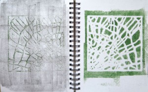
Some experimentation with a stencil and leftover printmaking ink. I used the stencil as a mask and rolled over with ink, then printed from the stencil onto a page previously inked blue. I repeated this, trying to get a crisper negative image from the stencil and printing onto a gray page.

IMG_2261      IMG_2262

Two sketches outside the window of the bus: Traffic jam, which caused the bus to stand still so that I could use the time. Both sketches on inked paper. The first was inked with ink remainders on a dabber and I particularly like how this evokes the idea of smog clouds to accompany the heavy traffic.

IMG_2265      IMG_2266

Some more experiments with the stencil:
– A print onto rice paper, glued into the sketchbook
– Cleaning the stencil onto the sketchbook page, thus creating a negative image
– Spray paint over stencil
– Spray paint over second layer with stencil
– Printing off the stencil
– Cleaning the stencil onto the paper which transferred spray paint in unexpected ways.

IMG_2268      IMG_2271 IMG_2272

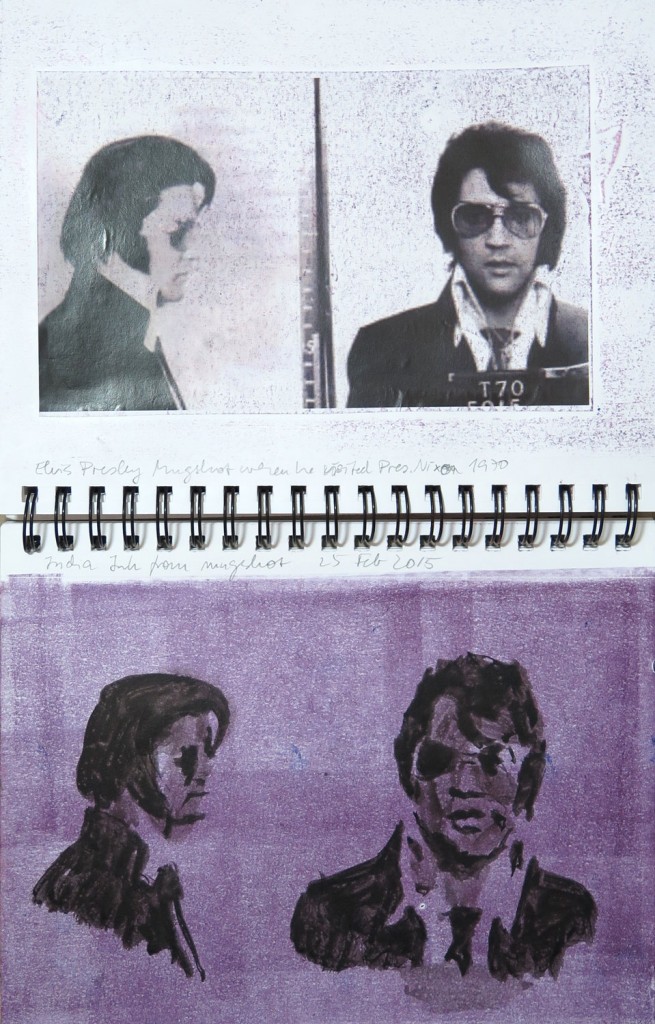
The final image is special for me. It was made in two separate sessions. Recently I rediscovered Elvis Presley and was totally impressed. I see him now, being a mature person myself, and admire his exceptional voice and stage performance. I had been totally unaware of this as my memories were those from the late seventies shortly before he died. I knew many of his songs but wasn’t aware how groundbreaking they had been nor of the special quality of his voice.

I found a photograph in the public domain which was taken when Elvis Presley visited President Nixon at the White House. Pictures taken by U.S. state officials are called mugshots and those of celebrities enjoy particular interest. I glued the printout into the sketchbook next to a page inked purple previously, and then rubbed the pages together so that some of the purple ink transferred onto the black & white photograph. I really like the effect of subltle colour this created.

Later, I made two quick ink sketches from the photos onto the purple page, taking on board what I had learned recently about the importance of shadows in a face. The earlier sketch of Abraham Lincoln had served to practice the idea. Here I took a looser approach. The depiction has some errors but I was surprised by the degree of likeness. I particularly like the second sketch with the sunglasses. I think it captures his attitude, of which someone said “He invented cool”, even more than the picture itself gets this across.

IMG_2274


More artists: Eduardo Chillida

In Assignment 3 feedback, my tutor noted a similarity of one of my linocut process prints (the red single layer in the experimental cat tree print) with works by Eduardo Chillida. What I found remarkable was that I had only briefly assessed the single-layer componants of my reduction print, and my tutor’s remarks made me realize they are interesting in themselves, too.

Lines and mass     Eduardo Chillida - lines and mass

It’s good to get this kind of feedback because I think I’m sometimes “too close” to what I’m doing. The outside perspective is helpful as a different take on things. I noticed that I get a more detached view after some time has passed, discovering qualities I did not appreciate when I had just finished them.

eduardoAs for Eduardo Chillida (1924-2002), he was a Spanish (Basque) Sculptor. I found a blog with a video showing an exhibition of his works in the United States. The monumental sculptures were set up in a golf lawn. They look quite expressive. The blog also features the image my tutor included in the feedback, set in context with three others.

What fascinates me about Chillida’s sculptures is the combination of curved shapes and hard edges, created in hard materials like iron or stone, which I perceive as rigid and fixed. The combination creates much tension. It should be interesting to draw these objects from various angles.

Eduardo chillida 1993 Advice to Space V    Eduardo Chillida 1989 Lurra G-128

I’ve recently become interested in sculpture but wasn’t able to find the time for further exploration, so this was a nice opportunity to look outside my usual interest in 2-dimensional works. Prints are normally seen as 2-dimensional, but collagraph prints extended my understanding somewhat. I realized that the plates are actually 3-dimensional – as any relief and can have multiple height layers. In addition to this, the plates create an embossing of the paper, which is also a 3-dimensional effect.

Actually last summer I went outside during lunch breaks and on two occasions, made sketches of a large sculpture. They were done in the context of my watercolour course. The second one is only a section and I’ve used a white pencil to increase the 3-dimensionality. I’m including them only for reference here because they are going to be assessed elsewhere.

IMG_1212   IMG_1620

Robert Cook - DinocerusThe sculpture is by Robert Cook, named “Dinoceros” and it really looks like some strange kind of artificial dinosaur. It’s located on 51st Street/Park Avenue in Midtown Manhattan. During lunchtime, lots of people are around, eating their lunch from a nearby food stand or smoking a cigarette.

I thought it might be interesting to make sculptures myself with the intention of setting up some interesting objects and views to draw. Of course I’d do something simpler and smallish which would fit into my studio!


References

Eduardo Chillida Blog post: http://nialldebuitlear.com/blog/?p=1097 (accessed 24 Feb 2015)

Video of 2011 Exhibition in Florida, USA https://www.youtube.com/watch?v=3quRqVGFCfA (accessed 24 Feb 2015)

Tutor feedback: Assignment 3

Overall Comments

Electronic submission, student lives in USA

Summary of video feedback 17 Feb 2015

  • Your grasp of reduction print technique has been ably demonstrated
  • You have a solid working process from initial drawing through to finished print. Sensibly grounded in the visual experience of your subject matter
  • But you will benefit from exploring more ideas before committing to a single idea. Use the notion of an ‘ideas pyramid’
  • Blog continues well. More insight to your visual motivations would be helpful

Feedback on assignment

Demonstration of technical and Visual Skills, Quality of Outcome, Demonstration of Creativity

Project 8 Reduction Method Linocutting

Careful attention to printing process has yielded a strong image that works well. Textural effects exploited to show the flat blankness of night sky contrasted with varied marks expressing manmade and natural forms. Conveys a sense too of the artificial colours produced by street lights. Good problem-solving to repair area of lino mistakenly cut away.

Project 9 Experimental Mark Making on Lino

Produced a mark-making vocabulary with potential for future use.

Project 10 Experimental Relief Prints

A good, steady, developmental process is demonstrated, from original drawing stage through to finished print.

Ambition and confidence demonstrated in production of a large A3-A2ish print

Scratch foil drawing has a lovely soft visual quality and I enjoyed the use of tone in preference to line.

scratchfoil

Reminiscent of some Philip Guston (1913 – 80) drawings:

Guston Original                                                               Inverted

Guston orig     Guston inverted

You are right to take abstracted shapes from the view in front of you (e.g. look at Ivon Hitchens [1893-1979]). This avoids the potentially overwhelming possibilities of complete invention. But you also make decisions based on what you feel the image needs e.g. bold primary colours rather than dull winter’s day colours.

Pleased to see artist reference to inspire you (Anne Sumpner Evans). Her work is vigorous and organic. It is worth casting around for work that aligns better with your intentions – even retrospectively. This way you can develop, improve and demonstrate your connection to the wider art world.

You: Lines and mass
Eduardo Chillida (1924- 2002). Note: lines and mass

Lines and mass       Eduardo Chillida - lines and mass

Ancient architecture: further development?
Laszlo Moholy-Nagy (1895-1946): Texture

ancient architecture        Laszlo Moholy-Nagy - Texture

Need to explore some initial ideas before committing to final design e.g. attempts to utilise the Project 9 mark-making in some way. Remember the notion of an ‘ideas pyramid’ we discussed: a broad exploratory base, progressively leading through to single idea. And this idea itself can then be subjected to a similar process (rather as you have done in this project).

Sketchbooks

Demonstration of technical and Visual Skills, Demonstration of Creativity

Looking forward to receiving your sketchbook with physical submission of next assignment – or photocopied pages (less desirable as not actual media).

In this Assignment you have used your book as a working tool to develop your idea, but as stated above, would be good to see a broader engagement with a developmental range of ideas.

(Your quick sketches from TV and your cat ink & wash drawings are attractive and interesting. Maybe worth pursuing?)

Learning Logs or Blogs/Critical essays

Context

Well-organised and easy to navigate.

Working processes are well described and illustrated, including problem-solving.

I suggest you devote some specific space to reflect on your learning journey. I’m still unsure of your artistic and creative preferences, likes and dislikes. I attach a sheet with some suggestions.

You did not carry out reflection against the assessment criteria, p.24.

Good to see you citing your references. Needs a tweak, I have attached the OCA guidance for your convenience

Suggested reading/viewing

Context

Google images and Pinterest will give extensive results for collagraphs.

Can you use this as a vehicle to show me/yourself what you like? Talk about choices in blog. Put artist images next to your own in sketchbook too.

Pointers for the next assignment

Collatypes:

Keep things glued to the base board at a similar height.

Blocks can prove unpredictable in the prints they yield, so be prepared for both good and bad surprises. Play with inking methods and how you lift the print – they can make quite a difference to the outcome.   Also play with papers, inks, and colours.

Make explorations and discoveries for yourself. These you can use later on. The test block (Project 11) a very useful learning experience (vocabulary).

Explore, develop a range of ideas, have fun.

Figurative collagraph

I began this plate while I was sealing the abstract collagraph. The idea was to see whether I’d get distinctly different textures when I had a little more space to work. The plate is about 15 x 20 cm. The materials were again glued on cardboard, but I used an image transfer technique that I’d been developing in the sketchbook as a guide on the plate.

The motif was based on one of the sketchbook drawings. I photocopied it and then glued it face down onto the cardboard plate. After drying, I wetted the surface and peeled off the paper layer, leaving the black and white image intact. This must be done quite carefully and I worked in several sessions with drying and re-wetting, before the image was sufficiently clear.

IMG_2111      IMG_2123 IMG_2128      IMG_2134

The first layer was printed in blue. The textures could not be inked well enough for printing with the brayer alone, so I used both the dabber and the brayer and experimented with selective inking. The second layer was printed in black from a less inked plate. The first two impressions were made without the mask, then one print with the positive and one with the negative mask.

Without the mask, the textures were not differentiated enough to clearly bring out the goose. I also did not achieve white on the spots where I wanted them. Initially I was so curious how the plate would print without any deliberate white areas. But looking at the print, I think the might be considerably improved when I wipe away the ink from the inside of the neck and the gooses body like it was in my original image. I had in mind to create textures that would retain different amounts of ink when wiped in intaglio style, but unfortunately I had put too much PVA over the water background so it wiped away almost completely. So I re-inked and did not apply the wiping technique, trying to make a relief print instead.

The only print that came out really well was the fourth one, where I used the negative mask to overprint only the goose in black.

The next day, after completing the abstract series, I thought I might improve readability of the prints by adding a third coloured layer in red, using the mask. This was applied to the first and third print.

I think the third colour indeed brought out the goose and the overlapping textures look quite interesting. If I extend the series at a later time, I think I’d start with some black prints and use selective wiping for the goose and the water reflections.

IMG_2183 IMG_2186 IMG_2187 IMG_2190

Second set

I made another attempt a few days later. I wanted to build on the experience that I could achieve better readability of the goose by using colour to separate figure from ground. I chose a violet for the goose and a green tone for the water background. The violet took up some shadow tones in the white of the feathers, whereas the green was taken from the reflections on the water surface. I wanted a black layer on top to give more depth and texture.

The prints were made on damp paper, using the positive and negative mask, partly pressed with the palm of my hand only, partly run through the press.

IMG_2194    IMG_2195

IMG_2198    IMG_2199

Concluding reflections

I think it was a good idea to extend my work on collagraph to gain more experience. I’m still not happy with the results, but I’m going to leave it at that and take a break from collagraph for now. I could probably go on for a year to explore the possibilities and try out materials and techniques before reaching some sort of control over the effects.

Despite a little bit of disappointment over results, I’m glad that I extended the course brief and did more prints on my own, because I found it so interesting to see what would result from the various textures I created. The textures printed look exciting actually, only the figurative elements work less well than I had hoped. Maybe with a little more distance timewise there’ll be more insight and appreciation of what I did for this part of the course.

IMG_2290A little later I realized how interesting the mask looked, with its overprinted layers, so I added it to the sketchbook.


Abstract collagraph

Being not really happy with the collagraph results so far, I made another attempt. I wanted to further experiment with textures and relief printing. I decided to work on an abstract plate because I found it too difficult to tackle the complexities of a figurative motive and the textured plate simultaneously.

The plate

IMG_2130The materials I collected for this plate were mostly the remainders of those from the initial test plate (Project 11), but I arranged them in a looser manner on my plate and also tried to see that the heights of various areas would not bee too different. The materials were glued onto a piece of thick cardboard and coated with several layers of PVA glue (Elmer’s brand), then sealed with three layers of shellac to make the plate waterproof. The plate size was 21.5 x 35 cm.

Initially the plate was bent, but it became flatter over the course of the printing series made with the press.

Green and black series

I found the composition somewhat organic and thought a green ink might work well. The first picture shows the single colour impression. The plate was inked with a brayer, so the ink mostly stayed on top of the textures for a relief print. I used medium weight, dry paper and considerable pressure to assure a good ink transfer, but the paper crinkled in the press.

To relax the paper and get rid of the crinkles, I soaked the sheet in the tub, placed it on a dish cloth and put a sheet of paper on top, to take up the water. The print remained crisp and I obtained a transfer print on the second sheet. Unfortunately, the original print was still crinkled after drying.

IMG_2138   IMG_2139

I made another plain green print with transfer sheet to get rid of crinkles, because at that time it wasn’t clear the soaking doesn’t help much. Then I went on to ink the plate with a dabber, printed it onto medium-weight paper and put it aside for later overprinting.

IMG_2144The next idea was to make a single-layer, two-colour print with green background and  black surface marks. I inked the plate with the dabber, with which I could get ink into the lower levels of the plate where the brayer would not get into. I made a first print on dry drawing paper with  moderate pressure just to take off the ink from the relief surface. Then I re-inked the plate in black with the brayer.

I printed this plate on damp copperplate paper (250 gsm) with high pressure. The ink transferred nicely and I think this is an interesting print. The green background works as I had intended, the black stands out well and the remaining white of the paper works as a third colour, brightening up the entire print. The heavy paper dried nicely and is not buckling as lighter paper does.

IMG_2146

IMG_2148I took a ghost print from the plate on damp Kozo paper (lightweight), but it doesn’t look very interesting, because the tones are so pale.

Then I re-inked the plate in black with the brayer and overprinted the green print made earlier from the plate inked with the dabber. I re-dampened the paper before printing. The print came out nicely with intense colours, somewhat more blurry than the single-layer, two-colour print.

IMG_2150


Red, blue and black series

IMG_2152On the next day, I continued with a cleaned plate and red, blue and black inks. The first print is a single layer impression from a plate that was inked with a dabber. Only few textured areas have white spots, the print mostly consists of light to dark red tones. The second print is another two-colour, single-layer print: The underlying red was inked with a dabber, the relief surface was then inked in blue with a brayer, then the plate was printed on damp paper. The print is nice, and I wish I had taken a heavier paper. The third print was made in the same technique, only with black as the surface colour, and on Copperplate paper (250 gsm).

IMG_2153   IMG_2158

IMG_2162I made a second set of prints with blue as the base colour. The print to the right is a single-layer print in blue. It’s special because it uses the single-layer, two-colour technique with blue as the sole colour. The plate was inked with a dabber, some other print taken, then the surface was re-inked in blue with the brayer, then this print was made on damp Lenox vellum paper (230 gsm). This resulted in soft background and darker surface tones and looks really nice.

The next two were made as two-colour, two layer prints. The first layer was printed from a dabbed plate similar to the very first red print above. Then a second layer was printed on top, using red in the left print and black in the right print.

IMG_2155   IMG_2159

Using a mask

I had hung the prints in portrait orientation for drying, and discovered something like a crude face in the center of the print. I thought I’d make a face-shaped mask to see whether two different colours would bring out the effect further.

IMG_2163     IMG_2176

I started with the negative mask and printed the “face” area in blue, while the surroundings were masked. Then cleaned and re-inked the plate in red, to use the positive mask, and print the surroundings. I made two prints like this and then overprinted one of them in black.

IMG_2166      IMG_2170

The black layer in the second print seems to hold the image together. It’s an interesting effect. It might work better with a figurative motif or additional shapes to make the face come out more prominent. The two parts of the mask also look interesting. They have quite intense tonal values from double printing

IMG_2178

Reverse layer prints

A final idea was to explore reversing the orientation of the plate when overprinting. The first print was made using an earlier red-blue ghost print, overprinted with a freshly inked black plate. The black is very dominant over the light background colours, but the overprinting creates a rich effect. The second print was the ghost from the black plate on top of a similar red-blue underprint. This time, the three colours work better together and are less distant from each other due to their similar tonal values, but the overall impression is less interesting because it’s a bit washed out.

IMG_2180     IMG_2182

Since I liked the strong black marks, I made another print on a clean, damp sheet of Lenox Vellum (230 gsm). The plate was inked with a brayer. While the paper was still wet, I made a second impression from the newly inked, reversed plate. This resulted in a very dense print with quite a fabric of textures. It looks chaotic in the small image, but the enlarged view shows how the textures from the two layers combine and new patterns result.

IMG_2174

Concluding reflections

Although I still feel a bit at a loss with collagraph, I’m glad I did this additional series because it helped to get more familiar with the effects of different methods of inking and printing the plate.

The biggest leaning point was the single-layer versus the two-layer method: The advantage of the single-layer technique is that it avoids the blur which results from almost inevitable slight misalignment when two layers are printed separately on top of each other. It was only with hindsight that I realized that no matter how hard I tried, all my two-layer prints were slightly blurred, whereas the single-layer prints were crisp. Slight misalignment looks interesting with clean shapes, but with textures it does not really work well. I tend to prefer the results from the single-layer technique in this series.

Other learning points may be more implicit – to gain experience with how the prints look, depending on how the plate was inked. The difference between inking with a dabber compared to inking with a brayer. How the print looks on dry vs damp paper. Trying to get the amount of ink right in relation to the dampness of the paper.

I used a lot of good paper this time. The composition may not really warrant it, but I think it’s important to gain some practice with good quality printmaking paper as well. I think for the future I’d go with plain paper during the experimentation phase and once I get the feel for the particular plate and the effects I can achieve, proceed to better quality papers for the presentation prints.

Another thing I developed further was the working method of preparing the paper. I tore my sheets of paper to size and kept the torn edges. It resembles the deckled edges of large sheets and I really like the effect. In the future I might go ahead and prepare a heap of paper for an edition rather than deciding print after print which paper to use next.

I think this kind of experience will help for future collagraph printing. I feel I’m still a million miles away from the quality of prints by Claire Romano and John Ross, for example, and will need much more experimentation. Unfortunately, I have the constant pressure from OCA time schedules to finalize my level 1 modules within a certain time frame. Otherwise I think I could go on with collagraph for the next six months or so.


Collatype collage prints

Preparatory work

For this project, I selected some of the pictures I took in summer 2014 in Crestwood, NY, at the local park where the river Bronx flows. It’s quite a romantic and peaceful place.

I printed them out in a reduced size (about 8×10 cm) and glued them in my large sketchbook next to each other. Initially I wasn’t sure which of the 6 selected images I liked best, but then chose the one with the group of geese on the pond and stayed with it. I liked the wiggly texture of the water and the colour reflections of the geese and bushes on the water surface and thought they’d work well as textures.

IMG_2090     IMG_0781

I made several sketches to test possibilities and look at some elements a bit closer. I found it easier to focus on selected elements than depicting the entire scene.

1) green oil pastel and india ink, 2) india ink, 3) to 5) pencil

IMG_2091      IMG_2094

IMG_2096      IMG_2098

IMG_2101

The plate

I decided to make a collagraph of the entire scene. My main idea was to use stretched silk stockings for the water surface. I wanted to have a heavily textured area as the foreground and a smooth surface in the background area, where the reflections on the water were very dark.

For the bushes in the background I used acrylic modeling paste, applied with a painting knife. While the paste was drying, I dapped with my fingers into it to create additional irregular marks. Later I applied a layer of glue and sprinkled black tea over it for additional marks.

IMG_1998The geese bodies were also made with acrylic modeling paste, and a piece of cotton t-shirt fabric was cut in shapes for neck and head, then placed on top of the paste which acted like glue.

Later I added several thick layers of glue in the middle areas to smooth out the rough texture of the stretched stockings. After everything had dried, the entire plate was sealed with shellac to prevent it from getting sticky when coming into contact with water later on.

Materials: Masonite board (11 x 14 inches / 28 x 35.5 cm), Elmer’s Glue (white PVA glue), shellac sealing

Textures: stretched silk stockings (the water), acrylic modeling paste (upper background of bushes, geese bodies), black tea (texture for the bushes), black cotton T-shirt fabric (geese necks and heads), thick layer of glue (background areas of the water)

The prints

I took many prints from my plate, and it took quite some time until the impressions got better. I struggled with my plate because it was so heavily textured that I did not manage to get enough ink on it. I tried high pressure on dry paper, this improved the ink transfer but caused the paper to wrinkle. I tried damp paper, but then the ink bleeded and the elements lost definition.

In the end, what worked was printing on heavy, damp paper and printing colours in layers rather than inking the plate with more colours in one go.

Paper used: Blick multipurpose paper loose sheets (ca. 120 gms), Strathmore printmaking paper pad (ca 120 gsm), Copperplate unsized printmaking paper (ca 250 gsm), Canson Edition (ca 250 gsm), coloured Canson paper (blue and gray), Japanese rice paper (Kozo), Arches text wove (ca 120 gsm)

Single colour prints

From the many I made, I selected four which are most typical for the results I obtained.

1) On dry, medium weight paper with high pressure: The print is ok, but the paper wrinkles
2) On damp, medium weight paper with moderate pressure: The print gets darker, there’s some bleeding, but the paper does not dry well, with all the buckles
3) On dry, heavier paper (Canson Edition, ca 250 gsm), moderate pressure: A good print, but a little light
4) On damp, heavier paper (Canson Edition again): I think this is a very good print and the paper dries nice and flat

IMG_2041      IMG_2043

IMG_2047      IMG_2054


Multicolour prints

I started my multicolour prints on cheap paper (Blick multipurpose, medium weight/ca 120 gsm) because I wanted to see improvements in quality before I use up the more expensive, heavier paper. The first attempts were made with water-soluble oil paints, applied with a brush onto selected areas of the plate. On top of this, black Akua intaglio ink was applied with a brayer. The first print was on dry paper and very faint, the second on damp paper but only blotches of colour made it onto the paper.

IMG_2056      IMG_2058

I switched to Akua liquid pigment for the colour and continued with damp paper. This wasn’t satisfactory either because the pigments bleeded into each other and the paper looked awful when dried.

IMG_2059      IMG_2062

IMG_2063      IMG_2066

First improvements came when I used heavier paper. The left print was on damp Copperplate, which is unsized. The right print is on Strathmore printmaking paper, medium weight but it dries better than the Blick paper. The colour effects when printing from a single plate inked with two colours were still not convincing.

IMG_2068     IMG_2069

I achieved the best results when printing in two steps on damp paper. The plate was first inked in green, this was printed, then it was inked in black, and printed on top of the green. These two prints show the result, left on Strathmore printmaking paper, right on Canson Edition paper.

IMG_2074     IMG_2080

Prints on Japanese paper

I wasn’t very happy with the results I achieved on Japanese paper. The single colour prints on dry paper came out a bit faint, and on damp paper they looked blurred. The colour prints weren’t very successful either. Maybe they need mounting to look more attractive.

IMG_2029 IMG_2030 IMG_2032 IMG_2035 IMG_2036 IMG_2038

Prints on coloured paper

Another experiment was printing on coloured paper. I wanted to see the effect of adding white and black so that the paper colour would represent a middle tonal value. I chose a medium-dark blue and medium gray papers, weight ca. 120 gsm.

The blue and trhe first gray were printed in plack first, then white on top. The second gray print was white first, then black on top. Some unavoidable misalignment created a slight 3D effect, but the major problem with these prints is that the textures are not varied enough and so the details can only be read from very close.

IMG_2082

IMG_2084      IMG_2085

More colour options?

A final colour experiment consisted in printing from a plain perspex plate which was inked in blue and fading green, to create a coloured layer. On top of this, the collagraph plate was printed in black.

I think this works quite nicely, although it’s again a bit difficult to detect the geese bodies on the water surface and to make sense of the motif.

IMG_2087

Concluding reflections

I must admit that I’m a bit disappointed by the prints that resulted from this project. I think there are several issues which I would address if I had to do it again.

Firstly, I think my choice of motif did not work very well with the textures I created on the collagraph plate. The geese bodies were difficult to distinguish from the water surface, and I wasn’t able to depict the reflections on the water surface. Overall, I think the textures on the plate are not varied enough. For a more interesting effect, I should have included very dark areas, very light areas, and several areas with clearly distinct textures.

Secondly, I might have better chosen a different composition with less, but larger elements. With hindsight, it might have been an error to not follow the intuition I had when doing the prep sketches, where I selected the group of three geese rather than depicting the entire scene on the water.

Thirdly, when working out the collagraph plate, I had in mind that I could use my knowledge of the motif to ink the plate in different colours. This did not work at all. I wasn’t able to create some white areas to indicate the reflections of the geese bodies on the water, nor did I manage to obtain a dark tone in the background area of the water. I think I included too many details in my composition, and then I did not translate them into different kinds of textures that would print differently on the paper.

On a more positive note, I think that I learned a lot from this project. For example, it took me some trial and error to produce nice prints at all, to sort out how I must ink the plate, print the colours, which paper to choose and adjust dampness and pressure of the press. Despite al the issues, I think the final single and two-colour prints are of a good quality and look interesting.

With respect to colour printing, I tried out two of the options suggested in the course materials: Multi-colour inking of the plate and printing colours in layers. I did not experiment with masking because I don’t think the results would have been interesting due to the issues with the plate.

The one thing I’d have liked to explore was combining intaglio and relief techniques in a multi-colour print. But from the initial experiments with the plate, I concluded that my collagraph wasn’t appropriate. I’m thinking of the blotchy multicolour print on damp paper (above). I think the relief was too high so the intaglio effect did not work.

For future work with collagraph, I think I’d try to create a composition that includes strong tonal differences in addition to a variety of textures, for example areas that print as plain colour, other areas that stay white, plus textures from dark to light with a variety of marks. I guess this would help to improve the overall visual effect.

Assignment 2: Tutor feedback

Overall Comments

Electronic submission, student lives in USA

  • An impressive submission of work in which you have not been afraid to challenge yourself
  • Good engagement with tasks and a readiness to engage in technical exploration of materials very evident
  • Purposeful, focussed play will be helpful to future development
  • Blog is very thorough. Use your artist research to pursue an increasing understanding of your own visual motivations.

Assessment potential

I understand your aim is to go for the Painting Degree and that you plan to submit your work for assessment at the end of this course. From the work you have shown in this assignment, providing you commit yourself to the course, I believe you have the potential to succeed at assessment. In order to meet all the assessment criteria, there are certain areas you will need to focus on, which I will outline in my feedback.  

Feedback on assignment

Demonstration of technical and Visual Skills, Quality of Outcome, Demonstration of Creativity

Project 5 Linocut mark making

You have begun to build a useful vocabulary of marks and an understanding of your tools. No exploration of black on white at this stage.

Project 6 Single colour linocut

Corner of room interior view: A lovely and challenging choice of subject-matter that has enabled you to produce a print of exciting black and white contrast and pattern. An impressive early effort, well done.

Still life: Another good composition. The simple colour scheme works well and the carrying of the colour into the upper part of the print has allowed you to unify the image. The sub-group of pencils and eraser all sitting neatly together is a delight.

Project 7 Multi-block linoprint

Again your challenged yourself with complex subject matter, causing difficulties as noted in your blog. But the final, corrected, print is great. The contrasts of scale, of textured mark-making and the composition all work together to create an interesting image that in my view looks very competent, in no small way due to your dogged determination to succeed.

The landscape sketch made on the spot before you started to freeze in the cold is a super little thing too. It conveys a lot by minimal means.

I agree with your ‘Concluding reflections’. Particularly, that your lino blocks all need to be exactly the same size; and that a clear, worked-out colour image would be a great help. When you are cutting a block, you need to know exactly what is going to go where.

The project brief asks for colour explorations. This could have been an opportunity to “push your limits”, something which seemed to elude you, according to your blog. It may be helpful to think of this as ‘purposeful play’. For example, you could try reversing light/dark tonal relationships. Or try exploiting colour theory, say by using harmonising or contrasting colours rather than more realistic colours. What about very deliberate mis-registering and upside down printing? How about applying colour roughly with a brush? How about printing two different prints onto each other? Some back drawing? Yes, ugly things will happen; but hopefully something interesting will turn up too. The important thing is to recognise when something note-worthy has happened, and then exploit these happy accidents in future work. Another way you can approach experimentation is suggested below.

Poinsettia experiments: I feel these would have benefitted from a clearer direction or goal – perhaps something you’ve seen when doing artist research. If you have a destination in mind, your experiments will be more purposeful.

Sketchbooks

Demonstration of technical and Visual Skills, Demonstration of Creativity

It is difficult to comment as your electronic submission did not include an extensive survey of your sketchbook. There appeared to be less activity than in Assignment 1, though this may not actually be the case. You clearly have an ability to draw and this has supported your print work. I was pleased to see evidence of the use of a range of media in both colour and black and white.

Learning Logs or Blogs/Critical essays

Context

Your blog is very thorough and well written. The Gallery section is enormously helpful in allowing an easily accessible view of your artwork itself. At Level 1 you could write less than you do; but this is a personal preference and if extensive writing helps you, please continue.

As before, your content covers visual and technical matters, research and reflection. There is discussion of how your researched artists may, or may not, influence your own practice. This is really good to see and will help you to better understand your own visual concerns and motivations.

I am pleased that you are so active in your artist research and gallery-going. Keep it up!

Suggested reading/viewing

Context

3-prints-b+w

Looking at the work you have produced in this assignment, there seems to be a strong interest in texture over other possible visual concerns such as colour (for its own sake) or decorative effects, e.g. as seen in the Bawden’s work.

These printmakers may interest you. They work in a representational fashion and use texture, which are things that ‘chime’ with your assignment work:

http://www.peterluty.com/Original-Prints.html

http://www.jenniferjokhoo.com/

The next artist is a wood-engraver, but worth a look because again there is much use of texture, but this time more ‘poetry’ in the realism:

http://www.rowleygallery.com/Artist-Howard-Phipps.aspx

Many of your own researched artists use texture in a very deliberate way too, e.g. Clare Romano. It may be well worth paying particular attention to this aspect in further research.

Pointers for the next assignment

Next assignment: This requires you to make a multicolour linoprint using the reduction method. This technique can be tricky to understand. Please read the assignment guidance carefully, all the way through before you start work.

Additionally, I’ll provide my own explanation here of reduction linoprinting in the hope it helps your understanding:

Only one block is used to print all the colours. The big thing to realise is that any material removed from the block can no longer print, and this is the key to the method:

  • First remove from the block any areas that need to allow the printing paper to show through, e.g. highlights, whites of eyes.
  • Then print the lightest colour first (it is usual to print in a light-to-dark sequence, as the darker colours better cover the preceding lighter colours). Don’t think about background and foreground – it doesn’t work like that and will only confuse matters. Make sure to print ALL the paper for your edition run, plus an allowance for test sheets, proofs and spares etc.
  • Remove the lino that needs to stay the first colour. This is the key to the whole process – it’s all about preventing over-printing on where you want that colour to remain.
  • Print the second colour, again bearing in mind the light-to-dark sequence. You should now be seeing sheets with areas of unprinted paper, areas of your first colour safely preserved, and the new colour.
  • Remove the lino that is to remain the second colour, so that it too cannot be overprinted.
  • Print the third colour. Continue as above if there are still more colours to print.
  • Finally, remove the lino that is to remain the last colour you printed.       This should leave you with a block consisting only of what is to be your black outline. Ink up and print this.

All being well, you should now have an edition of multi-colour prints with black outlines.

Further experimentation with collagraph

The course expands collagraph towards textured surfaces, and I wanted to do some additional experimentation with collagraph plates created from a variety of surfaces. I was inspired by Mary Ann Wenniger’s book on collagraphs and by the Clare Romano and John Ross collagraph prints I had recently seen in the exhibition at the Center for Contemporary Printmaking.

Creating four different printing plates

From Wenniger, I took up the suggestion of using Masonite boards rather than cardboard, because it was said to resist warping. I used a leftover Masonite board from an Ikea drawer. I cut it in two pieces about 30 x 40 cm with a utility knife, then cleaned the rough edges with a file. I used joint compound to fill the porous backside and then applied several layers of slightly diluted PVA glue. When the plates were dry, I went on to make two different designs.

The first plate got a layer of thin, organza-like table cloth that covered the entire plate. I glued torn stripes of sandpaper to the lower edge, then cut pieces of bandage and bristol board. These were glued in the center area. All the materials were chosen to have very different absorption properties. I wanted to try out how these different surfaces would print and whether they’d translate into different gray tones. I also wanted to try whether I could get some intaglio effects.

For the second plate, I used tape with different surfaces from rough painter’s tape, to medium-smooth artist and construction tapes, to very smooth Duct tape. The idea was similar to the first plate, try and see how the surfaces would translate into tonal values and whether intaglio was possible with these materials.

IMG_1857     IMG_1858

Then I proceeded to the textured surface plates. The course materials suggested poly-filler on cardboard, which I didn’t have. I used joint compound instead, which is used to work over drywalls to obtain smooth joints. I made two plates, one about 20 x 40 cm and the other somewhat smaller, like 20 x 25 cm. For the first plate I used the edges of a plastic card to incise a linear pattern. For the second, I applied a bamboo skewer and made a variety of different marks and textures. After the two plates had dried, I sealed them with shellac.

IMG_1862     IMG_1864

 Plate 1: Collagraph from fabrics and paper

IMG_1889I made a first print as a plain relief. Black Akua Intaglio ink was applied on the plate with a roller. The plate was printed on dry rice paper using the printing press. The print came out nicely and the different textures had somewhat differeing tonal values. The Bristol board came out darkest (the rectangles in the middle). The sandpaper (lower edge) didn’t print very well. The organza (background) came out with an interesting texture that resulted from air bubbles which I wasn’t able to flatten during glueing, despite trying hard. Looking from close, the texture of the materials had been well transferred onto the paper.

Next, I wanted to try whether the plate was printable as an intaglio. First I inked the entire plate using a brush to get the ink into all the crevices. Then I took a first print on dampened sulphite paper to take off the surface ink. This print came out really wonderfully, with all the materials creating different textures and tonal values. The Bristol board surfaces were relatively light because I had distributed their ink into the other areas. The sandpaper in the lower area came off much better. The white lines around most of the shapes indicated that the ink in these crevices was still on the plate and might be transferred in the next step, the intaglio.

So I went on to wipe clean the plate. I used tarlatan for this. The organza was wiped easily, but the bandage was a very resistant surface and despite being a soft cloth, tore the tarlatan. The sandpaper wiped off easily, probably because of the layers of PVA glue I had applied before sealing. The print was made on dampened sulphite paper as well. Overall, it showed me that the plate wasn’t that good for intaglio as well. But there are very few areas where the pure intaglio worked: The left and upper edges of the Bristol board in the center and to the right. I’m not sure whether the bandages printed as intaglio or relief. From the organza, ink trapped in the air buble areas printed a strange pattern.

IMG_1891     IMG_1892

The result may not have been what I wanted in terms of intaglio, but I found it interesting to see the different effects that were possible just from varying how the ink was applied and wiped off the plate.

Next I wanted to experiment with colour on the plate. I had been researching Japanese woodcut printmaking (Mokuhanga) and had read that these prints were made with water-based colours and rice paste. I found this interesting and was curious whether the method would work with collagraph. Following a recipe I found on the web, I cooked a light flour paste, and prepared some student grade watercolours in tubes. Basically, I tried to follow the method with which the woodcuts are made: First the woodblock is dampened with water, then a few drops of paint and a drop of paste is applied. Paste and colour are mixed with a brush on the block. Then dampened rice paper is placed on top of the block. Another protective paper sheet is put on top, then the paper is burnished with a baren. The circular movements of the baren push the paste and the pigment into the fibers of the paper and create solid areas of colour.

IMG_1865For my coloured prints off the collagraph plate. I followed this procedure and inked the areas with different surfaces one at a time, printed, then went to the next surface. The first print was made on sulphite paper. I soaked it in the tub and dampeded it over sheets of blotting paper, using kitchen towels to drain off excess water and obtain damped paper suitable for printing. I improvised a registration method by placing the inked plate onto a registration sheet and folding the printmaking paper over the plate for printing, then folding it back to do the next inking. The second coloured print was made on dampened rice paper using the same method of registration and colourwise inking.

IMG_1895     IMG_1896

All the prints are around A2 size. The ink on the dampened rice paper bleeded a little, the contours of the shapes are less crisp and the surface textures didn’t transfer much. Instead, the marks are mostly my brushmarks from the inking process. The colouring method felt a bit like monoprinting and it would probably be difficult to achieve consistent effects over a series of several prints.

I liked this series of experimentation, but felt a bit like working into the blue because I had no clear image idea in mind. The value of this series lies in trying out a new process. I hope that I can later build on these experiences.

Plate 2: Collagraph from different kinds of tape

IMG_1944On the prints from from the first plate, I saw that around the edges of the paper bits had happened some intaglio effects, so I expected this second plate to create more of it because of the paper-like relief elements from the different kinds of tape. I made a first print on dry, rough, medium weight drawing paper as a plain relief print, inking the plate with a brayer.

Then I wanted to try whether I could produce an intaglio print. I re-inked the plate with a brush to get ink into all the small spots and crevices between the elevated tape areas. Then I took an impression on dry paper to take off the ink from the relief (rather than wiping it all into some tarlatan). The print looked similar to the first one, but there was still so much ink on the plate that I took another one on dry rice paper. I wiped the plate with tarlatan and finally took an intaglio print on dampened paper. I used Arches text wove here, which took on the ink nicely. The shapes I created with the tape transferred nicely and there was also a bit of tonal difference due to the different roughness of the tapes, which held back the ink to a different degree. This was the effect I had wanted to explore when choosing the tapes.

IMG_1945     IMG_1948

IMG_1949

Then I took up the suggestion in the course materials and re-inked the plate with my dabbers, using a blueish red, blue and yellow Akua liquid pigment. The inks mixed on the surface when I applied them onto the overlapping shapes. I did not clean the plate from the black remainders before inking. I printed on damp paper (medium weight drawing paper) with the press.

IMG_1952

I quite like the effect of the irregular colour and the transparency effect with the shapes. Looking at it now, it reminds me of a painting I made about 30 years ago. I’m including it here to have a look at the correspondence. It’s strange how the visual effect of “transparent shapes in blue and green” had reappeared, through some unconscious forces maybe.

bilder-048

IMG_1955I took another print from the plate on damp rice paper to take off the remaining ink, but apparently most of the ink had already been transferred. So the ghost print is really only a ghost of the first pull. I always find it quite interesting how differently the ghost print comes out, and use it to learn about the properties of my inks. Conclusion: Akua liquid pigment transfers well onto damp paper, leaving not much on the plate.

Plate 3: First textured surface made with joint compound

After a day’s break and some Suminagashi experimentation (see blog post http://ocaprintmaking1.blueconcretemoon.com/?p=1230), I got back to my plates. I was curious whether I could use Suminagashi to create an interesting background pattern, then print on top. I was also curious whether Akua liquid pigment might work as a Suminagashi ink. So as a first step, I tested the liquid pigment on small sheets. The first one tore as I accidentally used a piece of the weak rice paper (rather than the better stuff off the roll), but the second and third attempt using Arches text wove worked.

The next problem was that I did not want to extend the Suminagashi pattern over the entire printing paper, but rather to be only in the area which I’d later overprint. My solution was to cut a paper frame which I would place onto the water, before putting my printmaking sheet on top. I had also improved my setting and moved the large soaking tray between the two sinks in the bathroom, so I could fill it (and later empty it) easily. The picture shows the frame already placed onto the suminagashi pattern. I had used red and brown Akua liquid pigment. The pattern is hardly visible on the photo and was indeed quite pale on the paper as well. The right picture shows how it looked on the rice paper before I printed on top.

IMG_1900   IMG_1901

To try out my plate, I made a first plain relief print on dry rice paper, and a second from the same plate without re-inking on dampened rice paper. For the first print I used the press, for the second only my hand pressure, not even a baren. The plate was inked with Akua black intaglio ink, using the brayer.

IMG_1904     IMG_1908

Then I re-inked the plate briefly and printed on top of the Suminagashi print on the rice paper, which was still damp. The pattern can only be seen from close, because the inks came out too pale. I re-inked the plate and made another Suminagashi try, this time using blue and red inks and trying to get them more concentrated. The pattern transferred slightly better, but still a bit pale. The printed sheets are around A2 size.

IMG_1906     IMG_1909

IMG_1912The frame I had used looked interesting, but overall, the Suminagashi experiments didn’t convince me, so I decided to continue working with the plates alone and try to explore other colour effects.

First I printed a ghost from the plate as it was, on dry paper but using the press. I then re-inked the plate with brown intaglio ink. My idea was to retain black ink in the crevices and add brown ink on the relief. But already when inking the plate I realized this wouldn’t work because there had been too much ink left on the relief which mixed with the brown ink. Nevertheless the resulting print in two colours on dry paper looked interesting. The second colour gave it kind of depth.

IMG_1914     IMG_1917

But then I took another print from the plate (without re-inking). It was made on damp paper (medium weight Blick all media paper, using the smooth side) with the press. With the damp paper, much more ink was transferred. Correspondingly, much more of the surface qualities was included in the image. From close, the effect is almost three-dimensional. I realized that the previous prints were much less interesting and that I preferred how it looks when the plate made full contact with the paper.

IMG_1920

I re-inked the plate with purple red Akua liquid pigment on top of the remaining black intaglio ink. I had a vague idea that a viscosity effect might occur, but no clear concept how to exploit it. I printed on damp paper and received another print I liked because of the stronger surface texture effects. Then I re-inked the plate with purple red and yellow Akua liquid pigment to add more interest through the additional colour, again printed on damp paper. This time I added a second blanket and adjusted the pressure of the press.

IMG_1922     IMG_1924

From close, the texture effects are interesting, but in the miniatures the ink looks a little blotchy. It was indeed hard to see which areas of the plate I had sufficiently inked and which I had forgotten, because the inks are relatively transparent and the brush works only on a small area at a time. Maybe a foam roller gets the inking more evenly, but then it soaks up so much ink which is a disadvantage.

Then I wanted to further explore the viscosity effect which might happen between the liquid pigment and the intaglio ink. The evening before I had read the explanation in Clare Ross and John Romano’s printmaking book: If viscuous ink was applied first as a relief, then a second layer of stiff ink would be rejected from the relief surface, but sink into the deeper layers of the plate for an intaglio effect.

I tried to exploit this the other way round: I inked my plate with Akua liquid pigment in purple red and yellow, using a brush to get it also in the crevices. Then I pulled a print on dry paper with the idea of taking off the ink from the relief, but leaving it in the crevices. Then I re-inked the plate with black intaglio ink (stiff) and a brayer, expecting it would stay out of the crevices because the liquid ink rejected it. In theory, I would get a bit of an intaglio effect in purple and yellow, and the relief would print as a black.

IMG_1918The first print was made on dry sulfite paper, and it actually served just to take off the relief ink and so I didn’t have high expectations. It’s similar to the other relief prints on dry paper and I found them not very interesting compared to the richer inks on damp paper.

But for the second print I had prepared dampened Rives Heavyweight. I don’t remember to have used really good printmaking paper before, so was quite curious whether the good paper would support the overall impression of that print. This is how the print came out:

IMG_1928

The yellow had mixed into the purple and earlier brown and had completely disappeared as separate colour, but I found the print overall very good. My reversed viscosity effect had indeed produced a kind of coloured background with black marks on top. But due to the irregularity of the surface and the way I had inked the plate, the black ink had also gone onto the lower areas of the plate and mixed into the colours. I think this is quite a successful print and it looks wonderful on the chosen paper.

Plate 4: Second textured surface made with joint compound

So finally I came to the fourth plate, made in the same way as the previous one but with different instruments to texture the surface. To get to know the plate, I made a first plain relief print using Akua black intaglio, applied with a brayer onto the plate, then printed on damp paper. I chose the medium weight drawing paper for this.

I wanted to make a corresponding print to the final one of the previous series. I cleaned the plate from the black intaglio ink and re-inked it with yellow and green Akua liquid pigment, making sure I get ink evenly distributed into the lower areas and crevices as well. Then I took a plain relief print on dry paper, which looked a bit pale, but I had expected this.

IMG_1930     IMG_1931

I re-inked the plate with black Akua intaglio using the brayer, and then made the print onto damp Rives Heavyweight paper.

IMG_1934

I think the print looks really interesting. The plate has very deep marks which I couldn’t realistically expect to be filled with ink as an intaglio. But the black ink stuck to the borders of these crevices and created contour lines, whereas the coloured ink transferred from the lower areas of the surface onto the paper. The overall effect corresponds really well to the other print made in the same technique.

Finally I tried another approach using multiple colours. I applied green, yellow and blue liquid pigment with a brush, then took a print on damp drawing paper. The print came out nicely. The subsequent ghost print on damp rice paper confirmed my earlier observation: Liquid pigment transfers so well that almost nothing remains on the plate from which to create another print.

IMG_1936     IMG_1938

Concluding reflections

I undertook this extended experimentation series on Collagraph printing because I found the course brief a bit short and wanted to get more hands-on experience with the technique. The first two plates explored different ink-retaining surfaces and experimented a bit with relief and intaglio possibilities. I made a brief excursion into Suminagashi and combined it with textured surface overprint. I also explored printing from a textured surface using multiple colours and experimenting with viscosity effects.

I produced a lot of prints and feel I’ve barely scratched the surface of what can be done with collagraph! I encountered some practical problems:

– The PVA glue I used at first remained sticky even after it had dried for several days. It would glue to the damp paper, and the solution was to seal the plates it with shellac.

– Subsequently, I used Elmer’s Glue, which is also PVA, but dries in a day and then it’s no longer sticky. I sealed the cardboard back of the textured surface plates with it. The surface itself had been sealed with shellac. The plates worked well during printing, but when I cleaned them later with soapy water, the back got wet and became sticky again. So probably the best is to seal everything with some final layers of shellac.

– The collagraph plates bend after drying. I was reluctant to run them through the press and feared they might break, but luckily they didn’t. Rather, after a few runs throught the press, they were perfectly flat again. The problem was with the edges of the textured surface plates, as they began to crumble. I guess this was because they were somewhat irregular at the edges. I don’t know how I could prevent this in a hand made process where I just eyeballed the thickness of my joint compound layer. If I’m going to print again with the plates, the edges need some additional sealing because otherwise the edges will continue to crumble away. But either way, the life expectancy of the textured plates is limited, there are fine cracks everywhere which makes them look like ancient porcelaine. Actually the plates themselves are quite attractive!

I think this series of experiments resulted in interesting prints and provided me with some experience on which to build in the next project. I’m glad I took the time for some extra work.