The course expands collagraph towards textured surfaces, and I wanted to do some additional experimentation with collagraph plates created from a variety of surfaces. I was inspired by Mary Ann Wenniger’s book on collagraphs and by the Clare Romano and John Ross collagraph prints I had recently seen in the exhibition at the Center for Contemporary Printmaking.
Creating four different printing plates
From Wenniger, I took up the suggestion of using Masonite boards rather than cardboard, because it was said to resist warping. I used a leftover Masonite board from an Ikea drawer. I cut it in two pieces about 30 x 40 cm with a utility knife, then cleaned the rough edges with a file. I used joint compound to fill the porous backside and then applied several layers of slightly diluted PVA glue. When the plates were dry, I went on to make two different designs.
The first plate got a layer of thin, organza-like table cloth that covered the entire plate. I glued torn stripes of sandpaper to the lower edge, then cut pieces of bandage and bristol board. These were glued in the center area. All the materials were chosen to have very different absorption properties. I wanted to try out how these different surfaces would print and whether they’d translate into different gray tones. I also wanted to try whether I could get some intaglio effects.
For the second plate, I used tape with different surfaces from rough painter’s tape, to medium-smooth artist and construction tapes, to very smooth Duct tape. The idea was similar to the first plate, try and see how the surfaces would translate into tonal values and whether intaglio was possible with these materials.


Then I proceeded to the textured surface plates. The course materials suggested poly-filler on cardboard, which I didn’t have. I used joint compound instead, which is used to work over drywalls to obtain smooth joints. I made two plates, one about 20 x 40 cm and the other somewhat smaller, like 20 x 25 cm. For the first plate I used the edges of a plastic card to incise a linear pattern. For the second, I applied a bamboo skewer and made a variety of different marks and textures. After the two plates had dried, I sealed them with shellac.


Plate 1: Collagraph from fabrics and paper
 I made a first print as a plain relief. Black Akua Intaglio ink was applied on the plate with a roller. The plate was printed on dry rice paper using the printing press. The print came out nicely and the different textures had somewhat differeing tonal values. The Bristol board came out darkest (the rectangles in the middle). The sandpaper (lower edge) didn’t print very well. The organza (background) came out with an interesting texture that resulted from air bubbles which I wasn’t able to flatten during glueing, despite trying hard. Looking from close, the texture of the materials had been well transferred onto the paper.
Next, I wanted to try whether the plate was printable as an intaglio. First I inked the entire plate using a brush to get the ink into all the crevices. Then I took a first print on dampened sulphite paper to take off the surface ink. This print came out really wonderfully, with all the materials creating different textures and tonal values. The Bristol board surfaces were relatively light because I had distributed their ink into the other areas. The sandpaper in the lower area came off much better. The white lines around most of the shapes indicated that the ink in these crevices was still on the plate and might be transferred in the next step, the intaglio.
So I went on to wipe clean the plate. I used tarlatan for this. The organza was wiped easily, but the bandage was a very resistant surface and despite being a soft cloth, tore the tarlatan. The sandpaper wiped off easily, probably because of the layers of PVA glue I had applied before sealing. The print was made on dampened sulphite paper as well. Overall, it showed me that the plate wasn’t that good for intaglio as well. But there are very few areas where the pure intaglio worked: The left and upper edges of the Bristol board in the center and to the right. I’m not sure whether the bandages printed as intaglio or relief. From the organza, ink trapped in the air buble areas printed a strange pattern.


The result may not have been what I wanted in terms of intaglio, but I found it interesting to see the different effects that were possible just from varying how the ink was applied and wiped off the plate.
Next I wanted to experiment with colour on the plate. I had been researching Japanese woodcut printmaking (Mokuhanga) and had read that these prints were made with water-based colours and rice paste. I found this interesting and was curious whether the method would work with collagraph. Following a recipe I found on the web, I cooked a light flour paste, and prepared some student grade watercolours in tubes. Basically, I tried to follow the method with which the woodcuts are made: First the woodblock is dampened with water, then a few drops of paint and a drop of paste is applied. Paste and colour are mixed with a brush on the block. Then dampened rice paper is placed on top of the block. Another protective paper sheet is put on top, then the paper is burnished with a baren. The circular movements of the baren push the paste and the pigment into the fibers of the paper and create solid areas of colour.
 For my coloured prints off the collagraph plate. I followed this procedure and inked the areas with different surfaces one at a time, printed, then went to the next surface. The first print was made on sulphite paper. I soaked it in the tub and dampeded it over sheets of blotting paper, using kitchen towels to drain off excess water and obtain damped paper suitable for printing. I improvised a registration method by placing the inked plate onto a registration sheet and folding the printmaking paper over the plate for printing, then folding it back to do the next inking. The second coloured print was made on dampened rice paper using the same method of registration and colourwise inking.


All the prints are around A2 size. The ink on the dampened rice paper bleeded a little, the contours of the shapes are less crisp and the surface textures didn’t transfer much. Instead, the marks are mostly my brushmarks from the inking process. The colouring method felt a bit like monoprinting and it would probably be difficult to achieve consistent effects over a series of several prints.
I liked this series of experimentation, but felt a bit like working into the blue because I had no clear image idea in mind. The value of this series lies in trying out a new process. I hope that I can later build on these experiences.
Plate 2: Collagraph from different kinds of tape
 On the prints from from the first plate, I saw that around the edges of the paper bits had happened some intaglio effects, so I expected this second plate to create more of it because of the paper-like relief elements from the different kinds of tape. I made a first print on dry, rough, medium weight drawing paper as a plain relief print, inking the plate with a brayer.
Then I wanted to try whether I could produce an intaglio print. I re-inked the plate with a brush to get ink into all the small spots and crevices between the elevated tape areas. Then I took an impression on dry paper to take off the ink from the relief (rather than wiping it all into some tarlatan). The print looked similar to the first one, but there was still so much ink on the plate that I took another one on dry rice paper. I wiped the plate with tarlatan and finally took an intaglio print on dampened paper. I used Arches text wove here, which took on the ink nicely. The shapes I created with the tape transferred nicely and there was also a bit of tonal difference due to the different roughness of the tapes, which held back the ink to a different degree. This was the effect I had wanted to explore when choosing the tapes.


Then I took up the suggestion in the course materials and re-inked the plate with my dabbers, using a blueish red, blue and yellow Akua liquid pigment. The inks mixed on the surface when I applied them onto the overlapping shapes. I did not clean the plate from the black remainders before inking. I printed on damp paper (medium weight drawing paper) with the press.

I quite like the effect of the irregular colour and the transparency effect with the shapes. Looking at it now, it reminds me of a painting I made about 30 years ago. I’m including it here to have a look at the correspondence. It’s strange how the visual effect of “transparent shapes in blue and green” had reappeared, through some unconscious forces maybe.

 I took another print from the plate on damp rice paper to take off the remaining ink, but apparently most of the ink had already been transferred. So the ghost print is really only a ghost of the first pull. I always find it quite interesting how differently the ghost print comes out, and use it to learn about the properties of my inks. Conclusion: Akua liquid pigment transfers well onto damp paper, leaving not much on the plate.
Plate 3: First textured surface made with joint compound
After a day’s break and some Suminagashi experimentation (see blog post http://ocaprintmaking1.blueconcretemoon.com/?p=1230), I got back to my plates. I was curious whether I could use Suminagashi to create an interesting background pattern, then print on top. I was also curious whether Akua liquid pigment might work as a Suminagashi ink. So as a first step, I tested the liquid pigment on small sheets. The first one tore as I accidentally used a piece of the weak rice paper (rather than the better stuff off the roll), but the second and third attempt using Arches text wove worked.
The next problem was that I did not want to extend the Suminagashi pattern over the entire printing paper, but rather to be only in the area which I’d later overprint. My solution was to cut a paper frame which I would place onto the water, before putting my printmaking sheet on top. I had also improved my setting and moved the large soaking tray between the two sinks in the bathroom, so I could fill it (and later empty it) easily. The picture shows the frame already placed onto the suminagashi pattern. I had used red and brown Akua liquid pigment. The pattern is hardly visible on the photo and was indeed quite pale on the paper as well. The right picture shows how it looked on the rice paper before I printed on top.


To try out my plate, I made a first plain relief print on dry rice paper, and a second from the same plate without re-inking on dampened rice paper. For the first print I used the press, for the second only my hand pressure, not even a baren. The plate was inked with Akua black intaglio ink, using the brayer.


Then I re-inked the plate briefly and printed on top of the Suminagashi print on the rice paper, which was still damp. The pattern can only be seen from close, because the inks came out too pale. I re-inked the plate and made another Suminagashi try, this time using blue and red inks and trying to get them more concentrated. The pattern transferred slightly better, but still a bit pale. The printed sheets are around A2 size.


 The frame I had used looked interesting, but overall, the Suminagashi experiments didn’t convince me, so I decided to continue working with the plates alone and try to explore other colour effects.
First I printed a ghost from the plate as it was, on dry paper but using the press. I then re-inked the plate with brown intaglio ink. My idea was to retain black ink in the crevices and add brown ink on the relief. But already when inking the plate I realized this wouldn’t work because there had been too much ink left on the relief which mixed with the brown ink. Nevertheless the resulting print in two colours on dry paper looked interesting. The second colour gave it kind of depth.


But then I took another print from the plate (without re-inking). It was made on damp paper (medium weight Blick all media paper, using the smooth side) with the press. With the damp paper, much more ink was transferred. Correspondingly, much more of the surface qualities was included in the image. From close, the effect is almost three-dimensional. I realized that the previous prints were much less interesting and that I preferred how it looks when the plate made full contact with the paper.

I re-inked the plate with purple red Akua liquid pigment on top of the remaining black intaglio ink. I had a vague idea that a viscosity effect might occur, but no clear concept how to exploit it. I printed on damp paper and received another print I liked because of the stronger surface texture effects. Then I re-inked the plate with purple red and yellow Akua liquid pigment to add more interest through the additional colour, again printed on damp paper. This time I added a second blanket and adjusted the pressure of the press.

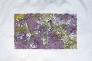
From close, the texture effects are interesting, but in the miniatures the ink looks a little blotchy. It was indeed hard to see which areas of the plate I had sufficiently inked and which I had forgotten, because the inks are relatively transparent and the brush works only on a small area at a time. Maybe a foam roller gets the inking more evenly, but then it soaks up so much ink which is a disadvantage.
Then I wanted to further explore the viscosity effect which might happen between the liquid pigment and the intaglio ink. The evening before I had read the explanation in Clare Ross and John Romano’s printmaking book: If viscuous ink was applied first as a relief, then a second layer of stiff ink would be rejected from the relief surface, but sink into the deeper layers of the plate for an intaglio effect.
I tried to exploit this the other way round: I inked my plate with Akua liquid pigment in purple red and yellow, using a brush to get it also in the crevices. Then I pulled a print on dry paper with the idea of taking off the ink from the relief, but leaving it in the crevices. Then I re-inked the plate with black intaglio ink (stiff) and a brayer, expecting it would stay out of the crevices because the liquid ink rejected it. In theory, I would get a bit of an intaglio effect in purple and yellow, and the relief would print as a black.
 The first print was made on dry sulfite paper, and it actually served just to take off the relief ink and so I didn’t have high expectations. It’s similar to the other relief prints on dry paper and I found them not very interesting compared to the richer inks on damp paper.
But for the second print I had prepared dampened Rives Heavyweight. I don’t remember to have used really good printmaking paper before, so was quite curious whether the good paper would support the overall impression of that print. This is how the print came out:

The yellow had mixed into the purple and earlier brown and had completely disappeared as separate colour, but I found the print overall very good. My reversed viscosity effect had indeed produced a kind of coloured background with black marks on top. But due to the irregularity of the surface and the way I had inked the plate, the black ink had also gone onto the lower areas of the plate and mixed into the colours. I think this is quite a successful print and it looks wonderful on the chosen paper.
Plate 4: Second textured surface made with joint compound
So finally I came to the fourth plate, made in the same way as the previous one but with different instruments to texture the surface. To get to know the plate, I made a first plain relief print using Akua black intaglio, applied with a brayer onto the plate, then printed on damp paper. I chose the medium weight drawing paper for this.
I wanted to make a corresponding print to the final one of the previous series. I cleaned the plate from the black intaglio ink and re-inked it with yellow and green Akua liquid pigment, making sure I get ink evenly distributed into the lower areas and crevices as well. Then I took a plain relief print on dry paper, which looked a bit pale, but I had expected this.


I re-inked the plate with black Akua intaglio using the brayer, and then made the print onto damp Rives Heavyweight paper.

I think the print looks really interesting. The plate has very deep marks which I couldn’t realistically expect to be filled with ink as an intaglio. But the black ink stuck to the borders of these crevices and created contour lines, whereas the coloured ink transferred from the lower areas of the surface onto the paper. The overall effect corresponds really well to the other print made in the same technique.
Finally I tried another approach using multiple colours. I applied green, yellow and blue liquid pigment with a brush, then took a print on damp drawing paper. The print came out nicely. The subsequent ghost print on damp rice paper confirmed my earlier observation: Liquid pigment transfers so well that almost nothing remains on the plate from which to create another print.


Concluding reflections
I undertook this extended experimentation series on Collagraph printing because I found the course brief a bit short and wanted to get more hands-on experience with the technique. The first two plates explored different ink-retaining surfaces and experimented a bit with relief and intaglio possibilities. I made a brief excursion into Suminagashi and combined it with textured surface overprint. I also explored printing from a textured surface using multiple colours and experimenting with viscosity effects.
I produced a lot of prints and feel I’ve barely scratched the surface of what can be done with collagraph! I encountered some practical problems:
– The PVA glue I used at first remained sticky even after it had dried for several days. It would glue to the damp paper, and the solution was to seal the plates it with shellac.
– Subsequently, I used Elmer’s Glue, which is also PVA, but dries in a day and then it’s no longer sticky. I sealed the cardboard back of the textured surface plates with it. The surface itself had been sealed with shellac. The plates worked well during printing, but when I cleaned them later with soapy water, the back got wet and became sticky again. So probably the best is to seal everything with some final layers of shellac.
– The collagraph plates bend after drying. I was reluctant to run them through the press and feared they might break, but luckily they didn’t. Rather, after a few runs throught the press, they were perfectly flat again. The problem was with the edges of the textured surface plates, as they began to crumble. I guess this was because they were somewhat irregular at the edges. I don’t know how I could prevent this in a hand made process where I just eyeballed the thickness of my joint compound layer. If I’m going to print again with the plates, the edges need some additional sealing because otherwise the edges will continue to crumble away. But either way, the life expectancy of the textured plates is limited, there are fine cracks everywhere which makes them look like ancient porcelaine. Actually the plates themselves are quite attractive!
I think this series of experiments resulted in interesting prints and provided me with some experience on which to build in the next project. I’m glad I took the time for some extra work.