The next phase consisted of combination prints, mostly based on monoprint and collagraph combination prints. I employed multilayer monoprinting, painted and textured monoprints, backdrawing, and Chine Collé. I used different types of paper and printed on dry and damp paper, by hand or with the press.
Multicolour monoprints
Two-layer painted monoprint and its ghost
I first inked the plate yellow, then drew into the ink with a stick to create some white lines and areas. Then I overprinted the plate with a painted monoplate, using the negative mask to protect the yellow background.
The yellow underprinting provides a unifying ground for the strong contrast between violet and blue-green. Subtle texture and colour effects result from the white areas in the underpainting. I liked the warm yellow colour. The ghost came out a bit weak but might work as an underpainting for other layers.


Backdrawing over monoprint
The first layer of this print was the ghost of a masked monoprint from a multicolour plate, hand burnished on drawing paper. Then a backdrawing was applied.
The backdrawing gives the print the necessary definition. I like the irregularity of the colours in the background and think it’s quite an interesting result.

Multicolour monoprint with hot glue relief plate overlay
This print was made from a loosely inked plate, then overprinted with the hot glue relief. The plate moved over the print which created partly double outlines. The resulting print is quite vibrant and lively.


Multicolour monoprint with backdrawing
The perspex plate was inked in transparent black, then painted into with Akua Liquid pigment in red and yellow. The liquid pigment rejects the intaglio ink whick results in white brushmarks with subtle hints of colour. The backdrawing was supposed to give more definition to the image, but the effect came out a bit weak. The lines are rather gray than black because I slightly thinned the ink with transparent base.


Texture monoprints
Textured monoprint with backdrawing
I placed synthetic wood shavings onto an inked perspex plate and printed this onto a sheet of newsprint, with the intention of texturing the plate for a subsequent monoprint.
After painstaikingly peeling of the shavings off the plate, I painted into the plate with green and red intaglio ink, using a brush to stipple over the surface. This printed as the first layer onto drawing paper, hand burnished. A backdrawing was supposed to give more definition to the tulip shapes, but again I found the effect too soft to be successful.


Monoprint with sprinkled background texture
The first layer of this print was a ghost of a tulip flower monoprint with white background. Then I inked the perspex plate in transparent black and sprinkled denatured alcohol with a toothbrush on top. I placed the positive mask on the print and overprinted it with the black plate. Finally a backdrawing was added.
The sprinkled background was a bit too weak and is hardly visible, but the technique might be interesting for future exploration. The alcohol dissolves the ink and creates spots in the plate which don’t print.

Multi-layer combination monoprints
Combination monoprint with masking, texture, chine collé and backdrawing
The first print was made on top of a light gray ghost from an earlier print on white drawing paper. I placed the positive mylar mask onto the print and draped some string over the entire area. Then I placed a plain transparent black perspex plate on top, turned it all upside down and ran the arrangement through the press.
Next I cut out tulip flower shapes from thin blue paper scraps and glued these firmly onto the print, using the brayer for pressure. Finally a backdrawing was applied.
I think this is a successful and interesting print, there are lots of elements I like:
– the unusual and unrealistic colour choice
– the dynamic effect of the light background lines from the string
– the backdrawing which is dark enough to stand out and has an interesting quality of line


The second print was made as a ghost from the above plate. I pulled off the mask and the string, then painted and splashed some denatured alcohol over the plate. Unfortunately the print came off too weak. I guess this was because I used dry paper with a rough surface (Arches text wove). Despite release agent and printing with the press, the ink did not come out dark enough, so the texture effects are only visible from close or in enlarged view.
A later overprint with a coloured flower ghost and a backdrawing improved contrast and definition, but the overall impression remained a bit too faint.


Monoprint and collagraph combination prints
Multicolour monoprints, wiping technique
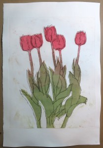
 The multicolour monoprints with wipled background became my favourite single-technique prints. They were made by inking the perspex plate over the transparent tulip drawing, either with a brayer (for plain surface) or with a brush (for brush textures), and then wiping away the entire background area with tissue paper and cotton buds. The interest comes from “insufficient cleaning” – there are still some ink remains which print as faint hints of background colour. I liked these prints so much that I resisted the temptation to add backdrawing.


Backdrawing over multicolour monoprint
This monoprint was made by inking the plate with the brayer, wiping away the background, and then applying a backdrawing to define the leaves and the flower petals.
Here is another monoprint, this time with the flower painted and printed on damp Canson Edition paper with the press. The left image shows the original print, the second is after a transparent black (gray) backdrawing was applied. The backdrawing is soft and can better be seen when the image is enlarged.


In both prints I like the backdrawing, but it’s hard to say whether the prints work better with or without backdrawing. This suggests that backdrawing doesn’t make much difference if it is as subtle as in the second print. On the other hand, it does change the overall visual effect. I think it adds a little strangeness to the print and moves it from a more painterly style a little closer to a coloured drawing.
Monoprint and collagraph
Finally I combined the monoprint flowers with the collagraph plates. For the first combination printwith the tonal collagraph, I chose I chose one of the flower monoprints with wiped background. In the resulting print I did not like the colour spots in the background area.
Therefore I made the three subsequent monoprints with the negative mask or cleaned the background area very thoroughly. In these follow-up prints I also varied the colour temperature between cooler and warmer red and green tones by adding yellow to the green and orange-red to the blue-red base colour.
I wiped away much of the background ink from the collagraph to obtain a subtle background effect. The tonal values looked differently depending on whether the flowers had been inked with the brayer or with the brush. On the smooth colours from the brayer the collagraph print came out clearer, but I also liked the liveliness of the texture mix in the painted flowers.


Monoprint, chine collé, collagraph and backdrawing
The last print presented here was made in multiple consecutive steps:
– The plate was inked orange-brown, then tulips were painted into the inked plate with denatured alcohol to create white brush marks. This was printed on damp Vellum printmaking paper with the press
– The paper was re-dampened, then dark red and orange tulip shapes were cut out and placed as Chine collé onto the paper (for easier registration).
– The cloth and sand collagraph plate was inked in black for the background and green for the leaves, then wiped intaglio style. The print was made with the press. This simultaneously glued the tulip shapes firmly onto the paper.
– Finally a gray backdrawing was applied to improve the definition of the leaves.
The resulting print would certainly look better with a different choice of colour for the monoprint and collagraph layers. I think I made the mistake of mixing inks for my orange-brown, rather than using clean colours, so the result became a muddy base colour, which wasn’t improved through black and green overprinting.
On the other hand, I definitely like the Chine collé effect and despite the muted colours, the print has interesting visual qualities resulting from the textures. I think it was an important learning experience and future prints in this technique should come out better if I improve the colour choices.
