The experimental printmaking phase had left me with lots of interesting prints and approaches to follow up, but I had not worked towards creating a coherent series of four prints around my subject. I realized this only when I looking through the prints to try and select four prints I could possibly present as project result. There were several prints I considered as favourites and others that had beautiful elements despite less successful overall effect.
At first I was disheartened because I had put so many work in making the five plates and then making all kinds of combination prints. I did not know how I might arrive at a series with inner coherence fom what I’d done so far. Then I decided to take a more systematic approach and analyse why there the prints did not cohere and which were the successful bits in my prints so far.
As reasons why the prints did not look like an ensemble I identified
– different paper types with different surfaces and different hues of white
– different paper sizes: Some cut to fit through the press, others with varying margins
– a whole lot of different techniques applied in explorative fashion, i.e. somewhat at random
– experimentation with colour, sometimes successful and sometimes not, resulting in arbitrary colour combinations when a set of prints was placed next to each other
My conclusion was that I needed to address these points and develop a concept that integrated the most interesting and successful bits of my prints so far.
The first aspect was choice of paper. I wanted to use the same paper for my series, all cut (or torn) to the same size, which would provide a formally unifying characteristic. But paper choice depended on the choice of technique. For example, with the collagraph plates, I would have to use the press and dampen the paper, which worked best with medium to heavyweight printmaking paper. On the other hand, fine monoprint textures came out best on white drawing paper because of the very smooth surface. If I was to use a technique that required the press, I was at the same time limited to a paper format that fit through the press, which meant that the side margins could be no larger than about 2 cm.
With this in mind, I went through my prints and identified the monoprint and collagraph combination prints as my favourite technique. I also found the effects of warm vs. cold colours interesting. I liked Chine Collé as well, but it tended to soak up the ink of the collagraph overprint as if there was no overprint at all in those areas.
Finally I came up with a concept for the series of four prints. I wanted to use two collagraph plates, the cloth plate with tonal values and the joint compound plate with the cracked background. I wanted to print these over monoprint flowers with clean background. I also wanted to juxtappose warm vs cold colour hues. The paper I liked best for collagraph was Canson Edition (250 gsm) which is fairly bright and not overly rough so it would bring out sufficient amount of texture. It would also look good with the embossing effecs of the joint compound plate.
The two collagraph plates had the tulip image in mirror orientation, because I accidentally worked out my master drawing directly on the cloth plate and corrected the error by reversing the image for the other plates. I thought that including prints in different orientation would add an element of interest.
I planned to make 8 prints in total from which I’d hopefully be able to select four as my final series. I prepared four sheets of paper for the first plate, then somewhat arbitrarily started with the joint compound plate and a set of cool colours.
Monoprints with the joint compound plate
For the first print, I had dampened all 4 sheets in advance, and then began inking the perspex plate. After printing the first layer, I needed about an hour for inking and wiping the collagraph plate, and the paper dried considerably. Unfortunately, the collagraph plate misaligned after registration and I didn’t notice, so the print came out at an angle.


The print looked good nevertheless but I learned that I’d better ink both plates first, then dampen the paper, and then print both layers consecutively. I took great care to handle the paper with clean hands and subsequently tried to avoid unnecessary movements once the collagraph plate was placed on the monoprint, to avoid the risk of accidental misalignment. I also managed to work out the two pressure levels for my press and was able to reliably switch between the low setting for the thin perspex plate and the high setting for the 0.6 cm collagraph plate.
The next collagraph was printed onto a painted monotype, again with a cool colour choice. I had found my wiping of the collagraph background too thoroughly, compared with the intense tone of earlier prints from that plate, and so tried to apply more ink and wipe away less. This print had more background tone and registration was successful


The third monoprint was painted again, but I added medium red to the flowers and some yellow into the green for the leaves for a livelier effect. The overprint was in the same blue-black ink mix as before. This time, I inked only the background because I found the burlap texture less successful. I wiped the background still more gentle and the resulting print looked the way I wanted. From close and enlarged, the background cracks can be seen as embossments in the paper.
The fourth print from this plate was made in the same technique, but with a choice of warm colours. The painted monoprint used orange-red for the flowers and yellow-green for the leaves, and the collagraph background was inked in Van Dyck brown, then gently wiped.
I found the two prints quite successful and thought that two corresponding prints from the cloth collagraph would make a nice ensemble.


Monoprints with tonal value collagraph
Thinking through the prints so far, I wondered whether I could also integrate prints with dark background into the series. I had particularly liked the transparent black background and the blue coloured tulips in earlier prints, so went ahead with a corresponding monoprint. I painted the tulips with Akua Liquid Pigment into the dark intaglio ink, using the rejection effect between the inks to create white and coloured marks with the brush. The monoprint was overprinted with the collagraph inked in blue-black and wiped intaglio style. As with the previous plate, I wanted to retain some more of the ink in the background area and therefore wiped thoroughly over the flowers and gently over the background.


The next two prints were made as painted monoprints with thoroughly wiped background, one in cool colours, the other in warm colours. I’m including the pictures of the monoprints because I found the change resulting from the collagraph overprint so stunning
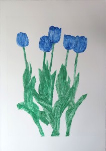


By this time I began hesitating between two approaches: Making a series from two prints off each collagraph plate, or building the series from the cloth and joint compound collagraph only. Placing the two light background prints from this set next to the two of the earlier set, they corresponded nicely, but the ensemble was less interesting than I had hoped, compared to the three prints so far from this set.
I reflected what might work well as a fourth print in this set, and thought I’d like one with a coloured background, so I’d have two with coloured and two with white base colour. I wanted to stay with the warm colours to match two cool, two warm colour prints, and concluded that with the brown background colour, I’d have to choose a relatively light colour or the brown would sink in or look “dirty”. I remembered how I liked the warm yellow of the only multi-layer monoprint I made. I was unsure whether this would look good but wanted to give it a try.
I think the brown collagraph overprint has a stunning effect and completely changes the colour effect. I would not have anticipated this effect and find it very successful. As a result, I decided to stay with the second set of prints as my series for this project.


The series of four prints
I’m placing the four prints next to each other to show the ensemble effect. Of course I know that there would have been a million more possibilities to explore and compared to that, I might be judged of having made obvious choices. But I think this is a successful series of prints, technically well executed with interesting colour effects. I will discuss the potential I see for further development in the supporting statement in a separate blog post.