My idea for project 15, the final project of this course, was to develop a series of prints around tulip flowers. Before making the decision, I also considered cats as a subject, taking into account recent tutor feedback with some encouragement towards this direction. But I wanted to take a subject that would be still enough for me to study from life. The problem with cats is that they’re always moving and this makes it hard to depict them unless I’d be working from a photo. I’m very fond of flowers, so I thought for now that would help to satisfy my interest in closer visual study without resigning to photos. I thought about lilies too, but then chose tulips in a pot. I made some initial sketches to explore the possibilities of the subject and develop ideas for a viewpoint and the composition of future prints.
Then I wanted to look around a bit how others approached the subject and did a google web search with ‘tulip print’ as my search term. Quite a few images came up and I selected several I liked. They represent a variety of different approaches. With a few exeptions, they were made from contemporary artist, with many contributed by craftmakers. I guess studying towards a painting degree I’m expected to search for “real artwork” but it’s not that easy to locate tulip prints by respected artists.
But actually, I do like what I found so far and find it inspirational already. I’m not yet in a position to know what I’m going to develop, and I also see the danger of muting myself by looking too much at what others have produced already.
Painterly approaches
I found two prints which I suppose are both monoprints, the first by Amy Akers, the second by Julia Ayres.
The Akers print reminds be a bit of Van Gogh paintings, because the lines are so fluid and irregular even for the harder materials like wood and ceramic vase. It gives a very lively effect to the image.
Ayres is the author of a monotype printmaking book and has much experience with the technique. The print includes a chine collé blockprint (the eye) which I think doesn’t very well integrate with the print as a whole. The monotype strongly corresponds to the tulip intaglio print below, maybe that plate was also used in the print. I particularly like the faint remainders of the red background colour from the wipe away technique.


In the ‘painterly’ section I also include these two etchings, the first by Josefina Hernandez, the second by Louise Stebbing. I think both are very exciting compositions with an unsusual viewpoint, the first by cropping and the second by using the wilted flowers as models.
The Hernandez print makes me think about collagraph prints that use different ink retention properties of various surfaces. The flowers would be a surface retaining much ink, whereas the light background results from a smooth surface which was wiped almost clear. This is apparently the same principle at work as in etchings when collagraphs are used as intaglios!.
The Stebbing print is quite different, and I don’t understand the technique. It’s a wonderful play with transparency, lines and shapes, very mysterious in effect and very atmospheric.


“Botanical” approach
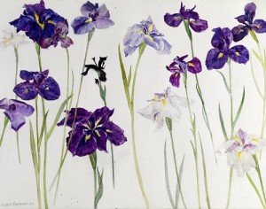
 I found a print by Sally Winters which reminded me of botanical drawings and watercolours by Elizabeth Blackadder, which I’m including here for reference. It’s in the tradition of botanical drawings, of which I’m including an example by Jacob Marrel (made c. 1635-45)
It’s not exactly what I’m interested in doing, but I still like it because it’s so delicate. Sally Winters’ print is an etching printed in colour . There are only only traces of a darker colour for outlines which creates the very fine style.

Winter presented some pressed flowers and another colour etching. I’m finding both very inspiring although I know it’s just too fine and delicate for me. I’m more at ease with a bold and expressionist way of working. But I do appreciate the visual qualities and in some of my tulip sketches I think there comes up something more sensitive and detailed that what I usually do.


Graphical approaches
Here I’m referring to bolder, black-and-white or restricted colour approaches that look a bit like poster prints. I guess this is the most frequent approach to linocuts, in particular single-colour linocuts. It promotes a stylized depiction that reduces detail and tonal values.
The first print (ted tulips) by Abigail Davidson is a linocut, but could have been made with stencils and looks a bit like the potato prints I used to make as a child. Nevertheless it’s nice in its simplicity and how it includes different stages of the tulip flower life cycle. The second print from “Anna’s Drawing room” impressed me by the loose cutting and the bold shapes.
It’s in stark contrast to the other two linocuts from Lapwing Printworks (left) and Rosamund Flowler right) with much more delicate and detailed cutting of lines, shapes and patterns. The Lapwing print has an interesting composition with a strong angle, although the cutting is a bit bland and not so interesting. The Fowler print reminds me of linocuts by Jacques Moiroud (as explored in resent research, see http://ocaprintmaking1.blueconcretemoon.com/?p=1819). I appreciate the technique but can’t help feeling that it’s overdone, there’s just too much pattern going on and this is a bit disturbing.


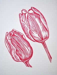 I also found a linocut of just the flowers with a pattern depicting the texture of the petals (published under the name Prionta Lionoile). It has the character of a detail study, but by enlarging it to take up the entire image space it becomes an almost abstract composition and the cutting patterns begin to create tonal values of light, medium and dark red. It is an interesting approach. I guess it works best on only a detail of the flower – in a group of tulips with leaves the image might become too busy overall.
Tulips in art and design
The initial google search was followed by a search on the collection of the Metropolitan Museum of Art, search term ‘tulip’. There came quite a lot of hits but most were not directly relevant for what I was interested in, for example more botanical drawings or depictions of tulips on vases or in rugs. I still found a few items I’d like to include here for a closer look.
Two drawings captured my interest, one is a study of tulips by Charles Demuth and the other a charcoal drawing of several tulips by Lilian Westcott Hale. At the time of writing this, I’ve done some more tulip studies myself. I realize that the Demuth studies are much looser that what I’ve done so far, but I seem to have been similarly preoccupied with the tonal values of leaves. Demuth apparently wanted to capture this in the watercolour wash. By contrast, I tried to capture this with hatching at first, then making colour studies with coloured pencil, and finally tried watercolour washes. Demuth’s drawing is looser and more impressionistic, whereas I tried to depict the shades the same way I saw them. I think Demuth’s drawing with wash is more sensual than mine are, but I feel still too preoccupied with analysing what I see before I can let go.
The Lilian Westcott Hale drawing inspired me to try out charcoal as well. What I admired in the drawing was the interplay of figure and ground, with white shapes before dark ground vs dark shapes before white ground. The light contours in the dark tulip shapes are intriguing. I tried to do something similar in my sketches but found it hard to erase the charcoal to obtain white lines inside a dark shape. I guess I was a little too impatient, it probably takes much more time and patient study to achieve the kind of results as seen here.


I even found one tulip print in the Metropolitan Museum’s collection, it’s an aquatint by
Joe Andoe. I do not particularly like the print, because I think it’s a bit kitsch with the stylized clouds in the background. Nevertheless I’m impressed by the simplicity of the flower shape which is enough to make it resemble a tulip.
And then finally, the tulip chair by Eero Saarinen which was really a surprise because I’m quite sure to have seen it already but have never been aware where it came from. Now having studied the forms of the tulips, I recognize its elements! It’s how the stem sits in the center of the flower, and it’s so smooth, straight and perfectly even in form. The green leaves have folds and wavy shapes that are really like the armrests of the chair. It similarity just makes me smile.


Web references (all accessed 6 April 2015)
Amy Akers, Pink Tulips http://www.artspan.com/art/2345921-98287/Printmaking/Giclee/Still-Life/pink-tulips.html
Joe Andoe 1993 Portfolio of 6 Aquatints: Tulips http://www.metmuseum.org/collection/the-collection-online/search/487026
Julia Ayres artist website http://ayresprintmaking.com/
Elizabeth Blackadder Irises watercolour http://stilllifequickheart.tumblr.com/post/3971525312/elizabeth-blackadder-irises-2010 )
Abigail Davidson https://www.pinterest.com/pin/363454632399481219/
Charles Demuth 1926 Tulips (watercolour and graphite) http://www.metmuseum.org/collection/the-collection-online/search/481640
Anna’s Drawing room http://annasdrawingroom.co.uk/2014/03/07/lobsters-on-a-postcard-please/
Rosamund Fowler – The tulip vase http://www.woodengravers.co.uk/gallery76_01.html
Josefina Hernandez http://www.josefinahernandez.com/printmaking
Prionta Lionoile https://www.pinterest.com/pin/165436986284139715/
Jacob Marrel ca 1635-45 Four tulips watercolour botanical drawing http://www.metmuseum.org/collection/the-collection-online/search/337769
Lapwing Printworks https://folksy.com/items/4002-Tulips?shop=yes
Eero Saarinen Tulip Armchair 1956 http://www.metmuseum.org/collection/the-collection-online/search/482088
Louise Stebbing at Skylarkstudios http://skylarkstudios.co.uk/index.php/prints/detail/49/
Sally Winter Etchings https://www.etsy.com/listing/77904353/tulips-a-botanical-etching-with-aquatint
Sally Winters Facebook Page https://www.facebook.com/pages/Sally-Winter-Etchings/352823438130241
Lilian Westcott Hale undated, Tulips http://www.metmuseum.org/collection/the-collection-online/search/10979 Charcoal