The next monoprints were experiments with different subjects, painted onto a plate and then printed by hand or using a press.
Blue pitcher and basket
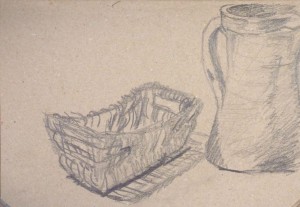
For the first try, I chose a blue ceramic pitcher and a little brown basket – two relatively large objects for an A4 format.
I made two quick sketches in an A4 sketchbook on brown paper – the first one with 9B Graphite stick, the second one with coloured wax crayons. I had to decrease the size of the objects to fit the format, which I found difficult. In the first sketch, I centred the basket, and then the composition went out of the format. The second composition fit better on the paper, but I didn’t like handling the wax crayons – they were melting in my hands, a messy thing.

I then proceeded to making monotypes. I chose the large glass plate as printing plate because I wanted to work in a comfortable format. I spent some time thinking about the colours, which ones I wanted and how I might mix them. I identified
– Medium blue for the pitcher and a dark tone for the shade inside the opening
– A medium brown tone for the basket, and a dark brown for the inner areas in shade
– A light orange for the background
– A reddish black for the cast shadows on the background
 I made a series of around 10 prints from the large glass plate on A2 white paper. I selected three which I liked best.The main problem was that the colours dried so quickly that by the time I had finished painting, the elements were already half dried. I experimented with adding more water, using extender, pre-mixing tones, soaking the paper – but nothing really helped. I think it has to do with the extremely dry winter climate here in New York. I know that people use air humidifiers to prevent their wooden furniture from cracking. During winter, my skin seems to be in constant need of creaming. So it shouldn’t be surprising that water-based printing ink dries quickly as well… It’ll be interesting to see how it’s in summer, where the climate here changes to very hot and humid.


I thought about trying out my watersoluble oil colours for monoprinting. They can be extended with linseed oil and I’m quite sure that medium would stay workable longer. This might permit a more comfortable and less stressed working style.
While doing the series, I began incorporating something I had learned from the research on Degas – using the brush to create marks, rather than making an even coating on the glass plate. I wasn’t able to deliberately exploit the effect, but at least I began observing my own mark making, which I perceived as a step forward. Working with the effect creatively may need more practice and also a medium that doesn’t dry so quickly.
I wasn’t quite satisfied with my colour mixing. The first colours were fresh, but I found the black to dominant. I tried to dissolve it to make it lighter, and later mixed in white into all the colours, but I think the colours went muddy. This is also something to practice – obtaining the desired tones from my base colours. A bunch of little palette knives would be handy for mixing, probably better than using the brush as I did.
I think my composition was a bit too complicated – the shadows were difficult to read and the little basket with handles was tricky, too. Over the course of the series, I did simplify the shapes and tones, but the objects remained too complex.
Now after so many negative aspects, I nevertheless like the entire series of prints, despite the shortcomings, for its boldness and the energy which may be a result of using bold brushes and having to work fast. Some prints are better than others, but I like looking at them and seeing the irregular brush marks. Somehow the prints suggest to be worked over, for example using watercolour to bind the objects together with a wash, or linear media to increase readability using line. I peeked into Assignment 1 and understood that prints made in the projects of part 1 are to be submitted. This is different from my other courses, where each part was finished by a separate assignment piece. I’m ok with this, but it means that I’d rather not work over the best prints in order to have them available for assessment. So I might use the weaker ones to experiment with other media and techniques. This also gives me a good reason to always make some prints in excess for each project.
There is also the chance effect to consider. Looking at this series, I realized how differently each print came out – in some prints the colours were barely visible, in others they were intense. Sometimes the brush marks were strong, in other prints the colours were laid out more evenly. One aspect is that it will take time and practice to learn to use these effects to express something. The other is that the more prints I make, the greater are the chances that among the series there will be one or two where chance and design work together to create an interesting and successful result. Or maybe some day I’ll even be able to “control chance effects”? It is a bit like when I take pictures – I take masses because I know that often enough, only one or two of them will be really good. But these stand out, and they are not necessarily those I had initially envisaged to be the best.
To summarize:
– I like working in a large format, but it uses up much colour and at times that felt wasteful – in particular because the paint was drying so quickly that it wouldn’t transfer to the paper by the time I was ready with the plate
– Premixing colours is helpful in the workflow, but I must be careful with white as it seems to result in muddy tones
– I’ll try watersoluble oil colours – maybe I can work with them longer
– I’ll try to use simpler objects and simpler compositions
– It’s a good idea to make a lot of prints – they might come in handy for further experimentation
Zucchini and onion
 I selected two more objects for another still life: Green zucchini and red onion, placed on a blue sheet of paper. The objects had quite intense colours which I liked. I made a coloured sketch in the brown sketchbook first, using oil pastels. Then I used watersoluble oil paint for the monoprints. This worked much better than water-based printing ink – it dried much slower, giving me enough time to actually paint the composition. It was a much less stressful experience than the first monoprint series.
 In the first print I used the back of a spoon to apply pressure, but this didn’t work because it left stripy marks on the print. For the other two prints, I used the lower side of my inner hand and applied moderate pressure. I liked the third print best because it had the printing ink quite evenly distributed with sufficiently intense colors. The print size is A3, I used the smaller glass plate to paint on.
I liked the brush marks that were transferred onto the paper and tried to get them somewhat homogeneous and small-patterned. I also tried to use mark making to support the objects’ three-dimensionality.
Blacks are still too heavy as shades. It was a simple solution for the dark colour but I’d like to find tones that integrate better into the composition. “Shades are coloured” I once learned and don’t get it out of my head, although I’m not yet able to apply this wisdom.
A potted plant
I had noticed the plant at night, when I looked out of the window and saw the plant’s interesting dark silhouette against the lighter outside. I began the series with a pastel sketch of the plant on its tray, in the brown paper sketchbook. I found the shapes of the leaves difficult and complex and made a pencil sketch to use as an underdrawing for the monoprint.


I chose a large perspex sheet rather than the glass plate this time, and found this much easier to handle because I didn’t fear to cut myself. I stayed with watersoluble oil colours and experimented with dampening the paper.
After painting the leaves in red and green, and the pot in dark gray and olive green, I had mixed a rose-orange coloured background which looked quite weird as a colour. To moderate the effect, I chose light blue paper for the first print. I made the second painting directly on the plate with the first painting serving as a guide, but chose a gray background and printed on damp white paper. I like this second print a lot because the colours of the plant are so intense and the shapes are so wavy.


Landscape – Baltic Sea
 From a week-end at the Baltic Sea in Germany 10 years ago, I had retained some photographs and selected two: A view on a village and a view onto the sea. I made an oil pastel sketch of the village in the brown A4 sketchbook. What I liked in the photo was the deep blue sky and the intense green tones of the grass. The trees where blueish green, from almost black to silvery. There were some peasant houses in the background. Making the sketch I realized the composition was quite complex, but I wanted to try out monoprints nevertheless. I decided to stay with a small format because this usually helps me to let go of detail.


 I made three monoprints, the first two on dry paper with hand pressure, and the third on damp paper, using a printing press. I found the first print quite pale and applied a thicker layer of colour for the second. The third was a ghost print of the second, using the remnants of the ink, but with damp paper and the higher pressure of the press, there was still quite a lot of ink transferred.
I wasn’t very satisfied with the prints because I found the landscape hardly recognizable. Brush marks were too bold to be interpreted as natural structures and so they were not able to support the composition. But I was pleased how well the ink transferred when I used damp paper and the printing press.
 For the next monoprint, I stayed with the smaller plate (slightly smaller than A4) and A3 paper, and decided to paint the view onto the sea directly onto the plate, without preparatory sketch or underdrawing. Again I used damp paper and the printing press and was satisfied with how intensely the colours transferred. I think the composition works better than that of the village because it is simpler. I also like that I left some of the plate without paint for the white paper to shine through. This might work well for depicting white foam on the water or for some clouds.
My cat Gina looking out of the window
I intended to make monoprints of my cats and thus made sketches of Gina in the sketchbook while she was resting.


 But then I found the sketches not the best I could think of as compositions for a monoprint. I thought that an upright silhouette might work better. On the next occasion, I took photos of Gina while she was looking out of the window. For the monoprint, I painted directly from the photo on the computer screen to the small glass plate, without prep sketch or underdrawing. I made only one monoprint, using light and dark brown tones for the cat and blue-gray tones for the table and the window background.
I really like this print. For one, I recognize my cat and how attentive she is when observing the outside. Technically, I like how I left out the areas of white fur where the white paper is visible. Later I thought I could have left out the table as well so that it would print as white too, and indicate the windows with lines instead of shapes. The analysis was similar to what I do with watercolours at the beginning of a painting, when I search for the lightest areas to leave without paint.
Dried Avocado thisle
The dried Avocado thistle was bou ght as a decorative item some time ago and I’m still fascinated by the shape of the petal leaves and the grassy interior. I made a preparatory sketch in the brown sketchbook of the underside of the thistle. This view has the more interesting petal shapes. But for the monoprint, I chose a view from the side because I thought this would make the plant more recognizable for a bolder approach.
In the first print, I wanted to experiment with mark making using a bamboo pen to scratch lines into the ink on the plate. I thought this might work to scratch out the lighter areas and the fine lines of the central area of the thistle. I used dry paper and the press. But I wasn’t satisfied with the result. I found the colours too faint and the brush marks too bold so that the finer scratch marks were hardly visible at all.
The second print was a simple ghost print using damp paper and the press. It surprised me how different the effect was and how much better the paint transferred to the damp paper, compared to the dry paper.
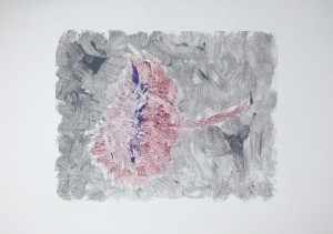

 For the third print, I made a new painting on the plate with different colours. I included a very dark tone to indicate shadows below the thistle and its stem. I used damp paper again and the press. I like this print best because the colours are more intense and the shadows create a sense of space around the thistle. I also like that the background is less dense.
What did I learn, what did I discover?
Dry vs damp paper, and using a press: I found it quite interesting to experiment with damp versus dry paper, and to use a printing press. The press isn’t really necessary with monoprinting but I’m glad I can gain some experience with it. In particular I found it a bit tricky to select the amount of pressure when using a glass plate for the monoprints – I wouldn’t want the glass to crack under the press! Also, I was planning to do some gelatine printing where the press cannot be used. But for now, I just enjoyed using it.
White space: The aspect of leaving out some areas in the painting to have the paper look through seems to be important. Course instructions pointed to this right at the beginning of the mark making exercises, but it was only towards the end of this series that I slowly began to become attentive to its effects within a composition. I would like to develop towards using less ink and create shapes by defining their boundaries rather than painting them in a thick layer of colour, thus making use of the paper colour. This will require some more experimentation and practice.
Some guided reflections
Colours in monoprints: After the initial monochrome experiments, I included more and more colours. Personally I think some restriction is beneficial, as opposed to using too many colours. I also prefer mixing colours to tones that do not look like right out of the box. Unfortunately this often leads to mudded tones. For example in the thistle prints, I wanted a pale violet and tried to mix it from red and blue paint. But the red was too much of an orange tone and mixing in blue resulted in brown rather than violet. So mixing can work, but it requires the right base colours. In my case, I might complement my palette to include a blueish red as well.
Monoprints in different sizes: I experimented with one small and two larger plates. In the end, I preferred the smaller plate because this helps me focusing on the essential and reducing detail. It also works better for monoprint because the smaller plate can be painted more quickly and is ready for printing before the first areas have dried already.
I didn’t experiment with using only parts of a plate though. This might work nicely for compositions in unusual formats.
Recently I made a small gelatine plate which I wanted to use for monoprinting, but then found that it was too soft for putting on paint with brushes. I did not want to spoil the gelatine surface with brush marks and so postponed gelatine printing until the next project. I think gelatine printmaking is better suited to applying paint with a roller, and I’m quite curious how it will work with stencils.