I had assembled quite a few things for experimenting with textures on the inked surface, but my first attempts to make marks by pressing items onto the plate did not work at all. I used black Akua Intaglio ink, and it turned out to be much too stiff for the technique. So I switched to using my materials as tools and created some marks for a print. The first print looked interesting, but there was not enough pigment left after that and so the ghost print was too faint.


Next I tried some bought stencils from craft supplies. The first print had the darker black tones, but the ghost prints after the stencils were removed from the plate looked really interesting. An ongoing problem with using plastic stencils is that it is so difficult to adapt the pressure of the press so that the stencils won’t slide on the inked plate.


I mixed the intaglio ink with transparent base, hoping this would help getting textures on the plate by pressing objects onto it. I made a second try, but no avail. So I made another print using the items as tools. I made no ghost print, in anticipation that it would look dull anyway.
 During a coffee break I reflected on what I’d done so far and realized that my textured objects did indeed leave marks on the plate – I only had to run them through the press! So I made another attempt, placing some stuff on the plate. And indeed, the first print was again uniteresting, but when I removed the items from the plate and took the ghost print, all the textures had transferred nicely.


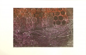
Next I took up the suggestion of using more than one colour to ink the plate and decided to add violet and orange to my black. I had the idea of creating a landscape at sunset and used some corrugated cardboard to represent gates over hills and fields. The first print came across nicely, but the black did not transfer well. So I decided to make a layered print with a second layer in black. I used the first print to lay out my textured items, then pressed the black plate into it to obtain a textured black plate. Looking at this plate, I realized it would probably cover much of the colour and I was tempted to simply make another monochrome textured print to capture the interesting patterns. I also considered wiping away the upper part of the plate to preserve the orange, and print black only into the lower areas. But then I decided to stick to instructions and just overprint to see how the result would look. It is indeed quite dark and has a totally different character from what I originally intended, but it does look interesting.

After another coffee break, I decided to have another go at creating a landscape print from a textured plate. I found that the corrugated cardboard looked a bit like apartment houses, and I thought of the New York City skyline before a sunset sky. Using a similar technique, I made the first print from a plate inked in orange and violet, wiping off a little circle for the sun. I overprinted using yellow, which changed the character of all colours into warmer tones. Then I made a second textured plate using pieces of corrugated cardboard for the skyline and clingfilm for the lower parts. I wiped the ink off the area above the skyline to retain the warm colours of the sky. The result is quite close to what I had in mind.

The next prints were made using soapy water, which is the solvent for Akua Inks. I drizzled some drops onto the inked plate and then moved the plate so that the liquid would wander around. The effect was very unimpressive, nothing much happened on the plate. In the print, I think the effect is not much different from selectively wetting the paper – the wet areas take on the ink differently. The ghost print confirms that the areas in contact with the solvent had transferred more of the ink, leaving almost white traces in this second print.


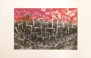
Then finally I tried out making direct marks using Q-Tips and kitchen paper towel. I returned to the idea of the Manhattan skyline – the view as a semi-island when looked upon from the south. I inked the plate in two colours, orange-violet in the upper area and black in the lower area, then made my marks directly into the plate. The image is very stylized, but I do like the print and the paler ghost.

Some reflections on the process
I was determined to let this series of prints not let go out of control as the previous did, because I was afraid to spend too much time on single aspects of this project. I think I succeeded in keeping the series manageable, but at the same time I realized that I did’t get as far as in the other project. It felt like playing a bit with effects, but not digging deeper and not fully exploring the potential. I guess this conflict between working thoroughly and explorative versus the need to get on with the course will accompany me until the end of this course, if not until the end of my OCA studies! Maybe a workable solution is to spend more time on those ideas and techniques that have particular appeal to me personally. On the other hand, a seemingly uninspiring technique might need some the extra time to reveal its potential. So basically, I don’t know how to solve the conflict and will decide each time anew.
A very important learning point from this series was how I could transfer textures to my inking plate. I had played with chance textures in the previous series, those left by the plastic stencils on the inked pvc plates. This time, I discovered a working procedure how to create textures on the plate. I’m really glad that I can use a printing press for this! It was also interesting to learn that the first print only served to create the texture on the plate, while the main interest was with the second print from the textured plate.
It was also good that I began to take the freedom of wiping off ink where I thought it would disturb the result. It may sound strange, but I tend to follow instructions to the word and it’s an act of liberation to just follow my instinct and do things differently, when I think it’s good for the print.