Find some printmaking artists who use back drawing. Examine how they use it and evaluate it. Does it work well? What can you learn from it? Make notes in your learning log.
I did some preliminary research on the topic, but somehow wasn’t able to locate artists that employed back drawing. Then by chance, I came across Paul Gauguin’s prints and discovered that one, he was seen as one of the groundbreaking artists for transfer drawing and two, there was currently an exhibition at the Museum of Modern Art (MOMA) in New York: Paul Gauguin Metamorphoses. So I decided to focus this research point on only a single artist and take the opportunity to make an exhibition visit.
I’m currently on a mini-pause to the printmaking course because working towards assignment 4 of the watercolour course, but I couldn’t postpone the visit any longer because the exhibition was soon to close. I wasn’t happy about switching between courses because it meant that I went with my mind entangled in a different art medium, but then it turned out to be no problem at all. I am so glad I went because the exhibition was so exciting and inspiring. It consisted of three large gallery rooms full of Paul Gauguin’s artwork made in relation to his travels to Tahiti. There were many wood prints, monotypes and oil transfer drawings, but also some oil paintings, wood reliefs and sculptures, and some ceramic works.
I made many notes and even a sketch from one of the transfer drawings that I found particularly interesting. I’ll try to summarize the main points and observations.
Wood prints
I don’t remember to have seen real woodprints (not reproductions) like these before. They have a special quality, very rough and “primitive” and I think this effect was intended by Gauguin. They all show the marks of the tools that were used, and they are not polished to fine detail but left raw and vigorous. The prints are delicate and atmospheric nevertheless.
I discovered interesting details about how the tools were used. Gauguin seemed to have carved very fine guiding lines to outline the motif, and then carved away those areas not to be printed. But for carving these larger areas he used a broader tool and did not get exactly to the edges of the fine carved lines. This resulted in very subtle double contours in some woodprints, and I really liked the effect.
 There was a sparceness in his linework which corresponded extremely well to the motif. For example, he made prints of night scenes lit by an open fire. The figures and objects were indicated only by a line contour. So most of the wooden area was inked and printed in dark, with light lines to indicate the figures, resulting in very subtly lit images.
In one print showing a female figure, I wondered how he achieved the soft shadings that separated the two legs, without using a clear cut line. He had carved away part of the backgroun, and here the legs were set off a white background. It looked to me as if he had sanded off the front area of the left leg up to the middle. In this area, the dark ink was lightened up to a medium tone. The right leg began where the ink was very dark again. The method was also used to set off parts of the dark figure against the dark background. This was very impressive and I found the technique quite inventive.
Gauguin’s prints in the first series presented, the Noa Noa suite, were quite uneven, but tremendously atmospheric. By contrast, prints from the woodblocks later made by his artist friend Louis Roy were technically “superior” in that they had very evenly printed forms with clear contours and clear colour separations. The interesting thing was that Gauguin’s rough and seemingly imperfect prints had much more character and appeal than Roy’s versions. I think this is very important to consider when making prints – the strive for technical perfection is not necessarily something that improves the overall result. More subtle ways of inking and printing can greatly enhance the individual character of a print.
Ceramics
 There were several ceramic objects exposed. I particular liked a vase, “decorated with Breton Scenes” (1886-87). It was about 45 cm high and 12 cm in diameter, made of dark brown clay, and colourfully glazed with a painted motif. The top and bottom rims of about 8 and 4 cm were dark in transparent glaze, while the middle area of around 30 cm had a white background. In this areas there were painted figures and trees. Especially nice was how the trees extended above the area of the white background to the top rim, like an element running out of the picture space. This detail was recurring in the so-called zincograph prints Gauguin made at the same time, the Volpini suite
Zincographs: The Volpini suite
 These were a series of prints in yet another printmaking technique Gauguin experimented with. I think it was something like drypoint etching combined with partial inking/wiping of a printing plate – monoprinting on a zinc plate, maybe? These were printed on yellow paper and several had unusual printing areas, for example a rectangle having two edges rounded off by 1/3 of the image area, or another which was shaped like a part of a cylinder laid out flat (see picture). Gauguin seemed to have experimented with image formats, or maybe it was the result of having only odd-shaped zinc plates available. Other prints had parts of the motif extending over the actual printing rectangle. The overall impression was really nice.
I realized that until now I had taken my rectangle printing plates as granted and that there’s much more potential for experimentation with differently shaped printing areas.
Monotypes
The exhibition presented several monotypes, mostly made in watercolours. They were quite faint, but had a very delicate quality to them, with fine lines probably added later on top of the actual print.
One of the monotypes I liked best was “Still life with pitcher and fruits” (c. 1899) which resembles the watercolour still lives by Paul Cezanne. But Gauguin’s style was different, with clear lines and simplified shapes. This one was made in gouache which resulted in somewhat intenser colours. It’s not very large, about 20 x 30 cm.

What struck me over the series of monotypes was how the style of Gauguin’s preparatory drawings resembled my own drawings for the stencil monotype series. In my own drawings, I had deliberately tried to simplify in order to obtain shapes that I could cut out in paper. Discovering a similar kind of simplification in Gauguins drawings and paintings made me think that maybe this was influenced by his printmaking.
Later reading of the Wikipedia article on Paul Gauguin informed me that this simplifying style in painting was termed ‘Cloisonnism’ by art critic Édouard Dujardin to characterize paintings “with flat areas of color and bold outlines” resembling the cloisonnée enameling technique. In this painting style, classical perspective rules are not followed, and this is something that I find very typical for Gauguins paintings – they all have a strange kind of perspective in them. Gauguins style is said to have evolved towards Synthetism, where “neither form nor colour predominate but each has an equal role”.
Oil transfer drawings
The exhibition info explained that Gauguin made his oil transfer drawings by covering a sheet of paper with oil paint, then placing a second sheet on top, and then drawing onto the clean second sheet with pencils. Afterwards, he pulled the two sheets apart and the actual artwork was on the back side of the drawing, transferred from the first sheet.
I really liked the combination of lines and shades of paint in these backdrawings. Unlike my own attempts, where the line work was more or less obfuscated by areas of ink unvoluntarily transferred, those of Gauguin were better controlled, with areas of colour supporting the linework.
Three of these drawings I found very remarkable. The first was part of a book cover for “Catholicism and the modern mind”, where Gauguin discussed and critiqued catholic moral beliefs. The two outward sides of the book cover were oil transfer drawings made in 1902. I made a sketch of the title page to study the distribution of light and dark more closely. The drawings were made on brown paper and I found it fascinating how the figures came up lighter off the background, and how Gauguin played with shaded areas to make elements come to the fore or recede.
By chance my sketchbook had brown paper and I was using a new pencil, “Prismacolor Ebony Jet Black”. My pencil drawings often lack depth because I’m having difficulties to create really dark values, but with these pencils it worked. They are very soft and with some overworking, quite dark tones resulted. I’m quite happy with my sketch because it captures what had fascinated me about the original drawing.


The second oil transfer drawing that impressed me was “Change of residence” (ca. 1902). It shows 2 figures to the left, a white horse in the middle, and another figure to the right. Again I was fascinated by the distribution of light and dark and how the areas in colour supported the linework. The figures had dark skin and were set off the dark background through lines only. They had light clothes on. Then there was the white horse which stood off from the dark background, but had its legs and feet darkened against a lighter background. The composition was a very intricate pattern of figure/ground, using line and light/dark values.
 Two back drawings with the same title exist, but I’m referring to the one where the figures have dark skin, and which is less clear overall.
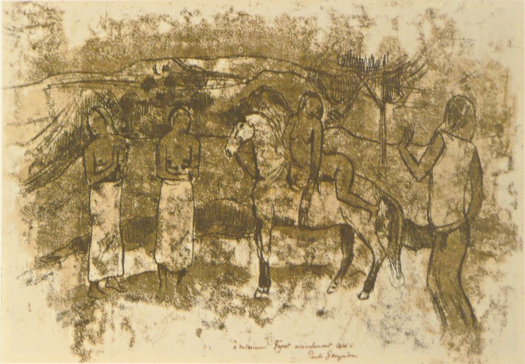
A third one titled “Tahitian woman with evil spirit” depicted the face of a young woman and an elderly male figure who represented the evil spirit. It was made in the same technique, but the overall impression was much subtler than the other two. I think this was the result of a different technique, maybe finer drawing tools and more controlled application of pressure on the paper.


With my own back drawing attempts, I had initially used a chinese bamboo pen without ink because I thought that applying pressure was the important thing and I did not want to “spoil” the verso of the paper sheet. But of course this did not work very well because I had no visual clue what I was drawing, besides very light impression marks. So I quickly switched to ball pen, which worked well for me because of the fine tip and exact linear pression (the results were diffuse but that’s another matter, probably too much ink on the plate).
In the museum, they presented the oil transfer drawings in free standing frames, so that people were able to look at both sides of the work. It was really interesting to compare the marks that were drawn with the transferred result. In one of the transfer drawings, Gauguin had made a light oil wash on the drawing side, and I thought this might have been to apply light but controlled pressure over a broader area – not to create a line, but to create shades.
Conclusion
I had been postponing the visit to this exhibition for weeks and really struggled to reserve the time for going. I’m so glad I finally made it, two days before the end of the exhibition. The visit was hugely inspiring and again I realized the difference between seeing real artwork versus seeing online or book reproductions. There are qualities in the real thing that cannot be transmitted by a technical reproduction: The true size, the quality of the paper, how the ink is layered on the surface. I loved looking at three-dimensional woodblocks and reliefs and getting a feel for their haptic qualities. It was exceptional and absolutely worth the trip.
Gauguins style resonated with me, maybe less the paintings, but the prints all the more, in particular how he simplified and clarified the shapes and how he used line, tone and contrast to support the compositions. I got so many ideas I’d like to try out in my own printmaking and am quite sure this visit will have quite an impact on future work.
I also like how I approached this research point. Focusing on a single artist and combining the research with an exhibition visit permitted me to dig a bit deeper. It was very rewarding and a welcome change to the often overwhelming experience of looking at many different artists in a brief period of time when researching a specified topic.
References
Exhibition site at MOMA http://www.moma.org/interactives/exhibitions/2014/gauguin/home
Exhibition checklist with all works http://www.moma.org/interactives/exhibitions/2014/gauguin/content/Gauguin%20Exhibition%20Checklist%2003.11.14.pdf
Paul Gauguin biography http://en.wikipedia.org/wiki/Paul_Gauguin
Catholicism and the modern mind book cover (ca 1902) http://www.slam.org/emuseum/code/emuseum.asp?style=single&newvalues=1&rawsearch=id/,/is/,/18302/,/false/,/true
Gauguin Metamorphoses, Exhibition catalog