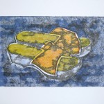
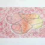
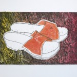
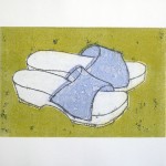
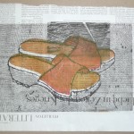
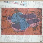
I started project 4 with a series of prints based on a drawing of a pair of wooden clogs. Out of a feeling that I did not want to embark on an over complicated subject, I chose the shoes in a matter of seconds when I saw them next to my desk. The shapes looked clear and simple and I found they’d work great for a print series based on simple masks.
I started with a pencil drawing in the sketchbook where I tried to capture the shapes as well as the tonal values. I did a quick second sketch from a different viewpoint, but found the variation less successful, so went back to the first drawing. I made a line drawing on transparent paper as basis for my masks and then created three sets of masks, positive and negative each: Firstly the entire shape, secondly just the soles and the upper leather, and thirdly only the upper leather. My initial idea was to use multiple colours and print in layers to create new colours from overprinting. I wanted to use the primary colours and create secondary colours through layering.


The series developed somewhat differently than I had originally planned. I started with red ink and made two sequences of four prints from each mask of the six masks: 1) Printing the positive shape, using the negative mask, 2) Making a ghost print, 3) pulling of the mask and printing the textured plate, 4) print from the inked side of the mask. I used a variety of different papers – different white tones, weight, surface texture, and also experimented with coloured paper and newspaper. Finally I had from 3 positive and 3 negative mask a total of 2 * 4 * 6 = 48 prints resulting from the first session. This was quite overwhelming, but on the other hand I liked the feeling of taking a systematic approach and having lots of base prints with which to play and explore effects of different colour overprints.
The next printmaking session was devoted to exploring printing with leaves that I had collected during a lunch break. I mixed a dark green colour from black and yellow ink and placed the leaves on the inked plate, then ran this through the press to texture the plate. I pulled off the leaves and obtained the plate from which I wanted to print. I made prints on smooth and rough paper, plus ghost prints. I really liked the effect and thought I might integrate a grassy background texture into the shoe motif. I’m including two examples from that series here.


Then I got back to the shoe subject and continued with yellow, and also experimented with a graded plate from yellow over orange to red. I made some yellow prints on clean paper and afterwards began overprinting some of the red prints. Later I continued with orange mixed from my base colours, then blue, mixed violet, and finally black. Over several sessions during the next two weeks I also experimented with texturing the plate, multiple overprintings in different colours with different masks, and finally explored the effects of backdrawing.
The process got a bit out of control in similar ways as the earlier ‘Clematis and leaf’ series. The main practical problem was that I have not enough studio space to lay out all the prints and look at them simultaneously. I improvised using washing lines in the bathroom and upright paper storage boxes in my office, and attached the prints with little clamps, to be able to look at several of them simultaneously and let them dry at the same time.
The creative problem was that I saw so many prints but none felt finished. I kept adding coloured layers but still the prints felt unfinished. This changed as soon as I employed backdrawing. I devised a technique attaching a transparent paper with a line drawing of the shoes to the back of the print. Then placed the print with attached transparent onto the inked plate and traced the shoes using a sharp pencil. The first backdrawings suffered from too much ink bleeding all over the paper, but later on I developed more control over the effect and with only lightly inked plates obtained crisp deep black lines and only minimal bleeding over the rest of the print.
Backdrawing worked like magic on all the prints I had made so far, and I finalized the entire series which had in the meantime expanded to a total of almost 60 prints. I made several variants with textured backgrounds, using ice scraper, back of spoon, fork, bubble print, Q-Tips and other implements to make marks on the plate. I did not get back to the leaf idea but thought I might explore this in a future series. My favourite background texture was a wavy pattern made with the back end of a fork scraping horizontally over the plate. Other than that, I preferred pre-mixed colours over mixed tones from overprinting, and I expecially liked it when there was still some white left in the print.
I’m quite overwhelmed by the series I created and there are several prints I like a lot for different reasons. It will be difficult to select only one or two for the assignment, because there’s so much variation.












Reflection on the outcome and the creative process
Maybe this series got out of control because of the pause I had made after project 3. I felt a need for experimentation with all aspects of the techniques employed: a set of masks, texturing the plate, and backdrawing, and this experimental approach became much more important than the motif that I had chosen.
A very special occasion was presenting selected prints of the series to a colleague at work. It was about the first time that I showed prints to somebody and it made me see the prints with different eyes. Aspects like technical quality of the print and cleanliness of the paper suddenly became much more important compared to when I had just worked alone at home. By presenting the prints I also realized that my arbitrary choice of subject was a shortcoming because the prints somehow lacked personal meaning.
On the other hand I felt a special quality in the straightforward approach and this reminded me of the Campbell Tomato Soup screenprints by Andy Warhol. I guess Andy Warhol had taken those soup cans because they had been available and straightforward, and a nice subject to work with a particular technique.
So in the end, I’m quite happy with the series but consider choosing a more meaningful subject for my next series. Unfortunately, this has already begun to create a sort of inhibition and hesitation. I already have several ideas for the next topic, but I’m feeling quite judgemental at this point, questioning the adequacy of each subject and somehow this feels detrimental to a creative exploration. This is also affecting my sketching. I had begun to loosen up a bit and finding pleasure in just sketching anything appearing before me whenever I could afford some time. Now it seems I’m back to the old critical me that “doesn’t want to waste time on trivial subjects”. So maybe for now it’s better to abandon the ambitious approach and rather stay simplistic and just get going. One of the ideas was to explore further printing with leaves. A more ambitions project idea is getting back to the skyline topic of an earlier project. I’m not yet decided.