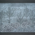
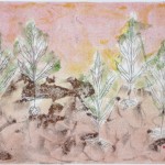
I started this project from the idea of printing off the texture of tree leaves which came up while printing the shoe series. It had been during a lunch break when I walked around the block and became aware of some interestingly shaped leaves. During the remainder of the walk, I collected different leaves and that evening and the next had a little printing session with them, as a change from getting lost in all my shoe prints.
First prints: Dark green ink on white paper, A3 format


These prints were made off a 20 x 30 cm printing plate, using Akua Intaglio ink (water based). Paper size is A3 format or close to it. I liked the crisp print on smooth bright white paper best (first print in this presentation). The series was actually made with dark green ink, but on the photos it looks more like black. After the initial series, I retained the idea of making a larger project using leaves as part of project 4 and some days later went to Prospect park in Brooklyn to collect more leaves. I placed these between newsprint sheets with a light weight on top to preserve them until after completion of the shoe series. I also drew some plants and greenery in my sketchbook while working on the series.
Since the shoes series took much longer than I had anticipated, the leaves were well dried once I was ready to start. I looked through all the different types of leaves I had and realized they would be too fragile to sustain multiple prints if I used them as masks. I took photocopies of all my leaves grouped by type, just in case I might later decide to make masks, to have something more durable to work from than the leaves themselves.
Second print: Five leaves, A2 format
From the about 5 or 6 different leaf types I had, I chose some with very intriguing shapes. My initial idea was to use the leaves to texture the inked plate, and then print off the textured plate. I started very simple with white paper and black ink. But I took up the suggestion of working on a larger scale which came up during the presentation of the shoe series to my colleague at work. So I used a 30 x 40 cm printing plate, double the size of the first attempts in dark green ink. This meant I’d be using much larger paper sheets too, around A2 size instead of the A3 format I had used all the time until now. The actual paper size it somewhat smaller to make the paper fit through my printing press.
It took me quite some time to decide an arrangement of the leaves. I worked this out on a clean sheet of paper and when I was finally satisfied, I placed the leaves onto the inked plate. I designed my registration system using a large paper sheet with marks for the size of the printing paper and for the plate, centered on the printing sheet. I had no clear compositional idea but wanted the leaves to look natural and well distributed over the available place.
 The first print was made with two layers. My idea had been to bring out the leaf structure but somehow through slight misalignment a 3-D-effect resulted. I was not very impressed and took some time to reflect how I would change things to proceed. I have made extensive notes in my notebook on practical problems, discoveries, open questions, solutions found during the entire series. It’s too much to include so I’ll just give a summary account.
With hindsight, the first print looks quite funny, like “drunken men lying on the floor”. I wasn’t so much aware of it at the time, but out of gut feeling decided to bring more structure into my composition by aligning the leaves upright in two groups of three and two, as if they were little trees. This was the most interesting discovery, to see how the little leaf shapes somehow resembled trees.
An imaginary landscape
 The remainder of the series built on this resemblance and my idea to create some sort of imaginary landscape. The first prints were very straightforward, with crisp textures and clean outlines. I worked over them so they looked quite differently in the end, but I kept this opaque white on black paper print in its initial state, as a reminder of the pure effect and the finely detailed original leaf texture.
I varied paper types and used different whites, smooth and rough surfaces, and also coloured papers. After a few prints my leaves disintegrated and I could no longer use them as masks or print off their texture. Instead, I made myself a tracing sheet from one of the crisp prints to use for backdrawing.
I was able to keep this series more manageable, compared to the shoe series, by not producing endless amounts of tryout prints. I was more thoughtful and slower this time. As a result, the number of prints to work on was smaller. I was able to focus on each one by one, trying to make the most out of it by experimenting with various techniques.
Techniques employed
I experimented with printing from plates inked with multiple colours, using the transparent sheet with the leaf outlines as a guide where to place my colours and which areas to wipe off before printing. I also tried out white opaque ink on dark paper and used it for overprinting dark ink to improve contrast to the leaf shapes. Almost all prints consist of multiple layers and combine techniques of masking, alignment/misalignment, texturing the plate, multiple colours, and backdrawing. In the shoe series, backdrawing came to be the technique that seemed to “save” every print. In this series, the addition of colour from a multiple coloured plate was the technique that greatly improved the overall impression. Sometimes I used backdrawing to improve readability of the image, but in other prints I preferred to retain the softer contours from printing off masks.
The final print was the one where I let go of the compositional restriction to my five leaves and created a little wood from three layers of backdrawing. This was born out of an accidental misalignment when I meant to correct an error in the backdrawing. To correct the misalignment, I made a second backdrawing using the back side of my transparent, which created a second layer of 5 leaf shapes. The result looked very silly due to the symmetrical distribution of the leaves. So I made a third layer, using a freshly inked plate, and a deliberately misaligned transparent sheet. This backdrawing created the effect of a little wood. The darker ink added a layer of depth and in the end I was quite happy with this print.
Evaluation of this series
Overall, I think this is a more accomplished series than the first because I felt more in control of the process. At the same time I became more experimental by varying not only colours, but also how I applied the techniques. An interesting discovery was that by sticking to the same composition and repeating the basic techniques, I became slightly bored, but this encouraged me to search for variations in the technique. For example, the later backdrawings depart from the exact contours to become more wiggly and less defined, and I also began varying the pressure of my pencil to achieve a different quality of the line.