After series 3 (the skyline) I took some days off printmaking to get a little inner distance and look out for new ideas. I found it difficult to come up with a completely different subject and trying to cover more than two techniques simultaneously. The technical requirements somehow seemed to block me from just going ahead and play around with whatever topic was at hand. But there was also the feeling that I needed to do more on the creative side, like taking a simple idea only as a starting point, then develop it further by improving the composition, adapting the colours etc. So far I felt that I had just stuck with my initial idea and varied the execution, but did not develop the idea.
There was also no preparative sketchbook work beyond an initial drawing that I used to create the masks or silhouette outlines to guide the subsequent steps. But realizing all this wasn’t helping me to become more creative, rather the opposite was the case. Quite a few ideas for topics came up, but then I thought through how I might develop them further, found them not substantial enough, and discarded them. So for several days, I just did not get anywhere and felt very stuck. I did some sketchbook drawings but they were ‘just drawing practice’, not related to printmaking ideas. I’d have liked to use one for the fourth topic but found them not suitable.
A trip to Greenwich, Connecticut
 After a week had passed whithout me getting any closer to a usable idea, I became totally stressed out and decided to make a trip to the seaside to draw and make some watercolours, in the hope that there might also come up a topic suitable for printmaking.
I was considering a landscape subject and thought this might work well using a painted or textured plate technique. I hadn’t used both of these techniques very much so far in project 4 and thought this might be a good addition.
So I went off to Greenwich, Connecticut, which is a pretty little village in the Long Island Sund, about 3/4 of an hour train ride from Manhattan. The best thing is that the harbour is at walking distance from the train station, so I hoped there would be some nice views for me. I must admit that making art outside is not my strong side. I feel very self-conscious and whenever people are around me, I’m in trouble and feel embarrassed because I find my drawing skills weak, in particular with landscapes. So I’m quite peculiar about finding a spot where I can sit and draw.
I arrived in Greenwich around noon, spent some time just walking around the village, then was hungry and needed to make a lunch break, but then finally, made it to the harbour. I walked around and discovered a little ferry but decided against taking a ride because of the original plan to come here for drawing, not for pleasure… of course that’s irony. It was quite a hot day and I had no shade, most of the time people were around me so I felt very unsafe, but I managed to make three very quick sketches on different locations, with water, boats and people.The first was A5 format, the other two were A6. I remember how I struggled to focus on anything particular of the wide scene I had before me.
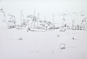

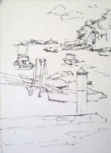
It became too hot and I walked back to the village park for a rest, found a suitable bench and decided to make a drawing of my view (A5 format, loose sheet). I liked it and found the place relaxing, so stayed a bit longer and also made a watercolour of the view towards the pond.


All the time, I had also made photographs as references for follow-up work at home. At around 5 p.m., I made it back home. I brought with me sunburnt arms because I had forgotten to buy sun protection cream, and now have feet with a nice sandal pattern of tanned vs white skin. I’m surely going to improve the preparations for the next excursion!
The view of the pond
 But the trip proved productive because I chose the view of the pond as the topic of the fourth series in this project. Back home, I switched to working from the photo I had made of the view. I found the composition difficult because the different elements were not easy to distinguish. Everything was more or less green with slightly different texture: The grass of the lawn, the foliage, some reflections on the water, the high grasses at the pond.
Work on the series alternated between making prints to try out technical variations, and making drawings to better understand the composition. The first drawing was an outline sketch of the main elements, the second was a pencil sketch, the third was made with charcoal. They are all roughly A4 format.


I did not change the composition because I did not knew what to do differently. So I focused on trying to make the differently textured areas better distinguishable, by increasing the variety of marks and by using colour.
The basic idea was to make an underprint with just the coloured areas, then overprint with a textured plate to indicate the differently textured elements. The central difficulty with texturing the plate was that I wanted to have light shapes before a dark background and dark shapes before a lighter background, but the methods I tried did not really work well for this. I was able to ink the plate, then wipe away light shapes and create darker and lighter textures, but did not find a really satisfying way to put back black marks on lighter backgrounds.
Exploring techniques
I tried backdrawing, but quickly abandoned the idea because with a thinly inked plate it produced just grey and unimpressive marks. I did not try a more saturated plate for this because I knew from earlier experience that this would give me more black spots but not the marks I intended to create. I guess backdrawing is great when the focus is on adding line, but it is not the best technique to create interesting marks with a graphically clean pattern of tiny deep black marks against a white background. This was what I wanted for the upper region of the composition, to depict the foliage of the foreground branch against the much lighter sky in the background. Prints were made from a 20 x 30 cm PVC plate on 43 x 28 cm paper.


So in the next prints, I experimented with various wiping techniques and instruments, using Q-Tips, corrugated cardboard, pvc foam etc. I also made one plate entirely from textured materials pressed on the plate, then taken away and reworked by hand for the actual impression. I found this worked nicely overall, but not for the sky area. The solution that worked best was to use water-soluble oil paint and actually paint those leaves – or better, trying to make marks that resemble foliage. I think I wasn’t very successful with this but it was as close as I could get to what I actually wanted.
Interestingly, I began looking out for contemporary artists using texture (the next research point) while working on this series, and one of them used woodcut. The effect I saw was close to what I had intended to achieve, so I asked myself whether relief techniques would be a better way to approach the problem. I’ll get back to this in the research point article and am looking forward to working with relief techniques in the next part of the course.
Choice of colours
For the background colouring, I decided to use Akua liquid pigment, which I like because of its transparency. The first prints were very faint despite my choice of bright white, smooth paper, so I increased the amount of ink and indeed this produced more intense colouring. I knew from earlier work with these inks that they work best with smooth paper so I stayed with my chosen paper for this series.
My initial coloured plate had two different colours: One for the sky area and its reflection on the water, and the other for all the green elements. After the first set of prints and trying out backdrawing, I decided to make a third area of no colour for the lightest area of the composition, which is the high sea grass at the edge of the pond in the background. This was a good change because it let the white of the paper shine through in the print. The white began to work as a third colour and increased the overall tonal range of the print.
I tried out different colour combinations: Beginning with a greenish blue for the sky with yellowish green for the rest, I switched to a blue-red sky, a purple sky with blueish green for the rest, an orange-red sky with yellow green, and back to ultramarine blue sky with yellowish green for the rest. Actually I like all the colour combinations, but in each set have a preference for the more intense colour. The difference in intensity was by chance, I just realized this afterwards and think it works better with the black overprint in this composition. I wouldn’t go as far to say that I’d try to achieve intense colours ‘always’, but in this series, I think intense colouring works better.


From the series, my overall favourite is the final ultramarine blue and yellow green one – it has intense colours and I think it also has the most successful textures, in particular the area that defines the contours of the pond. I managed to include some reflections and this area is better worked out than in the other prints. The colour choice supports the interpretation because the blue is more easily associated with sky and water, to the entire image becomes easier to ‘read’. My second favourite is the one with intense orange-red sky, because the overall colours are warm and bright, and I think it’s quite a powerful effect.
What have I learned? What would I change if I had to do it again?
I’ve certainly learned a good deal about texturing a plate. Over the course of the series, I became somewhat more inventive with the instruments and techniques I employed. I also felt that sticking to the difficult composition forced me to look closer how I might visually separate the different areas to create recognizable structure in the print. I feel I got closer to this goal towards the end of the series.
I think if I were to do it again, I’d spend more time at the original location and make more detailed drawings and paintings, also try out different viewpoints, to give me more variety to choose from when working out a scene for the print. As it was, I switched to my photo source as soon as I was home, for all subsequent work, and I think compared to the immediacy and brightness of the watercolour painting made on location, something has got lost. In particular, working from the computer screen where the portrait format photo comes out quite small, wasn’t very helpful in developing more variety with the textures. I did try out scaling up the size on the computer screen but did not work from the enlarged view because I felt this would have lead to overly detailed representation in my print.
Somehow I didn’t get beyond the photo and what it had depicted. Maybe I should resist the desire of taking photographs next time, or at least resist the temptation of using them, and instead rely on my memory of the setting and the works made on location. This is of course not only an issue with printmaking, it is also a recurrent topic in my other OCA courses. Switching working mode from using photos to relying on works made on location is not as simple as it is said, because there’s more attached to it – like my reluctance to draw or paint in public, whereas I have much less trouble just taking a quick photo.
Maybe a different printmaking technique would have been more appropriate for some aspects like the dark foliage against a light sky, or maybe I just wasn’t inventive enough with the techniques I’ve already learnt in the course so far. I might get back the subject as I get further along in the course. Quite sure that landscape as a topic will come up again for me. I’m actually quite interested in texture, so it was probably a good thing to have addressed the topic and try to broaden the “visual vocabulary” I have available for this.