Developing my subject in the sketchbook
I started a new, quite large sketchbook for this project because I did not want to have my preparatory work all on loose sheets. The size of 28 x 35 cm was unusual for me but I wanted to work somewhat larger.
The starting idea was the view from the living room over to the open kitchen, where the two cat scratchtrees are. They are huge and bulky and a bit like sculptures. I often look at them and like the abstract qualities of the shapes they create in space. This inspired me to make a first drawing to just study the view in a bit more detail.
The second drawing was meant to develop the subject towards abstraction. I tried to simplify some shapes and studied tonal values.


The next step was a colour version of the view, which I developed from an even more simplified outline drawing using black felt pen (Sharpie). I wanted to use only few colours to represent the different tonal values.
I also wanted to create texture effects to take up the rough and soft surface qualities of the scratch trees. I thought this could be done best using scratch-foam because that material permitted fine, curly marks that would be difficult to create with the harder linocut. To try this out, I used a sheet of silver-backed scratch foil, and scratched the desired textures into it with a little wooden stick.


I made another drawing to include the lower parts of the scratchtrees and a bit of the floor as well, because I wanted to emphasize the horizontal orientation with these forms. I developed this further using a different colour scheme of yellows and reds.


The coloured drawing became the starting point for the final composition. I made a traced drawing and transferred this to a scratch-foam sheet to create a printable relief for the scratch tree only. I forgot that I had to reverse the image so the print is not in the correct orientation, but it served the purpose of trying out whether the mark-making would work. I really liked how my curly and edgy marks printed off the scratch-foam.


 To try out how this would print over areas of colour, I went back to the sketchbook and painted geometrical coloured shapes in blue, red and yellow which took the abstraction from the actual view into the interior space a little further.
Then I made a black print of the scratch tree on top using the scratchfoam relief. I quite liked the effect how the colours printed through the black textures.
By the time I worked on this page in the sketchbook, I was unsure about the colour scheme and the degree of abstraction I wanted for the final print. I made two more tries with a different colour set, where I tried to get closer to the actual colours of the view, which were soft and muted because the room does not get much daylight on a gray winter’s day.


 I finally decided that I preferred the brighter colours. For the print, I thought about making just brightly coloured, large geometrical shapes which would correspond to the orientation of elements in space. For this approach I experimented with collage and glued coloured tissue paper into the sketchbook. I made a secoond scratchfoam version of the cat tree in correct orientation and printed it over the collage.
I was satisfied with the overall effect and proceeded to develop my linoplate for this.
Interior view linoprint with three colours and black
I wanted to make this print as a reduction linocut that would have blue, yellow, red and black elements. I also wanted the coloured shapes extend beyond the original image frame of the drawing. I developed the linoplate to start with the blue colour, but inked the plate only selectively because my transparent inks would not sufficiently overprint the first blue layer.
To register the prints, I used a paper sheet onto which I made an outline drawing of the linoplate. After printing the blue, I cut away some areas and proceeded to yellow, which was also inked and printed only selectively, not over the entire area. For reference, I made an additional print of the first and second stage of the complete plates in blue and yellow.


Then I cut away those areas I wished to remain yellow and proceeded to the red ink. For the print, I inked selectively to only part of the plate. For reference, I made an additional red print of the plate in stage three.


I wanted to finalize the linoprint with black and there were many edges and the texture for the floor which created a lot of potential blur. The selective inking was meant to reduce the blurr that results from minimal misalignment. These are the prints with three colours and then with the black layer added.

To finally place the cat tree at the correct location and identically for each print in my series, I used the transparent drawing and transferred an outline onto the registration sheet. This was then transferred to a clean registration sheet and guided the final step of the printmaking. The second registration sheet shows the inked scratchfoam relief aligned in place for printing.


I also made a reference print off the final stage from the linoplate and produced a black-and-white version of the interior view.


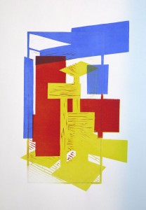
The final print in three colours plus black, with the scratch foam cat tree printed on top. Its size is 50.5 x 35.5 cm, that’s between A3 and A2 portrait format.

Evaluation of process and outcome
At the beginning, I had been very reluctant to follow my original subject idea because I though that the project expected students to focus on interesting textural effects, whereas I saw the main interest of my subject in its abstract, geometrical shapes. I think I was inspired by the linocuts of Anne Sumpner Evans which i found in the recent research on contemporary experimental printmaking. I was fascinated by her sailboat motif and the abstraction within the prints, and I think this was why I caught on these qualities in my interior view.
It felt a bit like I had chosen the wrong subject for the task at hand, but there was this aspect of beginning to develop my own interests and topics, which I found equally important. So I decided to stay with the subject and try to treat surface textures as an important element of the composition, but not as the guiding feature. I might have produced “more exciting” textures if I had cut expressive marks into the lino, but this wouldn’t have worked for me. By contrast, using the soft scratch-foam did exactly match my intentions for the surfaces of the cat tree and I really like how the two different relief materials complement each other.
The ink that “accidentally” printed in the cut away areas adds another interesting texture element. I actually took much care to retain the shapes of the basic compositional elements in these areas because I anticipated how this would unavoidably create ink marks in the final print. This can be seen in the black and white reference print I included above.
The most difficult part of this print was the decision how to print the colours. I considered using a collage technique, but had no idea how extend this to an edition of prints. A chine collé technique similar to what I did in the sketchbook might have worked. The method of colouring a plate with a dabber (as explained in the course materials) didn’t seem to be appropriate to achieve the clear-cut edges and evenly coloured areas that I wanted. But the reduction linocut with selective inking offered a method to reproduce the coloured area over the series of prints.
I made 15 prints this time, of which the first three were spoiled when the paper was wrinkled under the press with the black linoplate. I had to considerably reduce the pressure to stop this, with the consequence that the black did not print as dark as I’d have wanted. But overall, the print came out as I had expected. I made an alignment error with the black rectangle to the right which was supposed to be slightly wider, but I don’t think it’s too disturbing in the overall image.
I think the main interest of the print is how I developed the abstraction and broke up the outline of the printed image with the coloured shapes that extend outside the black image frame. The shapes create a sense of space but it’s in a somewhat abstract way. I think the choices I made for the textures work very well in context, both the linocut pattern for the floor and the finer marks of the cat tree.
Another aspect of personal progress is how I developed the idea for this print from the original drawing of the interior view. I felt that developing ideas is one of my weaker areas so I’m glad that I stuck to it and explored my topic to make an interesting print from it.
Strangely enough it occurred to me very late that it would have been nice to include my cats in the composition. It’s their tree and the image would probably have been much livelier. But I was already done with the linoprinting, and adding cat shapes at this point wouldn’t have worked because they were not integrated in the colours and existing shapes of other elements.
To finalize, I think I’ve made quite an unusual print with the approach of combining lino with scratch-foam. I don’t think I’d necessarily adopt the technique for future work, but in this particular case it worked quite well. Other than that, I think I prefer lino over other relief materials because it’s relatively easy to work with and holds its shape well.