Experiments in mark making and painted plates
I started these experiment with a slight feeling of discomfort about the task. I had no idea what kind of marks might look interesting and expected not to see anything exciting coming out of my selection of old school brushes in various widths.
My materials were:
– A set of watersoluble printing inks with retarder (extends drying time) and extender (adds transparency), Speedball brand
– Two large glass plates – simple thin window replacement glass with sharp edges
– Two smaller glass plates – taken from image frames, with slightly beveled edges
– A selection of inexpensive school brushes, firm and soft
– My stock of papers from earlier courses: drawing and sketching paper, but also a variety of artist papers of all kinds including heavy watercolour paper
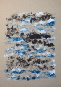
Series 1: White, blue and black marks on gray paper
The first print was made using the paint out of the tube, just worked through with a brush. I was somewhat disillusioned when looking at the result, the print looked like a heap of dots without meaning. The printing ink dried extremely fast in the dry New York winter climate.
So I decided to mix retarder into the ink for subsequent prints. This slightly changed the blue tone into a somewhat greenish tone, not visible in the digital image, but it helped to keep the ink longer usable. I applied ink more thickly, and tried to obtain more variation in marks. The second print filled the paper better and conveys more “will to creation”. The third print was a simple ghost print from the ink remnants on the plate. I found it too faint.
The fourth print developed into a linear pattern. The paint was almost dry and the print was again quite faint.
Series 1: Gray sketching paper, 110 gms, 49 x 34.5 cm



Series 2: Yellow, green and blue on off white paper
For this series, I took up the suggestion of using more colours. But since I wanted to stick with my set of base colours, I decided to use only yellow and blue and mix some greens from these. I made a lemon green, medium sap green and a blueish green for a total of five colours. This time I used water instead of retarder to dilute the inks and keep them longer workable. I switched to off white drawing paper.
The first print has more variation in mark making: long stripes, short stripes, and dots running into each other. The paint was fluid enough to print thickly, yet there were some interesting effects in the blueish green stripes where the ink printed off in different intensities which corresponded to the brush strokes I made.
For the second print, I painted new colour on the uncleaned glass plate, and soaked the paper in water, then dried it off a bit, before placing it on the plate. The damp paper changed the overall character of the print – the marks became soft and diluted, the shapes are not crisp but have blurred edges. I found the technique interesting because it helps to address the big problem that watersoluble inks dry so quickly.
The third print was a ghost print of the remaining ink on the plate. I think it is too faint to be interesting in itself, but it might become a background for a drawing or another print.
Series 2: off white drawing paper, 170 gms, 42 x 29.5 cm


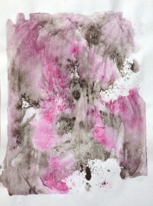
Series 3: Red and black on bright white Sumi-e paper
I had an inspiration to try out how this paper would work for monoprint, and went back to a reduced number of colours which I applied as pure tones. I switched to a small framing glass sheet as a printing plate which I felt more comfortable because the edges were less sharp. It was also intersting to work on a smaller scale.
I experimented with mark making and soaking or not soaking the paper. Sumi-e paper is intended for Japanese ink paintings and able to bring out many nuances of black ink tones. It is very thin and extends heavily when soaked, and the ink dissolves into the paper. I also printed on the plain thin separation sheets between the actual Sumi-e sheets. I experimented with using the brush handle to make marks into the ink.
Overall I think I prefer the prints on dry paper because I like the crisper shapes and how uneven paint thickness from the brush strokes is transferred onto the paper. With damp paper, this effect tends to get lost because the ink dissolves. The strength of the effect seems to depend on the paper, it was a bit less with the heavier drawing paper in series 2.
I think the best print in this series is actually the first one, because of the interesting brush marks. There’s also a feeling of airiness in this print resulting from the white background, compared to the other prints which appear a bit cluttered and overfilled. Print 5 is also quite nice. These were both made on Sumi-e paper. I tend to find the prints on soaked paper less appealing.
Series 3: Bright white Sumi-e paper, 80 gms, 24 x 32 cm



Concluding reflections
With respect to the inclusion of colours, I’m a bit sceptical. My earler printing experiences with linocuts led me to like the simplicity of using only a single colour with clean-cut shapes. Monoprinting as a technique permits a much more fluid working style, once the problem of ink thickness is handled.
Painting one colour over the other doesn’t work extremely well – the inks are wet and smudge the brush. I did not particularly like the effect in my first prints, but realize that it might be used deliberately to create softer edges and mixed tones.
Applying the brush handle created interesting textures which added some contrast to pure brush marks. In this series, I found their effect slightly disturbing. The technique might work well for some subjects and less for others.
What have I learnt?
I think this first exercise was quite important to gain initial experience with the materials and the working process. I was surprised how I took off on the process after reluctant beginnings. There was a pleasurable feeling of momentum and joy of playing around.