This project introduced a basic linocut working procedure which I found quite helpful. I have done linocut relief prints already, but never with so much preparation. Most of the times I just cut the design into the lino without even drawing. So this was quite different and I felt it gave me much more control over the outcome. On the other hand, I was somewhat intimidated by how elaborate the step-by-step approach was and felt it worked against spontaneity.
Finding a subject was difficult. Maybe this was because I had done a lot of watercolour painting and figure drawing recently and was somehow tied to looking for tonal values and colour composition. Considering a variety of subjects I mostly rejected them immediately because I found they would not work as linocuts. With hindsight I think this wasn’t true but was simply the effect of not knowing how to approach these subjects for relief printmaking.
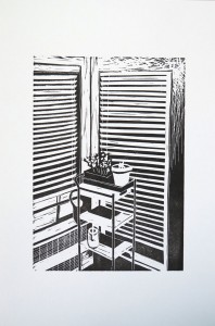
I would have liked to work on landscape subjects again, but it was getting uncomfortably cold outside, and I did not want to work from photos this time. One evening I became aware of an interior view that I liked: The two adjacent windows with the cart in front of them. I liked the pattern of light and dark through the blinds, so decided to give it a try for a drawing.
Making the drawing took an endless amount of time and I was in constant doubt whether this image idea would work for a linoprint. My main concern was that the balance of light and dark was tilted towards light, so I would have to cut away almost all the lino to retain just a bit of black for the shades which would indicate what was there. The other concern was that there was actually no texture, because all the surfaces were plain and smooth, besides the little plants on the cart.


Despite much doubt, I decided to stay with the idea because I was curious how the resulting print would look like and whether I was right with my ideas. So I went throught he suggested steps of the procedure, making a chalk drawing on a black paper and then using tracing paper to reverse the image. I made a photocopy of the chalk drawing on tracing paper for this.


A turning point came when I proofed the linocut. The resulting image looked interesting and this gave me some more confidence about the entire idea.


It was only when working on the plate that I decided to make a gradation for the light falling on the wall, so that the one side of the blinds would print as black. I think this was a good decision because it resulted in a better balance of light and dark areas. With respect to texture, to me it looks as though the pattern of the blinds and the other elements provide enough interest, even if the actual object surfaces are not textured. The irregular shapes of the plant in the center helps to loosen up the very geometric style of the image.
I made a series of ten prints. The initial prints came out a bit weak (left print) but then I managed to ink them better so that the black area to the right came out without white sprinkles (right print). I did not clean up the linoplate in between but think this worked fine for the edition.

For the future, I think I’d rather look out for a subject with more sturdy elements and maybe a simpler composition. But for a first go with the suggested process, I’m quite happy with the results.
Steps of the process:
– Initial pencil drawing on white paper
– Drawing with chalk on black paper
– Fotocopy of the drawing onto tracing paper
– Carbon copy lines on the linoplate, made by drawing over the reversed image
– Cut linoplate
– Proof made with a 2B graphite stick
– Two example prints from an edition of 10, one with lighter spots (left), the other deep black (right)
Guided reflections
What do you have to take into account in order to create a strong single-colour design?
The strong contrasts of my print came actually as a surprise to me. It gives a lot of drama to a composition. I found the most difficult part to clarify the shapes of my objects having only black and white, no tones. While cutting, I decided to make use of fine white lines to help the viewer reading the image.
A composition based on tonal values with weak contrasts will come out quite differently if executed as a single colour linoprint. I guess I will need to learn from experience what works well in single-colour linoprints. I wouldn’t say this or that won’t work, rather see it as a matter of finding the right translation into this technique, and results may be surprising.
Can you find suitable new drawing techniques which translate into a linocut which have not been included already?
I might try drawing with ink rather than pencil to get a feeling for making clear marks and patterns rather than using tonal values to indicate shape and three-dimensionality.