Find a couple of contemporary printmakers whose work you like, and reflect on their techniques. How do they use lino? What sort of marks do they make? What could you learn from them?
Atta Kwami, Ghana (born 1956)
I found this artist when searching for linocuts at the Metropolitan Museum of Art website. They struck me because I’m not aware of having seen abstract linocuts before. I was also impressed by the vivid colours.
They’re very different from what I usually associate with linocut works, like German Expressionism/die Brücke with their graphical style and figurative subjects. By contrast, Atta Kwami’s linocuts breathe african tradition with a novel approach to the technique of linocuts. The prints strongle relate to the artist’s other works, like abstract colourful paintings and textile It’s a very graphical style. What I can take home from these prints is the encouragement to explore abstraction using linocut.


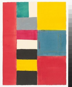
Images from Metropolitan Museum of art http://www.metmuseum.org/collection/the-collection-online/search/383727?rpp=30&pg=1&ft=linocut&pos=1
James Lesesne Wells, North America (1902-1993)
Wells was an African American artist, born and educated in the United States. The prints I chose are from the late artist, made in the 1970 to 1990s. Maybe due to my own mature age, I’d count this as contemporary, but they remind me more of the graphic style of the 1960s than of today’s contemporary art. I think the technique employed is traditional, but I find the treatment of the subjects very interesting. The shapes are broken up and irregular, objects have surface texture, the choice of colour is unusual.
It’s again an artist whose works go beyond what I knew as characteristic for linocuts. I was thinking that colour linoprints generally combine multiple cut blocks, all cut out to print parts of the subject in a distinctive colour, so that different colours sit next to each other and transparency and overprinting occurs. But these prints are different. The colours are separated by black. The technique looks as if a first impression was made from a plate inked with several colours, followed by a second impression in black from a cut linoplate. The black provides the holding structure for the composition.
The one woodcut (still life with flowers) included for comparison is made in a different approach, using more colours and less black.


Bus stop, Ghana (1972), a colour linocut. A colour woodprint from 1975 also exists.
Watusi Family (1988), colour linocut
Still life with violin (1987), woodcut
Yellow vase (1980), colour linocut
Overview of works: http://www.artnet.com/artists/james-lesesne-wells/past-auction-results
Artist biography: http://www.artnet.com/artists/james-lesesne-wells/biography
Images from http://www.mutualart.com/Artwork/Bus-Stop–Ghana/E1DFAD4FDADD6BD6
Tracing down the influence of the researched artists on my own practice
I have done this research after the single colour linocut of the interior view. I felt that I should do more research but also wanted to do practical work, so decided to take a break and read ahead in the course materials and do further research in parallel. Peeking into assignment 2 requirements, I realized there was room to do more single colour linocuts before proceeding to project 7 (multi-block printing), so I went on to do another linocut.
After that I took the opportunity to visit an exhibition at the Center for Contemporary printmaking in Norwalk, CT, and enjoyed an afternoon at the seaside as well, which led to my subject for the coloured linocut in project 7. There was such a momentum that I did not get back to this research topic until after having finished the multiblock print.
With hindsight, there is no apparent influence of these artist onto subsequent works, but I’m glad I proceeded in the way I did because the additional practice now lets me see these prints with different eyes. I continue to find them unusual and interesting in approach, but they’re not the direction I’m aiming for with my linocut work.