I’ve been following for quite a while the activities of the Center for Contemporary Printmaking (CCP) n Norwalk, CT. They offer all kinds of interesting workshops and it’s within reach of a day trip from New York. Finally I decided to go there and visit the exhibition of prints from master printmakers Clare Romano and John Ross. They must now be in their nineties, have been married since 1943 and have been making prints over a lifetime. They are the authors of the book ‘The complete printmaker’ which appears to have become a classic printmaking textbook.
The visit to the CCP was a super nice experience. I received a very friendly welcome and was led around the exhibition and the printmaking studios by Paul DeRuvo, Printmaker at the center. Paul also let me watch him make a chine collé print for another artist’s edition, and showed me some of his own prints. Upstairs I met some artists who were working on their prints, discussing ideas among them. I just got a taste for what I’m missing heavily in my everyday life, where I’m working full-time in a totally unrelated IT job and pursue printmaking alone at home, guided via distance education.
The exhibition itself presented prints by Clare Romano and John Ross spanning their entire artist lives. There were many woodcuts and collagraphs and I spent quite some time looking at each from close and making notes in my sketchbook. I admired textures and other details that one cannot see when looking at prints online or as reproductions in books. I also took some photos of prints I found particularly interesting. It was a very inspiring day.
Prints from the exhibition
Unfortunately the prints were framed behind glass and the studio lights created lots of reflections, so I had to photograph at an angle and the image quality is mediocre. The pictures just serve as a reminder.


Clare Romano, Dalmatia (1969), Collagraph: I was interested in the heavily textured effects in this print. I imagined it might have been made using a heavy body paint laid out on a plate and then textured with a spatula. The print was probably made in layers: First the basic colours of red, brown and blue and then a black print from a textured plate with ink wiped off the surfaces so that it would remain only in the ridges. I don’t have enough background knowledge on collagraphs but it’s something I’d like to explore.


Clare Romano, Into the clefts (1960), Woodcut: This resonated with me because it reminded me of the topic ‘New York’, the big city that can get so overwhelming. While doing some preparative research for the visit, I had seen woodcuts of New York by Clare Romano and John Ross that had been made for a book about Manhattan Island. They were in a 1950-60s style and I had hoped to see some of the originals for that book in the exhibition. There weren’t any, but I was sensitized to the subject. What I like in this woodcut is the composition (left photo): When you walk through the streets of Manhattan, you can see a tiny bit of sky above high buildings and maybe a small vertical stripe between two high rises when you follow the street up to the horizon. It looks like an evening scene with neon lighting that becomes blurred as you move through the streets taking a cab or the bus (right photo, detail from center).
I started with the ‘New York’ subject in Part 1, making textured monotypes and experimental prints using masks, and think I will get back to this subject again.

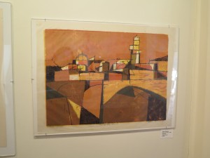 Clare Romano, East Side Structures (1952), Lithograph
Clare Romano, Along the Arno (1959), Woodcut
The lithograph was very similar to those I remembered from the Manhattan book: The colour choice of beige, brown and grey tones and the geometrical elements in the composition. The image is dominated by flat areas of colour and I guess this has to do with the litho technique. Within the colours there’s a subtle surface texture which I think results from the surface of the litho stone – and which works extremely well to convey the feel of the concrete buildings in that street view. Lithography apparently permits printing linear elements as well, which would be a pain to do with lino, never resulting in similarly clean surroundings. The overall effect with lino would be quite different, even if the same composition was used.
I love the woodcut print for its warm colours and the bold composition. Like the lithograph, this print is based on shape, not on texture. Interesting texture effects on the surfaces arise from light colours that were printed over darker colours. I just wonder whether the black lines were the result of a huge wooden plate where everything except the linear elements was cut away. I think I’d approach this differently and use a combination of woodcut relief with an intaglio method for the lines.
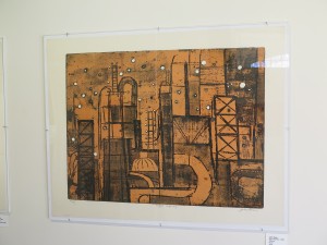

John Ross, Night Refinery (1964), Etching
John Ross, Harbor (1969), Etching
It is interesting to compare these etchings by John Ross with Clare Romano’s prints of built structures and see how the technique has an influence on the outcome. Although similar in colours, the overall impression of the etchings is very different from the woodcut and the lithograph. The Night Refinery etching seems to have been done on top of a brown coloured print on cream white paper. The white of the paper comes through in the round shapes which look like light bulbs in a nightly scene. There’s much greater emphasis on texture and line here, compared to lithograph and woodcut.
The Harbor etching is even more complicated. It might have been done in a single go from a plate that had etched lines and was then selectively inked with several different colours and only partially wiped clean. Similar effects might be obtained with a subtractive monotype technique, combined with backdrawing. I really like the subtlety of the colour effects here.
Canyons
Another subject that had been explored by both artists were landscape views of canyons. The four I selected were all collagraphs, using different materials for texturing the surfaces.


John Ross, Talus (1984), Collagraph
John Ross, Peak (1984), Collagraph
Clare Romano, Red Canyon (1983), Collagraph
Clare Romano, Silver Canyon (1984), Collagraph
Talus by John Ross and Red Canyon by Clare Romano used fabric to create texture, which can be seen from close. The other two collagraph plates were created differently, maybe some kind of gel or mass that could be manipulated with instruments. The Red Canyon seems to combine fabric and textured gel mass, whereas Talus builds on fabric alone.
In the meantime, I have completed my multiblock linoprint which features a landscape view with stones. It’s interesting to see how collagraph can be used to texture stone surfaces. It might be interesting to follow this up later, maybe combining the two techniques: Linocut for the definitions, collagraph for interesting textures. Not sure though whether linocut is at all compatible with a more impressionistic treatment of surfaces.
I have no idea how the multiple colours were printed. I remember that Paul DeRuvo mentioned the complexity of the process of inking these plates when he showed me around through the exhibition. Maybe a combination of selective inking with different colours and selective wiping plus several printed layers on top? I treated myself the printmaking book and also a book on collagraph, maybe I’ll be able to understand the process later on.
Resources
John Ross artist website: http://www.johnrossprintmaker.com/index.html
Center for Contemporary Printmaking in Norwalk, CT: http://contemprints.org/
Paul DeRuvo artist website: http://paulderuvo.com