After completing the multiblock linocut, I had a hard time letting go of my seaside subject because I felt that it would be good to do a follow up version and try to improve on all the issues I encountered. On the other hand, time is always an issue and I have a tight schedule, so thought it might be better to get on and try to improve in future projects rather than sticking endlessly to one particular subject. In the end, I made an agreement with myself to put practice to one side for a moment and do some research and after that, decide how to continue.
I’m still undecided whether to have another go at the seaside view, but having done more research confirmed the suspicions I had regarding the need for more clarity in my designs. It may have been this issue that led me to select Anne Lewis and Peter Catherall for a closer look. Both artists specialize on linocut and their style is clean and graphical. I think this is the direction towards which I’d like to develop in future linocut work.
Anne Lewis, Wales (born 1962)
These linocuts were made using the reduction method, where a single plate is used and consecutively cut away over a series of impressions from lighter to darker colours. Anne Lewis explains the process nicely on her blog. I guess the method requires lots and lots of practice to develop the necessary feel for the right colours and how to cut. Lewis has a background in illustration. I guess it’s this kind of training that helps to “clean up” a drawing and make it a good source for a coloured linocut.
I’m just so impressed by the quality of her work – the wide view of her landscape compositions, with the paper white providing accentuated highlights. The prints show very effective colour contrasts.
There’s a particular Photoshop software filter, I think it’s called ‘Colour separation’, which does approximately what is needed to go from a complex real view to a simplified abstraction that will work as a multicolour linocut. I might experiment with that on my source photos to see how it looks like. It’s a bit of a two-sided coin though because I don’t want to reduce linocutting to a mere execution of a digitally prepared image. I think there’s more to a good linocut than just applying a technical procedure.
For now the one thing I know that this is the style I had vaguely in mind when talking about cleaning up my multiblock print of the seaside view: Simplify the shapes, try to obtain clarity and clean up fussy textures.


Storm approaching, Birling Gap (2014), 7 colour linocut, Edition of 20, 30cm x 20cm
Late September, Tenby Harbour (2013), 13 colour linocut, Edition of 20, 41.5cm x 29.5cm
Capel Carmel, Conwy (undated), 5 colour linocut (3 blocks), Edition of 20, 17.5 x 18cm
Towards Trearddur from Porth y Corwgl (2013), 12 colour linocut, Edition of 15, 29 x 15cm
 Anne Lewis focuses on landscape, but there are also other subjects like animals and plants. I’m including two examples which I found particularly interesting. The ‘White Hellebore’ is very interesting because of the shapes that go outside of the image square, this adds to the livelyness of the print. It is such an accomplished work, I’m struck by the beauty… There is so much variety in the use of colour and line. For example, the black acts in multiple ways
– there are black lines on white or coloured grounds
– there are black shapes into which lines are carved and the colour shows through
– there are areas where the black is just a background, not a particular shape (negative space)
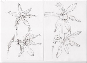
The narcissi, by contrast, are somewhat more difficult to read, and I think it is because not enough dark contrast was used to separate the flower from its background. It’s nevertheless a beautiful print and I found it very interesting to see a preparatory sketch as well.

White hellebore (undated), 3 colour linocut, Edition of 16, 13cm x 15cm (to petal and leaf tips)
Narcissi (undated), 5 colour linocut, Edition of 16, 28 x 8cm
Anne Lewis Artist website http://www.annlewis.co.uk
Anne Lewis at Martin Tinney Gallery http://www.artwales.com/artists-detail-mtg-en.php?artistID=71
Reference article by Nick Morley http://linocutboy.com/ann-lewis-linocut-artist/
Paul Catherall, England (born 1967)
Paul Catherall is a London based artist. City structures are a major subject in his prints. I wouldn’t have believed his prints were linocuts, I’d rather have thought their were screenprints. The style is even more extreme in its clarity and graphic approach. The artist stated
“It’s about a “quality that’s fairly abstract, where elements are missing and your eye does your work for you”, he says. “I’m exploring what to leave out rather than what to leave in, and getting the negative shapes to do the work.” [from an article at Creative Review website]
I think this is at the heart of what attracted me to these works. The abstract quality and the reduction to essential shapes is just stunning.


The architectural views of London are already great, but I was off my feet to see the prints of New York. Left: Empire State Building and Brooklyn Bridge. Right: The prints of high rises and other structures represent so much of what I see every day.

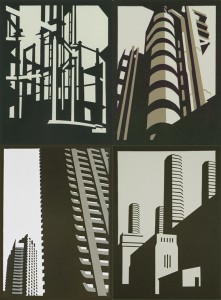
I’m quite sure that these works are based on photographs, because there are extreme perspective distortions which are typical for standard (zoom) lens cameras. By contrast, when drawing from a real view, the human eye and brain together automatically correct these distortions. It is of course possible that Catherall used a viewfinder for drawing which artificially imposes a little square on the scene and might stop the brain from “pulling the verticals straight”.
What I find most impressive and would like to adopt from these prints is the treatment of shadows to indicate the shape of the actual object.
Artist website (Flash animation) http://www.paulcatherall.com
2012 Linocut Exhibition http://www.designweek.co.uk/whats-on/paul-catherall-2012-linocuts/3034880.article
Selected works overview http://www.art-angels.co.uk/cat/paul-catherall
Paul Catherall Artist Details at the London Transport Museum http://www.ltmcollection.org/posters/artist/artist.html?IXartist=Paul+Catherall
Reference article by Nick Morley http://linocutboy.com/paul-catherall-linocuts-of-london/
Creative Review Exhibition Article: http://www.creativereview.co.uk/cr-blog/2013/april/paul-catherall
Graphicine Article (large image reproductions) http://www.graphicine.com/?p=667