Since a while I had developed the idea of making some prints which would work as a Christmas card. My choice of subject was inspired by recent research on Andy Warhol for the final assignment of the Watercolour course, where I came across his poinsettia screenprints. I thought it would be a good idea to get a little more linocut practice and maybe I could then even send out some cards for Christmas.
Preparations
First step was a drawing of my poinsettia plant in my A5 sketchbook. I chose an unusual perspective by placing the pot on the floor and looking on top of the plant, so that I would obtain a pattern of red leaves before a background of green leaves. I wanted a small format so decided to draw only a single poinsettia branch. I think the slightly distorted image with the emphasis on diagonals is a result from choosing this perspective.
The next steps were making an outline of the drawing with black China marker on transparent paper. Then I transferred this drawing onto the linoplates by retracing the backside of the transparent. I repeated the contour outline on the face side to have enough China marker pigment before the second and third transfer.


Then I cut all three plates, and this took me a whole day, with pauses. I tried using the bench hook, but it doesn’t work for me. I prefer a slide-stop rubber mesh mat placed under the lino. This is very versatile because I can turn the plate around all the time at arbitrary angles. I secure it with my weight on the left arm and cut away from myself with the right hand. Nevertheless I found it physically and mentally demanding to keep cutting until all the material outside my desired shapes was gone.

 I proofed only the final plate with a graphite rubbing and made some minor corrections afterwards where the cutting had not been clean enough.
I retained a slight objection against the method of cutting so much away of each plate, because it felt so wasteful. But I realized that my image required at least two plates. I couldn’t have done the red and the green leaves with the reduction method, because my inks are transparent and I’d have mud colour instead of a second clean colour. I don’t know if it might have worked with opaque inks but I don’t think it’s generally a good idea to print strong colours on top of each other when the aim is to obtain a clean colour result. The other objection I had was that my flower was not anchored to a fixed image rectangle, but floated “somewhere” on the page.
This was a matter of the composition. Originally I had intended to create an image border of about 4 mm thickness on the black plate, and I wanted to have the leaves peek out of that frame. This was influenced by my research on contemporary printmakers Anne Lewis and Ian Phillips, who both used broken up image rectangles with elements of the composition reaching out. But while working on my poinsettias, I did not find a satisfying solution where to place that frame. Experimenting with a drawn frame made it look “artificially square”, and I found the border destroyed the organic flow of the leave shapes. So I decided to stay with my borderless design.
I also realized that my design would become too large to be used as a Christmas card, but I thought I might place inside an A4 envelope, and went ahead.
 To place my linoplate on the paper, I invented a new registration system. Again, my pre-cut linoplates were varying in size and were not at all perfect rectangles, and I wanted to be independent from this. So I made cut marks into the sides of my plate, 2 on each, which I used to draw a grid on a sheet of paper.
I then taped my grid paper well aligned onto a sheet of my printing paper. The lower sheet served as a guide for the printing paper, and the grid paper served to register the linoplate.
First series
The first series was printed on a selection of different papers. My idea was to make a starting series of 5 on my standard printmaking paper and then proceed with 2 prints on each other kind of papers. I wanted to try which paper worked best first, and then choose one paper to make a little edition. My paper selection was:
Starting prints: Fabriano Accademia 160 gsm soft white, medium tooth, A3
White rice paper, approx. 50 gsm, 9.5 x 13 ” (22.9 x 33 cm)
Bright white inkjet paper, approx. 100 gsm, 11 x 17” (27.9 x 43.2 cm)
American Master’s Printmaking paper, medium, 250 gsm Cotton, 11 x 14 inches (27.9 x 35.6 cm)
Final mini series of 5: Soft white sulfite drawing paper, approx 120 gsm, smooth side, 12 x 18” (30.5 x 45.7 cm)


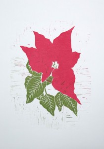


I liked the white sulfite paper best, but I found the differences between paper types were not that important – with the exception of the rice paper which was very thin and the colours tended to bleed a bit. There are also slight variations in colours resulting from the choice of paper, but I think the differences are so minimal that they cannot be seen in the online reproduction.
After the second series, I wanted to experiment a bit. I had in mind that in part three there are projects where several techniques were to be combined and I was just curious to try this out for my poinsettia. I also found that my prints were very traditional and wanted to attempt something different.
Second series
I had not an exact plan how to proceed, but several ideas like using textured and painted monoprints and stencils to combine with the linocut. I prepared transparents from the black plate single colour print which would help to register the linoplate and added grid lines onto the sheets. I also cut a positive mask from a pvc sheet (rather than from paper) because I could clean and reuse it.
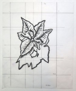
 For the second series I chose white all-purpose paper (acid free), using its smooth side. The format was large, roughly A2 (22 x 15” / 56 x 38 cm), and about the largest size I can run through my press.
I used a 30 x 40 cm perspex plate for inking and further developed the registration system to match my setting. On a sheet of printing paper, I measured a 4 cm frame around the perspex. I placed it in the upper half of the sheet with the intention of cutting away the excess paper on the lower edge after printing.
I taped the correctly oriented A4 copy from the transparent below the perspex plate to guide my inking of the plate. A black outline on the registration sheet served to register the plate. For printing, I outlined the printing sheet with the registration sheet.
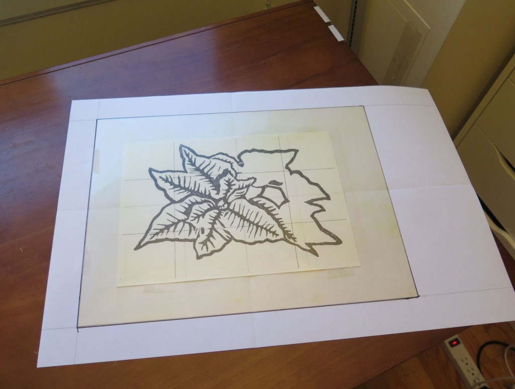
I started with a textured plate approach. I placed a piece of burlap on the inked perspex plate, ran it through the press, pulled away the burlap and then printed off the textured plate. I used a positive mask to retain white paper in shape of the flower.
The texture of the burlap came through nicely. I took a ghost print as well and a print from the inked side of the positive mask. Later, I developed this series with backdrawing and impressions from the linoplate.


The burlap approach had been to warm up for more experimentation. I had a vague image idea in mind – a dark blue background with glowing yellow patches, and within the blue background, longer edges that separated areas of different blue tones. I abandoned the texture and the mask approach because I found it too similar to what I had done in Part 1 of the course. Instead, I tried to work towards that faint image idea combining linocut with multicolour inked plate and painted monotype.


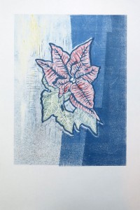
All the above prints involve three basic elements: A multicolour background, the painted poinsettia, and a linoprint off the originally black plate. Besides variations in how I inked the background, I also varied the quality of the linoprint impression. The first print was still in black, but handpulled and I liked the withered effect of the less saturated impression which worked well with the faint colours of the painted monotype and the background.
The second linoprint was made with the press on top of the painted monotype, which created a much darker and crisper impression, but let the linoprint pop out and not integrate well with the other elements. I decided to change the colour for the linoprint to dark blue, and to stay with hand printing, but use a brayer for a stronger impression from the linoplate. I think the blue colour and the slightly withered quality integrated the linoprint well with the background.
I experimented with the idea of blocks of different blue tones in the background but found it only moderately successful.
The print I like best from the series was actually reworked after an alignment error. Originally it had a black faint linoprint which I wanted to improve by adding a stronger blue impression on top, but then the second layer came out misaligned, which created a blurred image displeasant to look at. In an attempt to resolve the problem, I used white gouache to overpaint the misaligned elements. This worked technically to eliminate the blur and resulted in an interesting visual effect.

Tracing the influences: Surprise, surprise
I did not get back to my earlier research on Warhol and the poinsettias before starting my series, because I had a very clear image in memory and wanted to develop my own approach rather than copying Warhol’s style. The mental image was very strong. I saw a bushy plant with top leaves in dark red with dark green foliage below. There were strong black contours which set up all shapes against a white background. The style went towards Roy Liechtenstein / Comic book illustration, very graphical but not oversimplified.
The big surprise came when I actually looked at my research and the images I had retained as reminders. They were completely different from what I had memorized. These are the images I selected to study Andy Warhol’s poinsettias:
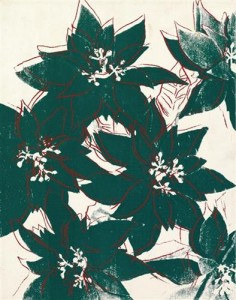


I started an image search, but did not find anything even moderately comparable to the mental images that had guided the development of the original linocut. I asked myself whether I had dreamt my own version of Warhol’s poinsettias or where else the image memory had come from. The discovery felt very strange because all the time I tried to avoid making an exact copy of my mental image but wanted to retain those qualities I liked, clarity and simplified shapes. Had I known that I had developed my own imagery already, I could have followed without hesitation rather than avoiding it.
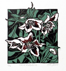
But reflecting on the qualities of my mental image helped me to finally track down the second important influence. It must have been the print “White Hellebore” by Anne Lewis. There are also the leaf points going outside the image borders, which I originally wanted to do as well.
Now it’s as if I had mentally combined Andy Warhol, Anne Lewis and my own phantasies plus some intended deviation from my mental ideal into the first version of the poinsettia print.
Looking at the hellebore print again, I appreciate what the background behind the flowers does. Instead of isolating the central flowers like I did, I could have included some background to fill the image. This would have avoided the need to cut so much away of my plate and having to deal with the inevitable marks from lino in empty areas.
Combining linocut with other techniques.
The second series took up techniques from Part 1 of the course and also served to develop new ideas. I wanted to combine linocut with other approaches, and found the main difficulty was the graphical quality of the linocut which overpowers softer and more impressionistic styles. I tried to adapt the linocut style so that it would integrate with the other techniques, which resulted in a completely different overall impression, compared to the first series. The prints are much less “obviously seasonal” through the different colours chosen.
Overall I’d conclude that linocut is difficult to combine with the more painterly style of monotypes and backdrawing. It works for me if the linocut is “toned down” by making fainter, withered impressions. It amounts to reducing the extreme graphical effects inherent to linocut. Linocut might work better together with more graphical printing techniques like etching which could be introduced for linear elements that are too fine to be made using linoleum.
I think I’m somewhat purist and tend to prefer a “one technique only” approach. I’d rather explore the limits of one particular technique and find solutions for restrictions within the given technology. This has only recently been undermined by the mixed media exercises in the watercolour course (and I liked it), and by now I’m somewhat more willing to experiment with mixed approaches, as in the final poinsettia print where I added paint on top of the print.
There were some more ideas what I could do with my poinsettia subject, for example adding collage to printed surface or doing multiple prints of the poinsettia over an even larger surface. But for now, I’ll finish and see that I’ll proceed with the course.
Where to go from here?
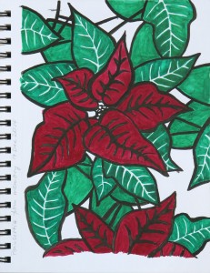 With the relief that my mental image seemed to have been “my own”, not a memory of someone else’s work, I thought I might as well try whether I can get a little closer to what I originally imagined. I made a painting from memory in my A5 sketchbook, using black ink (for the initial outlines) and gouache for the colours and overpainting the outlines.
The red and green hues are much closer to what I had in mind, also the strong contrasts between red, green, black, white. The shapes and the style of this one are about halfway between the red and green linocut and my mental image. In my imagination, the shapes are more edgy, more dynamic, less flowing and rounded.
I’m still not truly convinced about the origins of the mental image, but don’t know where else to search. Maybe someday I’ll come across that particular image and must then realize that it was indeed a memory, not my phantasy – or maybe not. What I find interesting is how painting helped me to express internal imagery, even if it’s not completely corresponding. It also feels a bit like “developing an idea” and “pushing the limits”. Maybe I should continue and develop another linocut from the painting. Or maybe try another painting first to work towards the more edgy character of my mental image, before getting back to linocutting.
I’ll see. It’s always difficult to decide whether I can afford the time to pursue some personal interests or if I should rather get on with the course.